


I need to make the background image of the slide swap and the content must be static as in the image 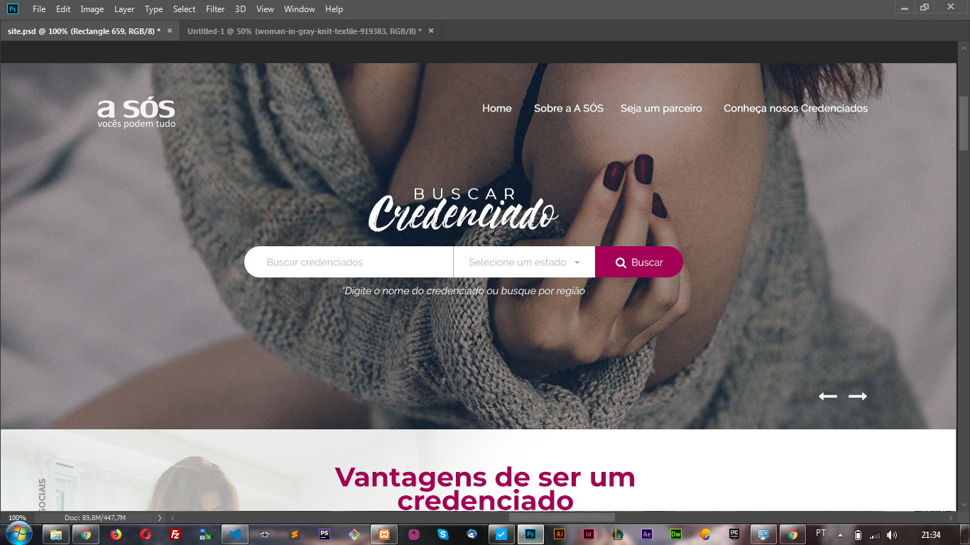 I believe doing with
 background-image of to do more I do not know how anyone knows how to help me
Slide owl carousel2 background image
0
asked by anonymous 07.10.2018 / 02:40
1 answer
1
Dude I made this example trying to make the most of the standard Bootstrap components since you said you're using it. I also made the carcel with Owl Caroucel as you had said it is using.
I had to put some element with position:absolute to be able to position on slider , but it was all 100% responsive and working. Bootstrap% original% works without problems as well as navbar
I did not use the original Owl Carousel nav buttons, I used a custom template to navigate the slides (#)
It was necessary to set a height for the car, but you can change it so the image will always occupy the entire screen without deforming, as I used slider
The responsive part is due to Bootstrap's own Grid which was used quietly to adjust the content in containers .
See how the model was, also test on "All Page" to see how it looks:
<!DOCTYPE html>
<html lang="en">

<head>
  <meta charset="utf-8" />
  <title>Page Title</title>
  <meta name="viewport" content="width=device-width, initial-scale=1">
  <link rel="stylesheet" type="text/css" media="screen" href="https://maxcdn.bootstrapcdn.com/bootstrap/4.0.0/css/bootstrap.min.css" />
  <link rel="stylesheet" type="text/css" media="screen" href="https://maxcdn.bootstrapcdn.com/font-awesome/4.7.0/css/font-awesome.min.css" />

  <link rel="stylesheet" href="https://cdnjs.cloudflare.com/ajax/libs/OwlCarousel2/2.3.4/assets/owl.carousel.min.css">
  <link rel="stylesheet" href="https://cdnjs.cloudflare.com/ajax/libs/OwlCarousel2/2.3.4/assets/owl.theme.default.min.css">

  <style>

.owl-carousel .item{
  height: 300px;
}
.owl-carousel .owl-item img {
  width: 100%;
  height: 100%;
  object-fit: cover;
}
.jumbotron-fluid-topo {
  margin: 0;
  padding: 0;
  height: 300px;
  position: relative;
}
.navbar {
  position: absolute;
  width: 100%;
  top: 0;
  left: 0;
  z-index: 1000;
  background-color: rgba(255,255,255,0.5);
}
.container-input {
  position: absolute;
  top: 50%;
  z-index: 100;
}
.btn-meio {
  border-radius: 0;
}
.container-nav {
  position: absolute;
  bottom: 0;
  z-index: 100;
  color: #fff;
  font-size: 2rem;
}
.container-nav .btns {
  cursor: pointer;
  opacity:0.5;
}
.container-nav .btns:hover {
  opacity:1;
}
</style>
</head>

<body>

  <div class="jumbotron jumbotron-fluid jumbotron-fluid-topo">

    <div class="owl-carousel owl-theme">
      <div class="item">
        <img class="img-responsive" src="https://placecage.com/360/200"alt="">
      </div>
      <div class="item">
        <img class="img-responsive" src="https://placecage.com/360/200"alt="">
      </div>
      <div class="item">
        <img class="img-responsive" src="https://placecage.com/360/200"alt="">
      </div>
      <div class="item">
        <img class="img-responsive" src="https://placecage.com/360/200"alt="">
      </div>
    </div>

    <div class="container-fluid">
      <nav class="navbar navbar-expand-lg navbar-light">
        <a class="navbar-brand" href="#">Navbar</a>
        <button class="navbar-toggler" type="button" data-toggle="collapse" data-target="#navbarSupportedContent"
          aria-controls="navbarSupportedContent" aria-expanded="false" aria-label="Toggle navigation">
          <span class="navbar-toggler-icon"></span>
        </button>

        <div class="collapse navbar-collapse" id="navbarSupportedContent">
          <ul class="navbar-nav mr-auto">
            <li class="nav-item active">
              <a class="nav-link" href="#">Home <span class="sr-only">(current)</span></a>
            </li>
            <li class="nav-item">
              <a class="nav-link" href="#">Link</a>
            </li>
            <li class="nav-item">
              <a class="nav-link disabled" href="#">Disabled</a>
            </li>
          </ul>
        </div>
      </nav>
    </div>

    <div class="container-fluid container-input">
      <div class="row">
        <div class="col-12 col-md-6 offset-md-3 d-flex justify-content-center align-items-center">

          <div class="input-group">
            <input type="text" class="form-control" aria-label="Text input with dropdown button">
            <div class="input-group-append">
              <button class="btn dropdown-toggle btn-meio" type="button" data-toggle="dropdown" aria-haspopup="true"
                aria-expanded="false">Dropdown</button>
              <div class="dropdown-menu">
                <a class="dropdown-item" href="#">Action</a>
                <a class="dropdown-item" href="#">Another action</a>
                <a class="dropdown-item" href="#">Something else here</a>
                <div role="separator" class="dropdown-divider"></div>
                <a class="dropdown-item" href="#">Separated link</a>
              </div>
              <button class="btn" type="button">
09.10.2018 / 02:43