


I need to make a navbar fixed top. When the user scrolls the page the navbar should keep on top but in a smaller size, displaying only the icons and omitting the texts. I need it to be done in SemanticUI because it is the system specification. Based on some examples obtained on the internet, I was able to just set it at the top, but resize and omit the texts yet.
HTML:
<div class="ui borderless main menu">
<div href="#" class="header item" id="logo">
<img class="ui short circular image" src="assets/images/logo.png">
</div>
<div class="ui text container">
<a class="item" title='Usuários'>
<i class="large users icon"></i><span class='large screen only six wide column'>Usuários</span></a>
<a class="item" title='Distribuição Automática'>
<i class="large settings icon disabled"></i><span class='large screen only six wide column'>Distribuição Automática</span></a>
<a class="item" title='Relatórios'>
<i class="line chart icon"></i><span class='large screen only six wide column'>Relatórios</span></a>
<a class="item" title='Pesquisar'>
<i class="large search icon disabled"></i><span class='large screen only six wide column'>Pesquisar</span></a>
</div>
CSS:
   body {
    background-color: #FFFFFF;
}
.main.container {
    margin-top: 2em;
}

.main.menu {
    margin-top: 4em;
    border-radius: 0;
    border: none;
    box-shadow: none;
    transition:
            box-shadow 0.5s ease,
            padding 0.5s ease
;
}
.main.menu .item img.logo {
    margin-right: 4.5em;
}

.overlay {
    float: left;
    margin: 0em 3em 1em 0em;
}
.overlay .menu {
    position: relative;
    left: 0;
    transition: left 0.5s ease;
}

.main.menu.fixed {
    background-color: #FFFFFF;
    border: 1px solid #DDD;
    box-shadow: 0px 3px 5px rgba(0, 0, 0, 0.2);
}
.overlay.fixed .menu {
    left: 800px;
}
.ui.borderless.main.menu {
    background-color: #3d698e;

}

.ui.menu .item{
    color:#ffffff;
    padding-left: 4em;
}

.ui.footer.segment {
    margin: 5em 0em 0em;
    padding: 5em 0em;
}

#logo{
    padding-left: 10em;
}
JS:
    $(document)
    .ready(function() {

        // fix main menu to page on passing
        $('.main.menu').visibility({
            type: 'fixed'
        });
        $('.overlay').visibility({
            type: 'fixed',
            offset: 80
        });

        // lazy load images
        $('.image').visibility({
            type: 'image',
            transition: 'vertical flip in',
            duration: 300
        });

        // show dropdown on hover
        $('.main.menu  .ui.dropdown').dropdown({
            on: 'hover'
        });
    })
;
Photo:
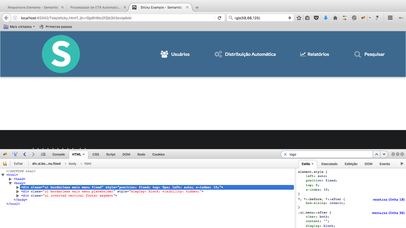
Afterscrollingthemenushouldlooklikethissite link . With a small height but displaying only the small 'icons and logo'.