Set Section [Position: absolute]

0

People,

I'm making a website as a college project, however I'm picking up a little to solve a problem with the positions of the elements. I have 3 sections, one set to be Header, one set to be Contents and one set to be Footer. The header and footer have the "position: absolute" attribute however, I'd like to get the content to start below the header and end before the footer without having to adjust the size for them.

How are you now:

HowIwantyoutostay:

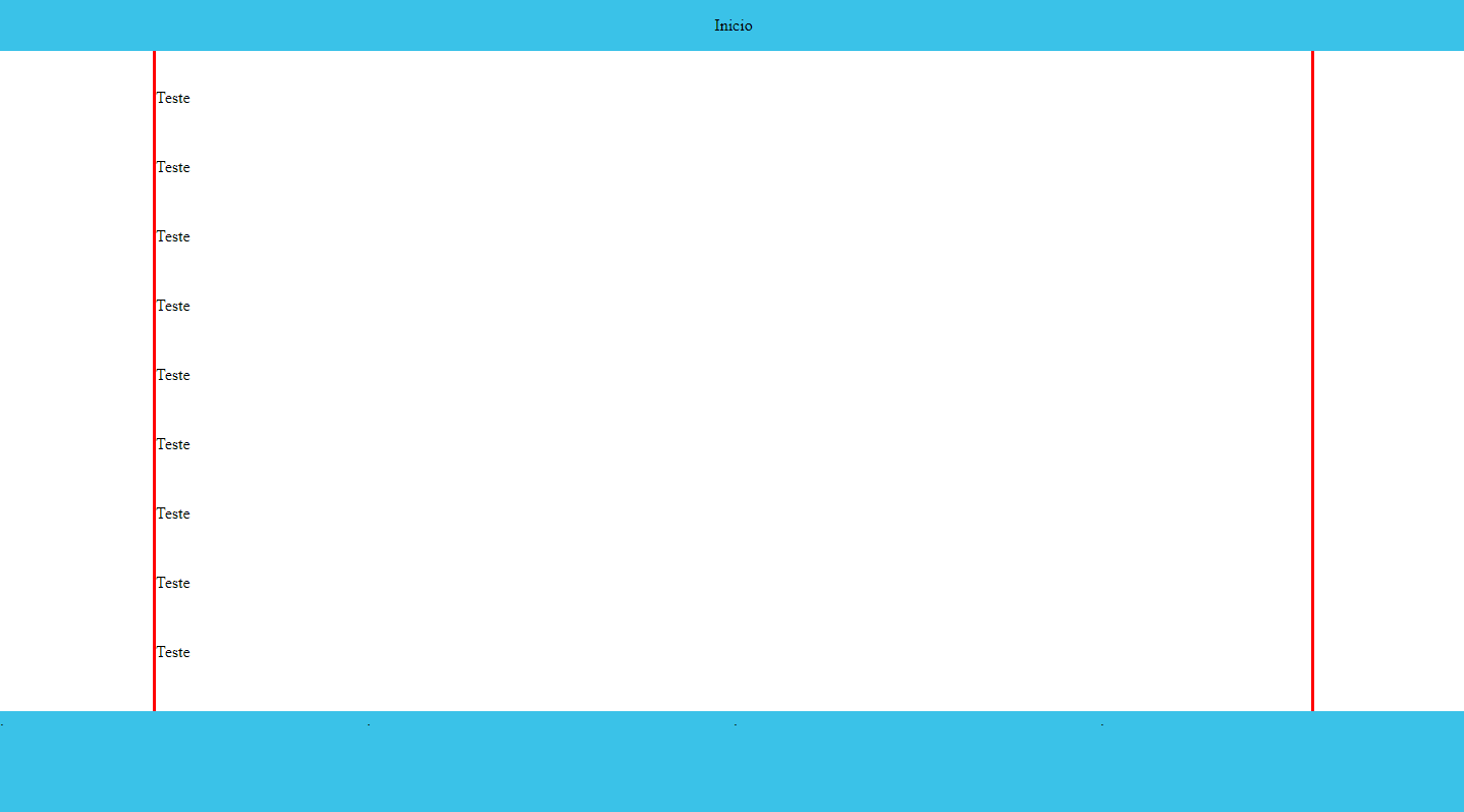
The red line represents the size of the section.

    
asked by anonymous 17.10.2018 / 22:34

2 answers

0

You can use the vh unit to set the container height to 100% static (can be relative too), and use flexbox to distribute the elements in top, middle, and footer with justify-content: space-between and flex-direction: column

* {
  margin: 0;
}
.ctn {  
  background: #cecece;
  height: 100vh;
  display: flex;
  flex-direction: column;
  justify-content: space-between;
}
#header {
  background: #424242;
  text-align: center;
  color: white;
}
#content {
  background: #ccc;
  text-align: center;
  flex-basis: 100%;
}
#footer {
  background: #424242;
  text-align: center;
  color: white;
}
<div class="ctn">

  <section id="header">Header</section>
    <section id="content">
      content <br>
      content <br>
      content <br>
      content <br>
      content <br>
      content <br>
    </section>
  <section id="footer">Footer</section>

</div>
    
17.10.2018 / 22:59
0

I believe your intention to put position:absolute is to keep header and footer always standing on the same lubar. So I made an example with main occupying 100% of the available height, and with overflow:auto , so only main will have scroll and the other elements always stays in top and bottom .

Here's how:

OBS: Run tb as "All page" to see how footer behaves when content is not large enough scroll to appear

html, body {
  margin: 0;
  padding: 0;
  height: 100%;
  width: 100%;
}
body {
  display: flex;
  flex-direction: column;
  overflow: hidden;
}
header {
  width: 100%;
  position: sticky;
  top: 0;
  background-color: #f00;
}
main {
  flex: 1;
  overflow: auto;
  background-color: #ddd;
}
footer {
  width: 100%;
  background-color: #00f;
}
<header>header</header>
<main>
  Lorem ipsum dolor sit amet consectetur adipisicing elit. Aperiam ipsam repellat eos animi officia qui, quia amet accusamus, fugit eius consectetur mollitia. Atque ea veritatis expedita dolorem unde? Alias, nihil? Assumenda quaerat officiis animi ipsum ut aliquam, consectetur dignissimos facilis impedit, est enim perspiciatis voluptas ea dolore velit accusamus cupiditate numquam amet mollitia asperiores recusandae laborum qui debitis iste! Aliquid veniam quibusdam aperiam sequi, quae porro ab et illo dolor nulla voluptatem, suscipit sapiente quos dicta tempora eius placeat cumque molestiae culpa nam reprehenderit? Suscipit animi, assumenda obcaecati nobis magnam esse enim deserunt libero ullam, omnis facilis accusantium, fuga molestias reiciendis. Recusandae aspernatur, magnam beatae at debitis, enim quam, quod ea maxime exercitationem nesciunt nisi. Consectetur provident quidem sequi temporibus esse nostrum eius obcaecati quam autem quae quo illo facere architecto iste nesciunt, aliquam delectus dignissimos inventore ab, excepturi dolorem quia quibusdam. Culpa cum amet ducimus, commodi quisquam laudantium in rem mollitia qui impedit odit ex neque laboriosam repellat, inventore eaque doloribus accusamus quod error! Dolorem, libero id laboriosam deserunt dolore fugiat quo at explicabo asperiores dicta sequi nemo quidem ab distinctio molestiae, accusamus, reiciendis qui atque blanditiis mollitia incidunt! Natus temporibus eum sint libero saepe aspernatur, atque animi? Mollitia?
</main>
<footer>footer</footer>
    
18.10.2018 / 00:06