TL; DR
The four parameters define the two control points of the Bezier Curve, P 1 (x 1 and 1 ) and P < (x 2 , and 2 ), to grade 3.
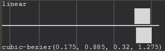
cubic-bezier(x1, y1, x2, y2)
The Bézier Curve
The Bezier Curve is a form of interpolation between a set of points and interpolation is understood as an approximation, or average, that seeks to reproduce the same behavior presented by the interpolated points. For example, if you have two points aligned, you can draw a line segment between them, estimating that all intersection points have the same behavior as the two points that originated the line segment; this estimate is what we call interpolation. In a more lay language, it would be like to say that it went from point A to point C, probably passed point B, since B is between A and C.
Mathematically, the Bezier Curve is represented by:
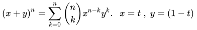
Where:
- (x,y)isthepointofthecurveinatwo-dimensionalplane;
- nistheorderofthecurve;
- kthesummationcontrolindex;
- taparameterusedtotraversethecurve;
ABéziercurveofordernmakestheinterpolationbetweenn+1points.
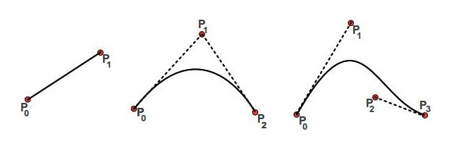
Font : examples of Bézier linear curves, quadratic and cubic.
The Cubic Bezier Curve
The cubic-bezier function, as expected, uses the particular case of the Bezier Curve for n = 3, thus it has 4 control points - points that generate interpolated and generate the curve. The starting point, P 0 , will always be the origin, (0, 0), and the end point, P 3 will always be the point (1, 1). it is necessary only to define the points P 1 and P 2 , which are defined precisely in the function parameters.
If you simplify the equation with the known parameters, you will have:

P0andP3(1,1),aswellaspointsP1andP2thataredefinedbytheparameters,weareabletoplotthegraphbyinterpolatingthepoints.
HowtocalculateP1andP2fromthegraphIwanttomount?
ThepointsP0andP3areknown,sowejustneedtodeterminewhoisP1andPsub>todefinetheparametersoftheequation.
Onewaytodothisistoputtogetherasystemofequations.Rememberingthateachpointiscomposedoftwodimensions,wewillhavethechallengeofdeterminingthevalueoffourvariables.KnowingthevaluesofB(t)whereyouwantthecurvetogo,youcansolvethesystemforthesevariables.
Jefferson Quesado has already done an answer dealing with linear system solutions that can be used as a basis.
The other alternative, which is usually the most viable in most cases is trial and error. Understanding that the point P 1 influences the beginning of the animation and the point P 2 influences the end of it, you can already position them as you wish and adjust according to your needs .
Tools
Obviously you do not have to make the trial and error at hand. There are already tools that help you create a cubic Bézier curve.
More others exist.
Examples
Ease In
Animation ease-in is known to start slow and be faster in the end.
#animations:hover .box {
  width: 100%;
}

.box {
  width: 0;
  height: 20px;
  background-color: red;
  transition: width 2s;
}

.box.ease-in {
  transition-timing-function: ease-in;
}

.box.cubic-bezier {
  transition-timing-function: cubic-bezier(0.4, 0.0, 0.2, 1);
}

section > section {
  margin-bottom: 20px;
}
<section id="animations">
  <header>
    <h1>Ease In</h1>
  </header>
  <section>
    <strong>Animação ease-in do navegador</strong>
    <pre>transition-timing-function: ease-in</pre>
    <div class="space">
      <div class="box ease-in"></div>
    </div>
  </section>

  <section>
    <strong>Animação ease-in definida pelo Google Material</strong>
    <pre>transition-timing-function: cubic-bezier(0.4, 0.0, 0.2, 1);</pre>
    <div class="space">
      <div class="box cubic-bezier"></div>
    </div>
  </section>
</section>
Ease Out
Animation ease-out is known to start quickly and slow down at the end.
#animations:hover .box {
  width: 100%;
}

.box {
  width: 0;
  height: 20px;
  background-color: red;
  transition: width 2s;
}

.box.ease-out {
  transition-timing-function: ease-out;
}

.box.cubic-bezier {
  transition-timing-function: cubic-bezier(0.0, 0.0, 0.2, 1);
}

section > section {
  margin-bottom: 20px;
}
<section id="animations">
  <header>
    <h1>Ease Out</h1>
  </header>
  <section>
    <strong>Animação ease-out do navegador</strong>
    <pre>transition-timing-function: ease-out</pre>
    <div class="space">
      <div class="box ease-out"></div>
    </div>
  </section>

  <section>
    <strong>Animação ease-out definida pelo Google Material</strong>
    <pre>transition-timing-function: cubic-bezier(0.0, 0.0, 0.2, 1);</pre>
    <div class="space">
      <div class="box cubic-bezier"></div>
    </div>
  </section>
</section>