


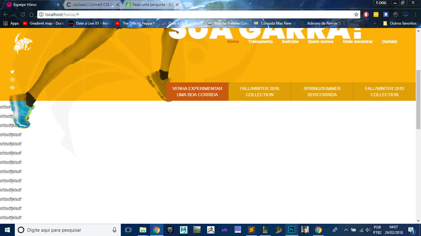
background-color: transparent more wanted that when the user rolled the page up the menu would have the white background and when the menu touches the top of the page it becomes transparent again it is possible to do that? follow my code.
My code works quietly the same problem is the background color that is always transparent realize that as my menu does not have a background color it is difficult to see the links even more when you have more scrolling than the background will already be White.
HTML:
<navclass="navbar navbar-default navigation-bar is-visible" data-nav-status="toggle">
          <div class="container-fluid">
            <!-- Brand and toggle get grouped for better mobile display -->
            <div class="navbar-header">
              <button type="button" class="navbar-toggle collapsed" data-toggle="collapse" data-target="#bs-example-navbar-collapse-1" aria-expanded="false">
                <span class="sr-only">Toggle navigation</span>
                <span class="icon-bar"></span>
                <span class="icon-bar"></span>
                <span class="icon-bar"></span>
              </button>
              <a class="navbar-brand" href="#"><img src="images/logo.png" class="img-responsive" alt="Equiep hórus" /></a>
            </div>


            <div class="collapse navbar-collapse" id="bs-example-navbar-collapse-1">
              <ul class="nav navbar-nav navbar-right ">
                <li class="active"><a href="#">Home <span class="sr-only">(current)</span></a></li>
                <li><a href="#">Treinamento</a></li>
                <li><a href="#">Instrutor</a></li>
                <li><a href="#">Quem somos</a></li>
                <li><a href="#">Onde encontrar</a></li>
                <li><a href="#">Contato</a></li>
              </ul>
            </div>
          </div>
        </nav>
      </div>
    </div>
SASS:
.navbar-default{
      background-color: transparent;
      border: none;

      .navbar-brand{
        position: absolute;
        top: 0px;
        width: 90px;
      }

      ul{
        li{
          a{
            color: #fff;
            font-family: 'Roboto', sans-serif;
            font-weight: bold;
          }
        }
      }
    }

    .navigation-bar {
        padding:2rem 3rem 2rem;
        left: 0;
        position: fixed;
        right: 0;
        top: 0;
        z-index: 1000;

        &.is-hidden {
          opacity: 0;
          -webkit-transform: translate(0,-60px);
          -webkit-transition: -webkit-transform .2s,background .3s,color .3s,opacity 0 .3s;
        }

        &.is-visible {
          opacity: 1;
          -webkit-transform: translate(0,0);
          -webkit-transition: -webkit-transform .2s,background .3s,color .3s;
        }
      }
JS:
$(document).ready(function(){
    console.log('Window Height is: ' + $(window).height());
  console.log('Document Height is: ' + $(document).height());

  var previousScroll = 0;

  $(window).scroll(function(){

    var currentScroll = $(this).scrollTop();
    if (currentScroll > 0 && currentScroll < $(document).height() - $(window).height()){
      if (currentScroll > previousScroll){
        window.setTimeout(hideNav, 300);
      } else {
        window.setTimeout(showNav, 300);
      }
      previousScroll = currentScroll;
    }

  });

  function hideNav() {
    $("[data-nav-status='toggle']").removeClass("is-visible").addClass("is-hidden");
  }
  function showNav() {
    $("[data-nav-status='toggle']").removeClass("is-hidden").addClass("is-visible");
  }

});