Element with a different size than the width and height definition in CSS?

5

Code:

div {
  width: 300px;
  height: 100px;
  border: 1px solid red;
  padding: 50px;
}
<div>
  Contéudo da div.
</div>
  • I would like to understand why inspecting the div that is in the code by the browser it has height:202px and widht:402px and not width:300px; and height:100px; ?
  • If I want to keep the values of width:300px; and height:100px; what should I do?

See:

    
asked by anonymous 06.04.2017 / 20:43

5 answers

3

You are adding 50px of padding to all sides of the element, so you are adding it to the size already set in width and height plus 1px borders. To work around this problem with padding you can use the box-sizing:border-box property

div {
   width:300px;
   height:100px;
   border:1px solid red;
   padding:50px;
   box-sizing:border-box;
}

This way your element will keep the padding but internal and will not increase the defined size of your element

    
06.04.2017 / 21:08
2
  

Because when you inspect the div that is in the code by the browser it is height: 202px and widht: 402px and not width: 300px; and height: 100px;?

This is because of the default area calculation model, called box sizing which is additive - that is, the final size is the sum of dimensions + padding + border + margin :


IfIwanttokeepthevaluesofwidth:300px;andheight:100px;whatshouldIdo?

Youneedtochangethetemplatetoborder-box,whichwillforcetherecalculationoftheinnerareaoftheelementbydiscountingbothpaddingandborder.Examplebelow:

div {
width:300px;
height:100px;
border:1px solid red;
padding:50px;
box-sizing: border-box;
}
<div>
Contéudo da div.
</div>
    
07.04.2017 / 16:33
2

Increasing the size of any element in a WEB page is due to the use of padding , the padding is nothing more than the inner space of the element, ie when padding of 50px , the element will suffer an increase of 50px para top, rigth, bottom e left.

There are two ways to keep the aspect ratio when adding a padding, I'll be quoting below:

First


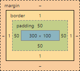
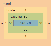
Choose an ending value for my div 300px por 100px by defining the internal spacing, taking into account that the spacing will increase on all sides the main element, ie if the element is 300 wide, then it will be worth 400, since 50 of top and 50 of base right 400, the same is valid for the height, then we must subtract 50 of the value we want, in this case we want a div com 300px e 100px , it will be like this.

div.d1 {
    width: 200px;
    height: 0px;
    /*É necessário por o height como 0px, pois se deixa vazio, ele assumirá um valor automático, e estragará o trabalho, eu deixei 0px 
 pois ele assume 50 de padding, o que já soma 100px da original*/
    
    padding: 50px;
    border: 1px solid black;
}
div.d2 {
    width: 300px;
    height: 100px;
    box-sizing: border-box;
    padding: 50px;
    border: 1px solid red;
}
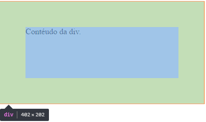
<div class="d1">Ajsutando manualmente.</div>
<br>
<div class="d2"> Com Border-Box </div>
<br>
	

Second


box-sizing: border-box , which is a style applied to elements, maintaining the original aspect ratio of each, thus not re-adjusting its size with padding.

Note: Note that border: 1px solid black consumes 1px on each side of the element, ie the width becomes 302px;

    
06.04.2017 / 21:44
2

The width and height properties define the dimensions of the boxes content area created by HTML elements. The final dimensions of the box (width x height) are the result of summing the values of the properties width , padding and border . So in your example the size of div is a result of:


height = 100 + 50 (padding-top) + 50 (padding-bottom) + 1 (border-top) +   1 (border-bottom) = 202


width = 300 + 50 (padding-left) + 50 (padding-right) + 1 (border-left) +   1 (border-right) = 402

The box-sizing property changes the way the Box Model is calculated, incorporating the values of padding and border to the width of the box created by the HTML element. So you do not have to make calculations to reach the width and full height dimensions of the box since they are exactly the ones you declared in your CSS rule.

div {
width:300px;
height:100px;
border:1px solid red;
padding:50px;
-webkit-box-sizing: border-box;
-moz-box-sizing: border-box;
box-sizing: border-box;
}
<div>
Contéudo da div.
</div>
    
06.04.2017 / 20:52
1

You can use the border-box property of CSS, as below:

div {
  width: 300px;
  height: 100px;
  border: 1px solid red;
  padding: 50px;
  -webkit-box-sizing: border-box;
  -moz-box-sizing: border-box;
  box-sizing: border-box;
}
<div>
  Contéudo da div.
</div>

It will cause the element's dimensions to be retained even when you use other properties that would change its size, such as padding and border . Obviously this is valid for width only, because height will adjust accordingly.

Without using it, the browser will keep the useful area (I do not know if it has a more technical term) with the dimensions you set, and any property used that varies the size of the element will be added to the dimensions of it. That is, the useful area of the element will be 300x100, adding 2 pixels in each because of the border (302x102) and finally another 100px in each because of padding , totaling 402x202, which are the values inspected. >     

06.04.2017 / 21:10