


Is it possible to convert the image below into css pure?
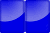
If yes, how could I do this? Does anyone have an example?
I also need to have that split, just like the image.
Is it possible to convert the image below into css pure?
If yes, how could I do this? Does anyone have an example?
I also need to have that split, just like the image.
EDIT: (just a <div> ) Only to do with div yes, following the same principle as using element ::before and putting backgrounde radial-gradient in each of them.
<div> and the other in contente:"" of ::after
See the example with just a div
html, body {
    width: 100%;
    height: 100%;
    margin: 20px;
    padding: 0;
}

.retangulo {
    display: block;
    width: 50px;
    height: 80px;
    background-color: #0000ff;
    background-image: radial-gradient(circle at top left, blue 0%,rgba(255,255,255,0.5) 60%, blue 61%);
    background-repeat: no-repeat;
    background-size: 150% 80%;
    background-position: top -10px left 0;
    border-radius: 5px;
    position: relative;
    box-shadow: 0 0 10px rgba(0,0,0,0.65) inset;
    font-size: 32px;
    font-family: 'Segoe UI', Tahoma, Geneva, Verdana, sans-serif;
    font-weight: bold;
    color: aliceblue;
    text-align: center;
    line-height: 80px;

}
.retangulo::before {
    content: "2";
    display: block;
    width: 50px;
    height: 80px;
    background-color: #0000ff;
    background-image: radial-gradient(circle at top left, blue 0%,rgba(255,255,255,0.5) 60%, blue 61%);
    background-repeat: no-repeat;
    background-size: 150% 80%;
    background-position: top -10px left 0;
    border-radius: 5px;
    position: absolute;
    left: 51px;
    box-shadow: 0 0 10px rgba(0,0,0,0.65) inset;
}
<div class="retangulo">1</div>Give me my young man, look at the result there. Pure CSS!
I used a box-shadow with inset to make the dark shading on the inside, and a pseudo :: after element to make the "glow" with a gradient radial background
html, body {
    width: 100%;
    height: 100%;
    margin: 20px;
    padding: 0;
}
.btn {
    width: 60px;
    height: 80px;
    box-shadow: 0 0 10px rgba(0, 0, 0, 0.75) inset;
    background-color: blue;
    border-radius: 6px;
    overflow: hidden;
    position: relative;
    float: left;
    margin-right: 2px;
}
.btn::after {
    content: "";
    border-radius: 50%;
    position: absolute;
    top: -70px;
    left: -50px;
    width: 120px;
    height: 120px;
    background-image: radial-gradient(blue 30%, azure);
    opacity: 0.65;
}
<div class="btn"></div>
<div class="btn"></div>It is possible, yes! And I would say even simple. All you have to do is break apart the elements of the figure to find the complete solution.
You could start with:
<body>
  <div class="retangulo">
 </div>
</body>
And create the styles, first the rectangle:
 .retangulo {
display: block;
width: 50px;
height: 80px;
background-color: #0000ff;
border-radius: 10px;
}
Now we need to create this "light" that shades the shape. We changed HTML to allocate the new element:
<body>
    <div class="retangulo">
      <div class="shade"></div>
    </div>
</body>
And CSS of the shadow I did so, it's not exactly the same as the original, but I just rode it quickly:
.shade {
  position: relative;
  width: 80px;
  height: 80px;
  border-radius: 50px;
  left: -30px;
  top: -30px;
  background: radial-gradient(rgba(255,255,255,0), rgba(255,255,255,1));
  opacity: 0.3;
  overflow: hidden;
}
Adjust CSS according to your needs!
Then just make HTML to look exactly the same in the reference image.
Example:
.retangulo {
  display: block;
  width: 50px;
  height: 80px;
  background-color: #0000ff;
  border-radius: 10px;
}

.shade {
  position: relative;
  width: 80px;
  height: 80px;
  border-radius: 50px;
  left: -30px;
  top: -30px;
  background: radial-gradient(rgba(255,255,255,0), rgba(255,255,255,1));
  opacity: 0.3;
  overflow: hidden;
}
<body>
<div class="retangulo">
<div class="shade"></div>
</div>
</body>