___ erkimt ___ Checkbox style with subway style ______ qstntxt ___
I need to change my checkbox so that it is identical to the following image:
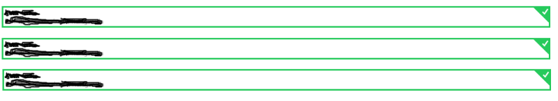
Itshouldlooklikethiswhenitismarked,whenitisnotmarked,itremovestheentireborderandappearsattheend.
IdidnotinsertcodebecauseIcouldnotgetoutofthebasic,ofcourse,thegreenborderseemsverysimple,butwhatisdifficultisthetopright,whereithasthesymbol.
Ineedonlythecsscodeclass.
______azszpr80661___
You can do exactly the same as the example using the %code% (adjacent) and %code% selectors, and a bordered trick to create the triangles
<ul>
  <li>
    <div class="circle"><img src="https://s3.amazonaws.com/uifaces/faces/twitter/boheme/128.jpg"/></div><h4>StevenWilson</h4><inputid="check-1" type="checkbox"/>
    <label for="check-1"><i class="fa fa-check"></i></label>
  </li>
  <li>
    <div class="circle"><img src="https://s3.amazonaws.com/uifaces/faces/twitter/allisongrayce/128.jpg"/></div><h4>JamieHarden</h4><inputid="check-2" type="checkbox"/>
    <label for="check-2"><i class="fa fa-check"></i></label>
  </li>
  <li>
    <div class="circle"><img src="https://s3.amazonaws.com/uifaces/faces/twitter/cacique/128.jpg"/></div><h4>MikePortnoy</h4><inputid="check-3" type="checkbox"/>
    <label for="check-3"><i class="fa fa-check"></i></label>
  </li>
</ul>
body {
  background: #607D8B;
}
* {
  box-sizing: border-box;
}
ul {
  border-radius: 2px;
  overflow: hidden;
  width: 360px;
  margin: 60px auto 0;
  box-shadow: 0 2px 2px rgba(0, 0, 0, 0.2);
}
li {
  width: 360px;
  padding: 12px;
  margin: auto;
  position: relative;
  overflow: hidden;
}
li.active h4 {
  color: white;
}
li:before {
  content: '';
  width: 100%;
  height: 100%;
  display: block;
  background: white;
  position: absolute;
  top: 0;
  left: 0;
  z-index: -1;
}
li .circle {
  width: 40px;
  height: 40px;
  background: #ccc;
  border-radius: 9999px;
  display: inline-block;
  vertical-align: middle;
  margin-right: 12px;
  position: relative;
  z-index: 10;
  overflow: hidden;
}
li .circle img {
  width: 100%;
}
li h4 {
  display: inline-block;
  font-family: "Roboto", Helvetica, sans-serif;
  font-weight: 500;
  font-size: 20px;
  margin: 0;
  vertical-align: middle;
  position: relative;
  z-index: 10;
  transition: all .5s;
}
li input {
  vertical-align: middle;
  display: none;
}
li input + label {
  display: inline-block;
  background: #ccc;
  width: 24px;
  height: 24px;
  border-radius: 2px;
  position: absolute;
  right: 20px;
  top: 20px;
  text-align: center;
  padding-top: 3px;
  color: transparent;
  cursor: pointer;
  transition: all .2s;
}
li input + label:after {
  content: '';
  background: rgba(3, 169, 244, 0.5);
  width: 10px;
  height: 10px;
  position: absolute;
  right: 8px;
  top: 8px;
  border-radius: 9999px;
  transition: all 0.3s ease-in;
  z-index: -1;
}
li input:checked + label {
  background: white;
  color: #03a9f4;
}
li input:checked + label:after {
  width: 1000px;
  height: 1000px;
  top: -500px;
  right: -500px;
  background: #03a9f4;
}
Example 2
I leave here for another example that I have improved for this answer that for simplicity is only developed in HTML > and CSS .
HTML
$('label').click(function() {
  $(this).parent('li').toggleClass('active');
});
CSS
<ul>
  <li>
    <div class="circle"><img src="https://s3.amazonaws.com/uifaces/faces/twitter/boheme/128.jpg"/></div><h4>StevenWilson</h4><inputid="check-1" type="checkbox"/>
    <label for="check-1"><i class="fa fa-check"></i></label>
  </li>
  <li>
    <div class="circle"><img src="https://s3.amazonaws.com/uifaces/faces/twitter/allisongrayce/128.jpg"/></div><h4>JamieHarden</h4><inputid="check-2" type="checkbox"/>
    <label for="check-2"><i class="fa fa-check"></i></label>
  </li>
  <li>
    <div class="circle"><img src="https://s3.amazonaws.com/uifaces/faces/twitter/cacique/128.jpg"/></div><h4>MikePortnoy</h4><inputid="check-3" type="checkbox"/>
    <label for="check-3"><i class="fa fa-check"></i></label>
  </li>
</ul>
Example 1
I have an example in the CodePen and jsFiddle I consider close to show you if applicable.
HTML
body {
  background: #607D8B;
}
* {
  box-sizing: border-box;
}
ul {
  border-radius: 2px;
  overflow: hidden;
  width: 360px;
  margin: 60px auto 0;
  box-shadow: 0 2px 2px rgba(0, 0, 0, 0.2);
}
li {
  width: 360px;
  padding: 12px;
  margin: auto;
  position: relative;
  overflow: hidden;
}
li.active h4 {
  color: white;
}
li:before {
  content: '';
  width: 100%;
  height: 100%;
  display: block;
  background: white;
  position: absolute;
  top: 0;
  left: 0;
  z-index: -1;
}
li .circle {
  width: 40px;
  height: 40px;
  background: #ccc;
  border-radius: 9999px;
  display: inline-block;
  vertical-align: middle;
  margin-right: 12px;
  position: relative;
  z-index: 10;
  overflow: hidden;
}
li .circle img {
  width: 100%;
}
li h4 {
  display: inline-block;
  font-family: "Roboto", Helvetica, sans-serif;
  font-weight: 500;
  font-size: 20px;
  margin: 0;
  vertical-align: middle;
  position: relative;
  z-index: 10;
  transition: all .5s;
}
li input {
  vertical-align: middle;
  display: none;
}
li input + label {
  display: inline-block;
  background: #ccc;
  width: 24px;
  height: 24px;
  border-radius: 2px;
  position: absolute;
  right: 20px;
  top: 20px;
  text-align: center;
  padding-top: 3px;
  color: transparent;
  cursor: pointer;
  transition: all .2s;
}
li input + label:after {
  content: '';
  background: rgba(3, 169, 244, 0.5);
  width: 10px;
  height: 10px;
  position: absolute;
  right: 8px;
  top: 8px;
  border-radius: 9999px;
  transition: all 0.3s ease-in;
  z-index: -1;
}
li input:checked + label {
  background: white;
  color: #03a9f4;
}
li input:checked + label:after {
  width: 1000px;
  height: 1000px;
  top: -500px;
  right: -500px;
  background: #03a9f4;
}
CSS
$('label').click(function() {
  $(this).parent('li').toggleClass('active');
});
JavaScript
%pre%
I hope I have helped.


