With CSS is it possible to fill in the "eyes" of the Source? Is it possible to fill in the "holes" in the letters A, O, P, etc.?

6

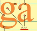
I was wanting to create a title to use in the sessions of my site, but I wanted the font to have a similar effect to those images, with my eyes filled in giving the impression that the font has the inside of the characters filled in.

TEST

Itestedwithtext-shadowbutdidnotreachanapplicableresult...

h1 {
  color: blue;
  font-size: 100px;
  font-family: sans-serif;
  text-shadow: 
  8px 8px 0 red,
  16px 16px 0 red,
  22px 22px 0 red;
}
<h1>AaBbDdOoPpQqR</h1>
    
asked by anonymous 22.10.2018 / 14:36

2 answers

2

The best solution would be to use a font that is how you want, however ...

A gambiarrenta form that resembles what you want is to use several text-shadow to create the completed phrase, use letter-spacing not to overlap letters and then transform: scaleX to flatten

h1 {
  color: transparent;
  font-size: 100px;
  font-family: sans-serif;
  text-shadow: red 0px 0px 0px, red 10px 0px 0px, red 20px 0px 0px, red 30px 0px 0px, red 40px 0px 0px;
  letter-spacing: 35px;
  transform: scaleX(0.30);
}
<h1>AaBbDdOoPpQqR</h1>
    
22.10.2018 / 22:07
1

What I had thought was exactly what is in the link of the stack in English that they sent you edited one with their letters. Something like creating a layer under the letter and just plugging the hole

h1 {
  font-size: 100px;
  font-family: Verdana;
}

.fill-letter {
  position: relative;
}

.fill-letter:after {
  display: block;
  content: "";
  position: absolute;
}

.A:after {
  background-color: orange;
  height: 30%;
  left: 33%;
  top: 30%;
  width: 35%;
  z-index: -1;
}

.a:after {
  background-color: orange;
  height: 20%;
  left: 32%;
  top: 60%;
  width: 35%;
  z-index: -1;
}

.B:after {
  background-color: orange;
  height: 50%;
  left: 33%;
  top: 30%;
  width: 38%;
  z-index: -1;
}

.b:after {
  background-color: orange;
  height: 33%;
  left: 33%;
  top: 45%;
  width: 38%;
  z-index: -1;
}

.D:after {
  background-color: orange;
  height: 45%;
  left: 33%;
  top: 30%;
  width: 40%;
  z-index: -1;
}

.d:after {
  background-color: orange;
  height: 35%;
  left: 30%;
  top: 40%;
  width: 40%;
  z-index: -1;
}

.O:after {
  background-color: orange;
  height: 50%;
  left: 25%;
  top: 30%;
  width: 50%;
  z-index: -1;
}

.o:after {
  background-color: orange;
  height: 35%;
  left: 25%;
  top: 40%;
  width: 50%;
  z-index: -1;
}

.P:after {
  background-color: orange;
  height: 30%;
  left: 25%;
  top: 30%;
  width: 50%;
  z-index: -1;
}
.p:after {
  background-color: orange;
  height: 30%;
  left: 25%;
  top: 45%;
  width: 50%;
  z-index: -1;
}
.Q:after {
  background-color: orange;
  height: 45%;
  left: 25%;
  top: 30%;
  width: 50%;
  z-index: -1;
}
.q:after {
  background-color: orange;
  height: 35%;
  left: 25%;
  top: 40%;
  width: 50%;
  z-index: -1;
}
.R:after {
  background-color: orange;
  height: 30%;
  left: 25%;
  top: 30%;
  width: 42%;
  z-index: -1;
}
.e:after {
  background-color: orange;
  height: 20%;
  left: 25%;
  top: 40%;
  width: 45%;
  z-index: -1;
}
.g:after {
  background-color: orange;
  height: 35%;
  left: 25%;
  top: 40%;
  width: 45%;
  z-index: -1;
}
<h1><span class="fill-letter A">A</span><span class="fill-letter a">a</span><span class="fill-letter B">B</span></span><span class="fill-letter b">b</span><span class="fill-letter D">D</span><span class="fill-letter d">d</span><span class="fill-letter O">O</span></span><span class="fill-letter o">o</span><span class="fill-letter P">P</span><span class="fill-letter p">p</span><span class="fill-letter Q">Q</span>
<span class="fill-letter q">q</span><span class="fill-letter R">R</span>
<span class="fill-letter e">e</span>
<span class="fill-letter g">g</span>
</h1>
    
22.10.2018 / 15:13