Forcing divs with text to remain on the same line?

1

I have the following HTML structure:

<div class="cloud_current_folder">
     <div data-folder-name>My Cloud</div>
     <div data-spliter></div>
     <div data-folder-name>Documents</div>
</div>

And the following CSS:

.cloud_current_folder{
    width:200px;
    height:20px;

    float:left;
    position:relative;
    top:30px;

    background-color:#F00;
}
.cloud_current_folder div[data-folder-name]{
    width:auto;
    float:left;

    line-height:20px;
    font-size:16px; 
    font-weight:550;
    color: rgba(19, 19, 19, 0.6);

    overflow:hidden;
    white-space: nowrap;
    text-overflow: ellipsis;
}

The size of cloud_current_folder will be dynamic, ie 100%, but for test purposes I put 200px , when the size of the divs containing the current folder name are greater than this value, such divs are placed in new lines:

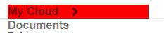
AndI'dliketocausethecurrentsizeofthe%divswithdata-folder-nametobereadjusted,andthetextinsidethosebecut,aneffectlikethis:

In such a way that no matter how many other divs are added, the current ones are resized by making room for a new one. How could it be done?

    
asked by anonymous 23.05.2018 / 19:19

1 answer

1

Leo with flex I think you get something very close to what you want. With it the divs is with dynamic width and occupy only the available space, when it does not fit, it does ellipsis .

The flex by default is row , which means that a container with display:flex will put all its children side by side on a single line. The flex-wrap:nowrap property will ensure that this "container" with flex will not throw any children to the bottom line. If you want a minimum width just put min-width:40px for example. So no element will be less than 40px wide.

See example (I just edited css to get better view of the layout)

.cloud_current_folder{
    display:flex;
    flex-wrap: nowrap;
    height:20px;
    position:relative;
    top:30px;

    background-color:#eff;
}
.cloud_current_folder > div{
    line-height:20px;
    font-size:16px; 
    font-weight:550;
    color: rgba(19, 19, 19, 0.9);
    
    border: 1px solid;

    overflow:hidden;
    white-space: nowrap;
    text-overflow: ellipsis;
}
<div class="cloud_current_folder">
    <div data-folder-name>5 Lorem ipsum dolor sit amet.</div>
    <div data-spliter>6 Lorem ipsum dolor sit amet consectetur.</div>
    <div data-folder-name>7 Lorem ipsum dolor sit, amet consectetur adipisicing.</div>
    <div data-folder-name>7 Lorem .</div>
    <div data-folder-name>7 Lorem ipsum dolor sit, amet consectetur adipisicing.</div>
</div>
    
23.05.2018 / 19:44