Another way, in addition to those already presented and explained, also using the skew property but applying the transformation only to two elements (one before and another after the image), instead of transforming the entire div , thus keeping the aspect of the image:
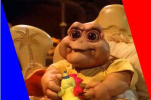
Intheexample,twoelements(beforeandaftertheimage)withbackgrounddifferentcolors.
Samplecode(usingspan):
*{margin:0;padding:0}

.image-wrapper {
  height: 200px;
  overflow: hidden;
  position: relative;
  width: 300px
}

.image-wrapper > img {
  width: 100%
}

.cut {
  background: #fff; /* A cor dos elementos antes e depois */
  display: block;
  top: 0; bottom: 0;
  position: absolute;
  width: 100px
}

.left {
  -webkit-transform: skew(16deg) translateX(-70px);
      -ms-transform: skew(16deg) translateX(-70px);
          transform: skew(16deg) translateX(-70px);
  left: 0
}

.right {
  -webkit-transform: skew(16deg) translateX(70px);
      -ms-transform: skew(16deg) translateX(70px);
          transform: skew(16deg) translateX(70px);
  right: 0
}
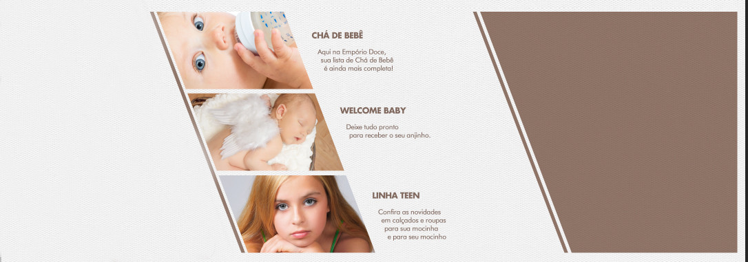
<div class='image-wrapper'>
  <span class='cut left'></span>
  <img src='http://i.stack.imgur.com/yMfhN.jpg' alt='Chá de Bebê'/>
  <span class='cut right'></span>
</div>


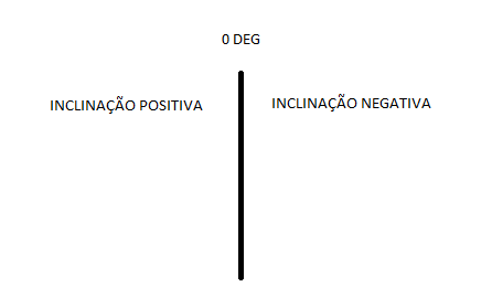
 I recently received a layout to develop, in which I have a specific aside that I can not do, I need a div that is tilted, as in the example, the more that the text flows normally, the text is not turned over in case of using transform.