


I have seen that in some registers, they are using the toggle button a lot.
Would anyone know how to do this?
I have seen that in some registers, they are using the toggle button a lot.
Would anyone know how to do this?
I suggest separating the question into two and having a separate question for the server side. I think there are plenty of examples of how to do it.
Note: I ended up doing a component of these in React on Github
The client-side part you can do as in the example below:
var estado = document.getElementById('estado');
$('#onoff1').on('change', function() {
    var el = this;
    estado.innerHTML = el.checked ? 'ligado' : 'desligado';

    // aqui podes juntar a lógica do ajax
    $.ajax({
        url: "some.php",
        data: {
            estado: this.checked
        }
    }).done(function(msg) {
        if (msg == 'failed') return el.checked = !el.checked; // caso o servidor retorne "failed" mudar o estado do botão
        else alert("Info gravada: " + msg);
    });
});
.onoff input.toggle {
display: none;
}
.onoff input.toggle + label {
display: inline-block;
position: relative;
box-shadow: inset 0 0 0px 1px #d5d5d5;
height: 60px;
width: 100px;
border-radius: 30px;
}
.onoff input.toggle + label:before {
content: "";
display: block;
height: 60px;
width: 60px;
border-radius: 30px;
background: rgba(19, 191, 17, 0);
transition: 0.1s ease-in-out;
}
.onoff input.toggle + label:after {
content: "";
position: absolute;
height: 60px;
width: 60px;
top: 0;
left: 0px;
border-radius: 30px;
background: #fff;
box-shadow: inset 0 0 0 1px rgba(0, 0, 0, 0.2), 0 2px 4px rgba(0, 0, 0, 0.2);
transition: 0.1s ease-in-out;
}
.onoff input.toggle:checked + label:before {
width: 100px;
background: #13bf11;
}
.onoff input.toggle:checked + label:after {
left: 40px;
box-shadow: inset 0 0 0 1px #13bf11, 0 2px 4px rgba(0, 0, 0, 0.2);
}<script src="https://ajax.googleapis.com/ajax/libs/jquery/2.1.1/jquery.min.js"></script><divclass="onoff">
<input type="checkbox" class="toggle" id="onoff1">
<label for="onoff1"></label>
</div>
<p id="estado">desligado</p>The part of changing and coloring the button is HTML + CSS only. The JavaScript would only be to know when the button changes and send to the server.
An example with pure CSS would thus be link , I made a simpler version link , its legal is that it works according to the% property checked and disabled thus adapting the behavior :checked and :disabled
Looking like this:
body {
    background: #eee;
}

.toggle {
    margin-bottom: 40px;
}

.toggle > input {
    display: none;
}

.toggle > label {
    position: relative;
    display: block;
    height: 20px;
    width: 44px;
    background: #898989;
    border-radius: 100px;
    cursor: pointer;
    transition: all 0.3s ease;
}
.toggle > label:after {
    position: absolute;
    left: -2px;
    top: -3px;
    display: block;
    width: 26px;
    height: 26px;
    border-radius: 100px;
    background: #fff;
    box-shadow: 0px 3px 3px rgba(0,0,0,0.05);
    content: '';
    transition: all 0.3s ease;
}
.toggle > label:active:after {
    transform: scale(1.15, 0.85);
}
.toggle > input:checked ~ label {
    background: #6fbeb5;
}
.toggle > input:checked ~ label:after {
    left: 20px;
    background: #179588;
}
.toggle > input:disabled ~ label {
    background: #d5d5d5;
    pointer-events: none;
}
.toggle > input:disabled ~ label:after {
    background: #bcbdbc;
}
<div class="toggle">
<input type="checkbox" id="foo">
<label for="foo"></label>
</div>
<div class="toggle">
<input type="checkbox" id="bar" checked>
<label for="bar"></label>
</div>
<div class="toggle">
<input type="checkbox" id="baz" disabled>
<label for="baz"></label>
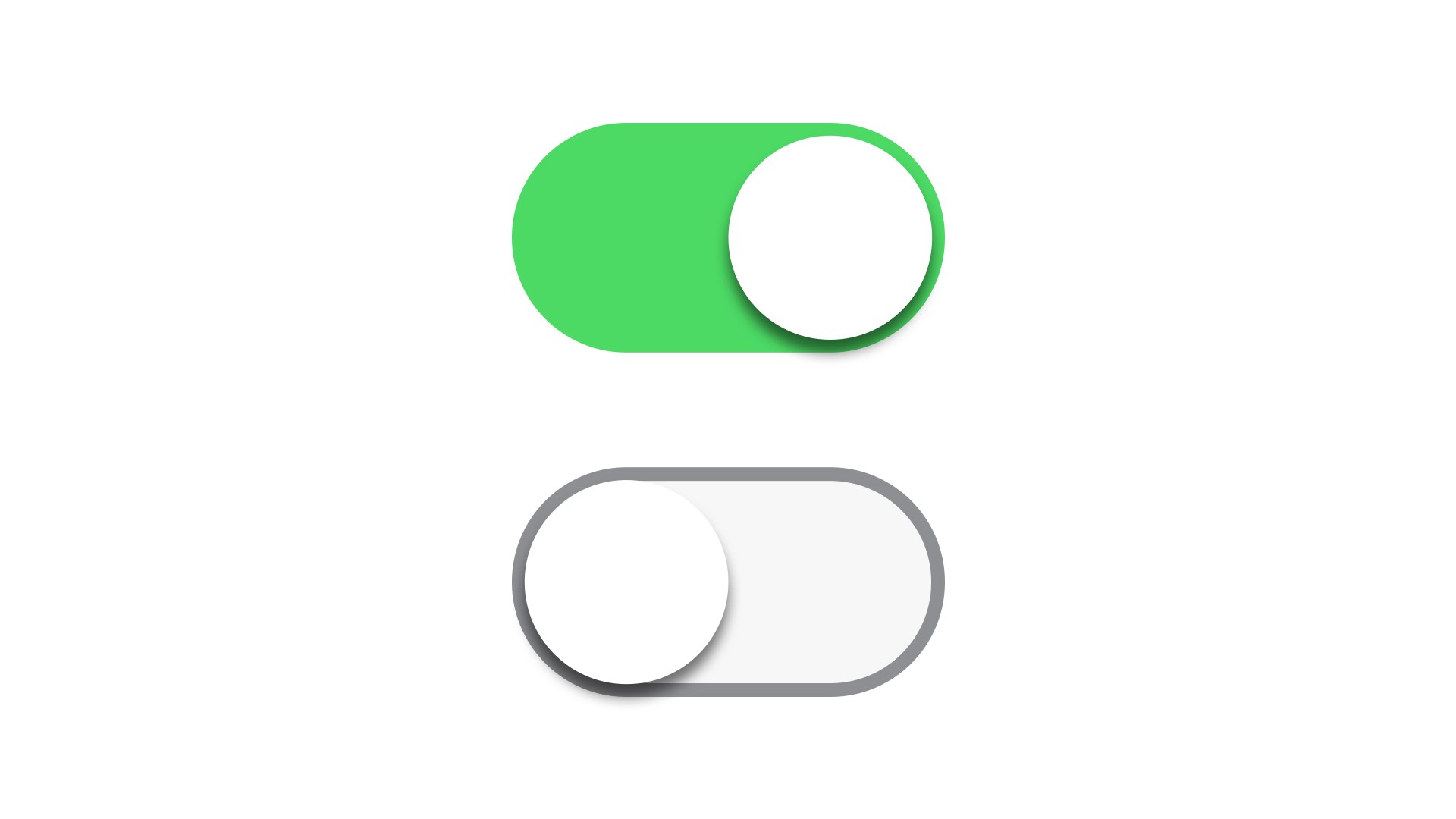
</div>To look similar to iOS
body {
    background: #eee;
}

.toggle {
    margin-bottom: 20px;
}

.toggle > input {
    display: none;
}

.toggle > label {
    position: relative;
    display: block;
    height: 28px;
    width: 52px;
    background-color: #f7f7f7;
    border: 1px #a2e3e6 solid;
    border-radius: 100px;
    cursor: pointer;
    transition: all 0.3s ease;
}
.toggle > label:after {
    position: absolute;
    left: 1px;
    top: 1px;
    display: block;
    width: 26px;
    height: 26px;
    border-radius: 100px;
    background: #fff;
    box-shadow: 0px 3px 3px rgba(0,0,0,0.05);
    content: '';
    transition: all 0.3s ease;
}
.toggle > label:active:after {
    transform: scale(1.15, 0.85);
}
.toggle > input:checked ~ label {
    background-color: #4cda64;
    border-color: #4cda64;
}
.toggle > input:checked ~ label:after {
    left: 25px;
}
.toggle > input:disabled ~ label {
    background-color: #d5d5d5;
    pointer-events: none;
}
.toggle > input:disabled ~ label:after {
    background-color: rgba(255, 255, 255, 0.3);
}
<div class="toggle">
<input type="checkbox" id="foo">
<label for="foo"></label>
</div>
<div class="toggle">
<input type="checkbox" id="bar" checked>
<label for="bar"></label>
</div>
<div class="toggle">
<input type="checkbox" id="baz" disabled>
<label for="baz"></label>
</div>