How to use Materialize side-nav?

1

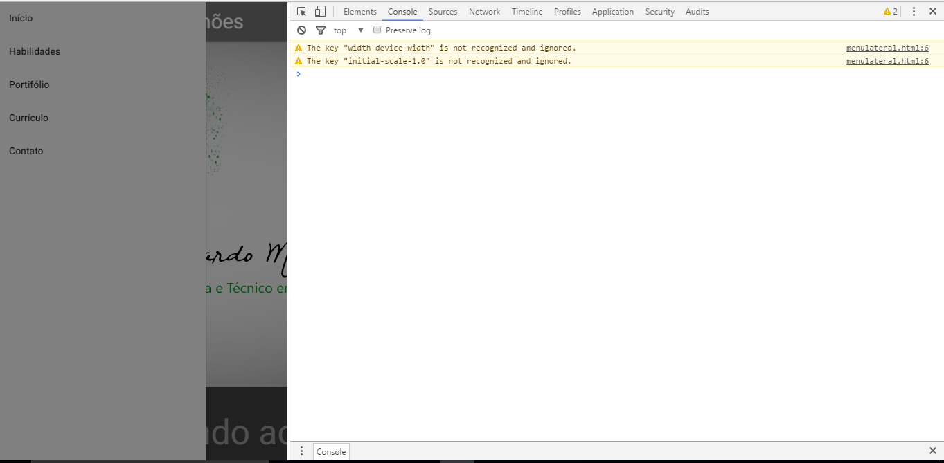
Good morning, I'm trying to make a menu responsive to my portfolio, I'm using the materialize but when I put it fixed the side-nav of the mobile buga version, it's all dark and does not click on the items, here's the image how it gets when you're with the navbar-fixed class

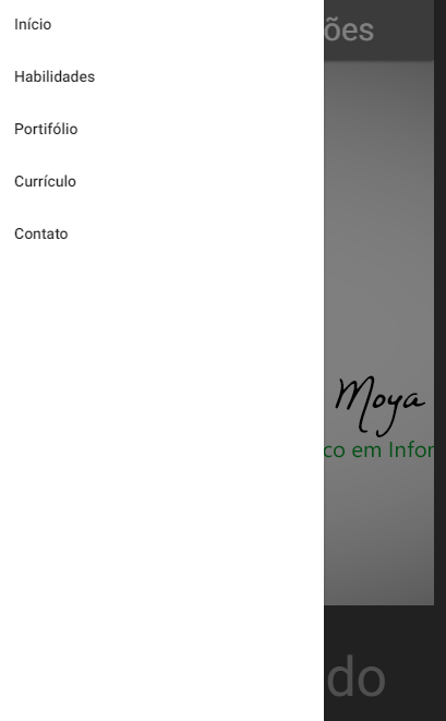
andhereisanimagetoshowhowitworksnormallywithoutputtingitfixed

TomakethismenuIwatchedthisvideo:2.-TutorialMaterialize:NAVBARofthechannelBrajanMontesPerezonyoutube,Ididnotputthelinkpqifthereisnowaytoputthehtmlcode

Mycodehere(Iremovedthebody)


            menulateral

<linkrel="stylesheet" href="css/materialize.min.css">
<link href="http://fonts.googleapis.com/icon?family=Material+Icons"     rel="stylesheet">
<meta name="viewport" content="width=device-width, initial-scale=1.0" />

<div class="row">

  <div class="navbar-fixed">
    <nav>
            <div class="nav-wrapper grey darken-1">
                <a href="#!" class="brand-logo">Eduardo Moya Simões</a>
                <a href="#" data-activates="mobile-demo" class="button-collapse"><i class="material-icons">menu</i></a>
                <ul class="right hide-on-med-and-down">
                    <li><a href="">Início</a></li>
                    <li><a href="">Habilidades</a></li>
                    <li><a href="">Portifólio</a></li>
                    <li><a href="">Currículo</a></li>
                    <li><a href="">Contato</a></li>
                </ul>
                <ul class="side-nav" id="mobile-demo">
                    <li><a href="">Início</a></li>
                    <li><a href="">Habilidades</a></li>
                    <li><a href="">Portifólio</a></li>
                    <li><a href="">Currículo</a></li>
                    <li><a href="">Contato</a></li>
                </ul>
            </div>
    </nav>
  </div>
   <script src="js/jquery-3.1.1.js"></script>
   <script src="js/materialize.min.js" ></script>
   <script type="text/javascript">
      $(document).ready(function(){
      $('.parallax').parallax();
    });
   </script>
   <script>
     $( document ).ready(function(){
     $(".button-collapse").sideNav();
   })
 </script>


asked by anonymous 08.03.2017 / 15:29

5 answers

1

The same thing happened to me and I discovered that it's because of the z-index of the .navbar-fixed class. To resolve just enter in your css:

.navbar-fixed {
  z-index: 998;
}
    
05.06.2017 / 03:01
1

Here I was bugging too, I solved the anchor of the action from inside the nav, mine was like this.

    <nav>
        <div class="nav-wrapper grey darken-1">
            <a href="#!" class="brand-logo">Eduardo Moya Simões</a>
            <ul class="right hide-on-med-and-down">
                <li><a href="">Início</a></li>
                <li><a href="">Habilidades</a></li>
                <li><a href="">Portifólio</a></li>
                <li><a href="">Currículo</a></li>
                <li><a href="">Contato</a></li>
            </ul>
            <ul class="side-nav" id="mobile-demo">
                <li><a href="">Início</a></li>
                <li><a href="">Habilidades</a></li>
                <li><a href="">Portifólio</a></li>
                <li><a href="">Currículo</a></li>
                <li><a href="">Contato</a></li>
            </ul>
        </div>
    </nav>  
    <a href="#" data-activates="mobile-demo" class="button-collapse"><i class="material-icons">menu</i></a>

I do not know why this happens, but at least here it was resolved, but then I had to reposition the anchor of the action

    
29.11.2017 / 02:00
0

Why are you using 2 ready (function) ??

Try to do this:

<script>
$(document).ready(function(){
  $(".button-collapse").sideNav();
  $('.parallax').parallax();
});
</script>
    
11.03.2017 / 17:29
0

 <ul class="side-nav" id="mobile-demo">
    <li><a href="">Início</a></li>
    <li><a href="">Habilidades</a></li>
    <li><a href="">Portifólio</a></li>
    <li><a href="">Currículo</a></li>
    <li><a href="">Contato</a></li>
</ul>

You should just put the code below after the div with the class "navbar-fixed":


  • Top
  •     
  • Skills
  •     
  • Portfolio
  •     
  • Curriculum
  •     
  • Contact
  •     
    17.10.2017 / 01:03
    0

    You have to define a smaller z-index for sidenav-overlay in relation to sidenav (obs: the name of the classes can change according to the version of materializecss).

    Inspect the sidenav and note its z-index, change in your custom css, or even in the materialize css itself, the sidenav-overlay z-index to be smaller than the sidenav itself.

        
    17.04.2018 / 03:25