How to create "Banner" with css?

1

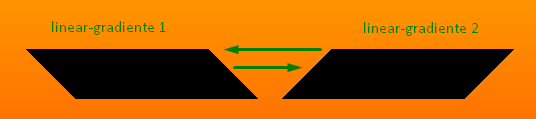
I would like to produce a Banner similar to the photo using css .

I tried using UTF-8 characters and the result was almost perfect, but I would like to do with css to avoid some reponsiveness problems.

HTML

<div style='background-color:black;'>
      <p><span style='float:left; color: white;'>&#9654;</span>
           <span style='color: white'>Texto no interior do banner</span>
          <span style='float:rigth; color:white;'>&#9664;</span>
       </p>
</div>

Result


▶            Text inside the banner           (I.e.        

How could I do with Css ?

    
asked by anonymous 11.12.2016 / 12:12

2 answers

2

With css you can define different borders to create triangular shapes.

<div class="banner">Texto</div>

.banner {
  position: relative;
  margin-left: 25px;
  padding: 0 25px;
  background-color: blue;
  height: 50px;
  display: inline-block;
  line-height: 50px;
  font-size: 32px;
  color: #fff;
}

.banner:before {
  content: '';
  position: absolute;
  top: 0; left: -25px;
  border-left: 26px solid transparent;
  border-top: 25px solid blue;
  border-bottom: 26px solid blue;
  width: 0;
}

.banner:after {
  content: '';
  position: absolute;
  top: 0; right: -25px;
  border-right: 25px solid transparent;
  border-top: 25px solid blue;
  border-bottom: 26px solid blue;
  width: 0;
}
    
11.12.2016 / 13:01
1

I made a version using two linear-gradiente as background-image , so you do not need pseudos-elementos and save some lines of code. If you want to do with pseudo-elements even I suggest you use transforme:skwe()

Concept concept:

Codereferringtotheaboveimages:

html, body {
  width: 100%;
  height: 100%;
  margin: 0;
  padding: 0;
  display: flex;
  justify-content: center;
  align-items: center;
  background-image: linear-gradient(yellow, red);
}


.box {
  height: 50px;
  line-height: 50px;
  text-align: center;
  font-family: Arial, Helvetica, sans-serif;
  font-size: 2rem;
  color: #fff;

  background-image: 
                    linear-gradient(-45deg, transparent 20%, black 20%, black 80%, transparent 80%), 
                    linear-gradient(45deg, transparent 20%, black 20%, black 80%, transparent 80%);

  background-origin: border-box;
  box-sizing: border-box;
  border-left: 2rem transparent solid;
  border-right: 2rem transparent solid;
  padding: 0px 6rem;
}
<div class="box">Meu Texto</div>
    
03.01.2019 / 12:10