Block positioning with FLEX-BOX

1

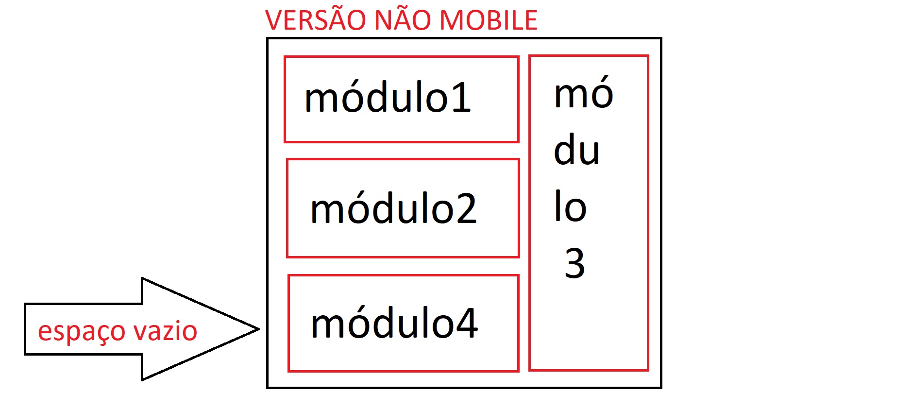
Well, I'm doing a site where in the home there are 4 modules, the first two have to be one underneath the other, so alright, except that the third module has to be next to these two as if it were a column, First I thought I'll put a div around the two and it worked, but then there was another problem, the 4 module would have to stay below the 1 and 2 only in the layout I received, the mobile version is in that order where the 4 module has to be underneath the non-mobile version column, so my question is:

- In the version where I create a div to wrap the first two modules, how do I make the 4 module fill the empty space?

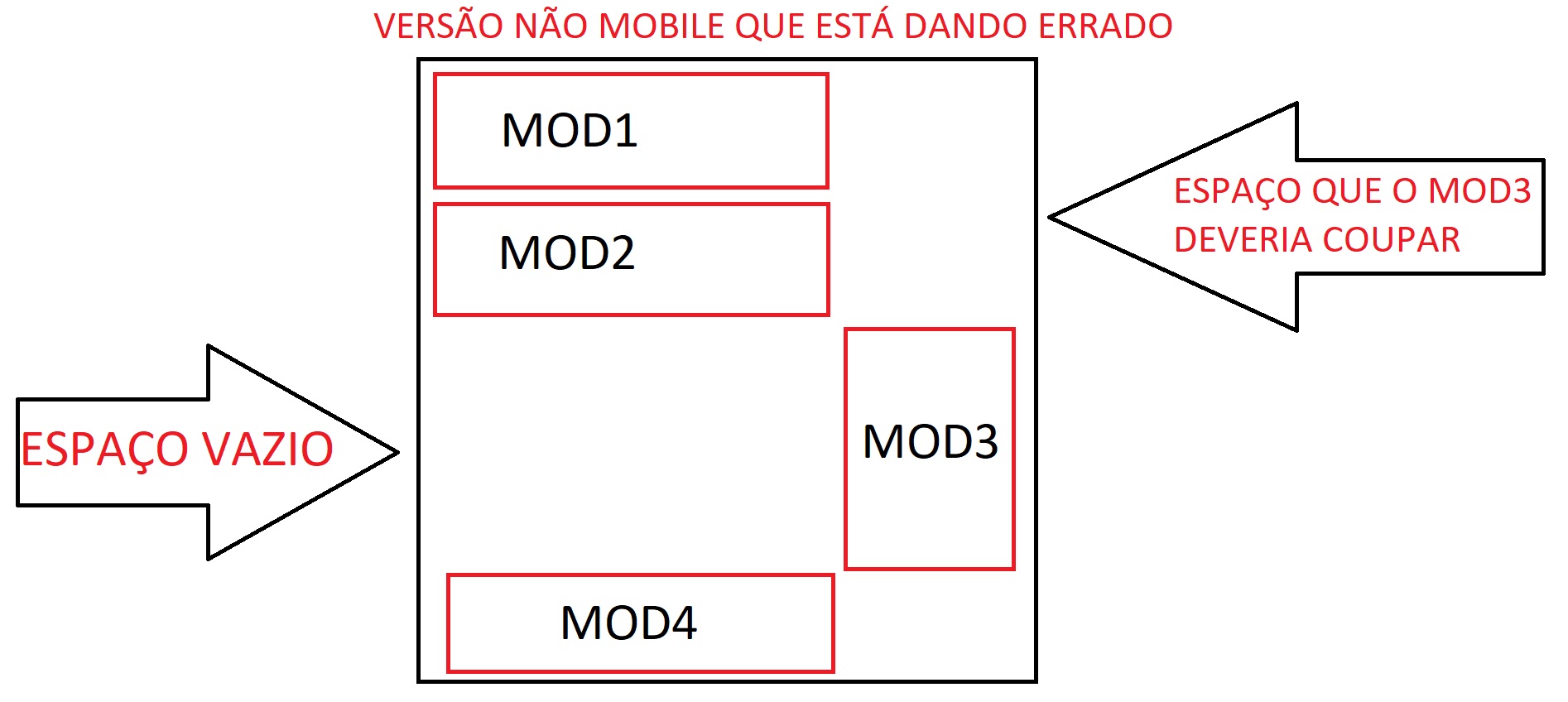
In the version where I do not create a div to wrap the first two, there is a way for the first two to be underneath each other the 3 next to the two and the 4 occupying the empty space below the first two ?

Remembering that I'm using FLEX-BOX but if you have a better alternative I accept suggestions.

I will put an image to illustrate how it should be

FINALSOLUTION

InsteadofusingflexboxIusedthefloatpropertyevenasfollows:

CSS

.pai{float:left}Larguraqualquer.pai.mod{width:704px;float:left;}Envolveomódulo1e2().pai.modulo3{width:296px;float:right;}Mod3ocupaoladodireito.pai.modulo4{width:704px;float:left;}Ocuparáoespaçovazio

HTML

<divclass="pai">
    <div class="mod">
        <div class="modulo1"></div>
        <div class="modulo2"></div>
    </div>
    <div class="modulo3"></div>
    <div class="modulo4"></div>
</div>
    
asked by anonymous 27.11.2017 / 18:16

3 answers

2

I made a template with flexbox only. I used the order attribute to change the order of item 4 and flex-basis: 100% in item 3 to make it 100% of the height of the parent.

section {
    display: flex;
    width: 100%;
}
section>* {
    padding: 1em;
    box-sizing: border-box;
}

.tres {
    background-color: hsl(72, 70%, 80%);
    order: 4;
}
.um {
    background-color: hsl(144, 70%, 80%);
    order: 1;
}
.dois {
    background-color: hsl(216, 70%, 80%);
    order: 2;
}
.quatro {
    background-color: hsl(288, 70%, 80%);
    order: 3;
}

.grid {
    flex-direction: column;
    flex-wrap: wrap;
    height: 16em;
}
.grid .um,
.grid .dois,
.grid .quatro {
    width: 80%;
    flex-grow: 1;
}
.grid .tres {
    flex-basis: 100%;
    width: 20%;
}
<section class="grid">
    <div class="um">um</div>
    <div class="dois">dois</div>
    <div class="tres">tres</div>
    <div class="quatro">quatro</div>
</section>
    
27.11.2017 / 19:20
2

I think it's easier to do using grid and positioning divs wherever you want. See in the example below that I can position the divs in place and with the dimensions that I want. Obviously it is just an example that should be tailored to your project.


Note: grid does not support IE, however a hack can be done to fix it.

.pai {
   width: 220px;
   display: grid;
   grid-template-columns: repeat(2, 1fr); 
   grid-gap: 5px; 
   background-color: #fff; 
   color: #444; 
}

.filhos {
   width: 150px;
   height: 50px;
   float:left;
   background: red;
}

.filhos:nth-child(2) {
   grid-row-start: 2;
   grid-column: 1;
}


.filhos:nth-child(3) {
   width: 50px;
   height: 160px;
   grid-row-start: 1;
   grid-column: 2;
   grid-row-end:span 3;
}
<div class="pai">
  <div class="filhos">
   1
  </div>
  <div class="filhos">
   2
  </div>
  <div class="filhos">
   3
  </div>
  <div class="filhos">
   4
  </div>
</div>

Grid Guide

Using Flex-Box

html, body{
   height: 100%;
}

.pai{
  display: flex;
  flex-wrap: wrap;
  flex-direction: column;
  height: 100%;
}

.filhos:nth-child(1),
.filhos:nth-child(2),
.filhos:nth-child(4){
  background: orange;
}

.filhos:nth-child(3){
  flex: 0 0 100%;
  order: 1;
  background: yellow;
}

.filhos:nth-child(2){
  background: gray;
}
<div class="pai">
    <div class="filhos">1</div>
    <div class="filhos">2</div>
    <div class="filhos">3</div>
    <div class="filhos">4</div>
</div>

flex-box guide

    
27.11.2017 / 18:37
1

Only with flexbox I think it is not possible, but you can join it with float, to get the result, the solution of the DVD is ideal if you do not have to worry about support between browsers, since grid still reaches 69.57 % unprefixed.

* {
box-sizing: border-box;
}
.ctn {
    display: inline-block;
    width: 400px;
    background: #333;
    }
.ctn > * {
  float: left;
  border: 1px red solid;
  width: 80%;
  height: 30px;
}
.mod3 {
height: 90px;
float: right;
width: 20%;
}

@media all and (max-width : 600px) {

.ctn {
display: flex;
flex-direction: column;
}
.mod3 {order: 3}
.mod4 {order: 4}

.ctn > * {flex: 1; width: 100%;}

}
    <div class="ctn">
      <div class="mod3">Mod3</div>
      <div class="mod1">Mod1</div>
      <div class="mod2">Mod2</div>
      <div class="mod4">Mod4</div>
    <div>
    
27.11.2017 / 19:17