Abalone shape with CSS how to do? How to make a shape in this half-rounded format?

7

I'd like to make an element half round, it's not an ellipse, not a circle, and not an element with border-radius . It is a half-rounded way as you can see in the image below and I could not do it with CSS.

Itriedtogetthisshakenform,butIcouldnot,itstillgetsastraightpartoneitherside.Iwouldlikeeachsidetobecurvedjustlikeinthatreferenceimage.

Followmycode.

html, body {
    width: 100%;
    height: 100%;
    margin: 0;
    padding: 0;
    background-color: rgb(231, 247, 255);
}
.box {
    width: 155px;
    height: 150px;
    background-image: linear-gradient(red, blue);
    border-radius: 45%;
    margin: 1rem auto;
}
<div class="box"></div>
I know that with SVG I can, but my intention is that it is only with CSS

    
asked by anonymous 19.12.2018 / 12:09

2 answers

6

There is the CSS property clip-path that you can use to cut unwanted parts of the element's background.

This article from CSS Tricks has some cool examples to understand how the property works.

To define a complex shape you can:

  • Use path() that you receive as a parameter a string containing a path in the same format as the SVG path.

    clip-path: path("M10 10 H 90 V 90 H 10 L 10 10");
    
  • Use a ClipPath SVG and reference it in CSS.

    clip-path: url("#meu-clip");
    

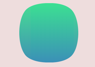
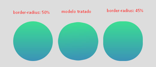
Below is the path of your vectorized image that I will use in the examples:

m59.533456,149.455558c-16.519209,-1.510568 -33.831918,-7.984429 -41.622636,-15.609198c-24.814882,-24.169081 -23.227884,-99.913255 2.452634,-119.694497c11.686078,-8.991474 31.018602,-13.810903 55.256394,-13.810903c19.548933,0 32.605601,2.445681 44.796633,8.344088c15.437165,7.480906 23.30002,20.140901 27.988878,45.101232c1.731271,9.423064 1.731271,33.37635 -0.072136,43.302937c-1.514862,8.559883 -5.338085,20.50056 -8.512082,26.54283c-3.390405,6.401929 -11.181124,13.882835 -18.25048,17.479425c-12.118896,6.258066 -26.257608,8.919542 -46.239359,8.703746c-7.141492,-0.071932 -14.210848,-0.215795 -15.797846,-0.359659z
Examples

path ()

body {
  background-color: #eedddd;
  display: flex;
  justify-content: center;
  padding: 15px;
}

.quadrado {
  display: inline-block;
  width: 150px;
  height: 150px;
  background: linear-gradient(#3ce092, #3b91b7);
  clip-path: path("m59.533456,149.455558c-16.519209,-1.510568 -33.831918,-7.984429 -41.622636,-15.609198c-24.814882,-24.169081 -23.227884,-99.913255 2.452634,-119.694497c11.686078,-8.991474 31.018602,-13.810903 55.256394,-13.810903c19.548933,0 32.605601,2.445681 44.796633,8.344088c15.437165,7.480906 23.30002,20.140901 27.988878,45.101232c1.731271,9.423064 1.731271,33.37635 -0.072136,43.302937c-1.514862,8.559883 -5.338085,20.50056 -8.512082,26.54283c-3.390405,6.401929 -11.181124,13.882835 -18.25048,17.479425c-12.118896,6.258066 -26.257608,8.919542 -46.239359,8.703746c-7.141492,-0.071932 -14.210848,-0.215795 -15.797846,-0.359659z");
}
<div class="quadrado"></div>

Remember that clip-path is experimental, so < a href="https://caniuse.com/#feat=css-clip-path"> support is very low .

The above example works in Firefox 64 by enabling flag :

layout.css.clip-path-path.enabled

SVG

body {
  background-color: #eedddd;
  display: flex;
  justify-content: center;
  padding: 15px;
}

.quadrado {
  display: inline-block;
  width: 150px;
  height: 150px;
  background: linear-gradient(#3ce092, #3b91b7);
  clip-path: url("#tela-tv-tubo");
}
<div class="quadrado"></div>

<svg width="0" height="0">
  <defs>
    <clipPath id="tela-tv-tubo">
      <path d="m59.533456,149.455558c-16.519209,-1.510568 -33.831918,-7.984429 -41.622636,-15.609198c-24.814882,-24.169081 -23.227884,-99.913255 2.452634,-119.694497c11.686078,-8.991474 31.018602,-13.810903 55.256394,-13.810903c19.548933,0 32.605601,2.445681 44.796633,8.344088c15.437165,7.480906 23.30002,20.140901 27.988878,45.101232c1.731271,9.423064 1.731271,33.37635 -0.072136,43.302937c-1.514862,8.559883 -5.338085,20.50056 -8.512082,26.54283c-3.390405,6.401929 -11.181124,13.882835 -18.25048,17.479425c-12.118896,6.258066 -26.257608,8.919542 -46.239359,8.703746c-7.141492,-0.071932 -14.210848,-0.215795 -15.797846,-0.359659z"/>
    </clipPath>
  </defs>
</svg>
    
19.12.2018 / 13:32
4

Option 1

With only one div and its pseudo-elements ::after and ::before it is possible to arrive at a very faithful result of the reference image.

The idea is to have a div master as container . Then in the element ::before we create a linear-gradiente that will be our background color. And later we'll put a border-radius in this ::before just to make a fine adjustment in the curvature of the vertices.

The second step is with ::after . Here is the main point, because ::after will receive TWO radial-gradiente , one vertically and the other horizontal, these gradients start from color transarente to the background color that in case White. Since ::after gets above ::before it will work as a mask.

To help understand, I leave this diagram.

Heretheborder-radiuswasappliedto::beforetofine-tunethecorners.

Thisisthefinalresult,stillgivingamarginforadjustments:D

Codereferringtotheimageabove.Leavethecommentsinthecodewheretomaketheadjustments.

html, body {
    width: 100%;
    height: 100%;
    margin: 0px;
    padding: 0;
}
body {
    display: flex;
    align-items: center;
    justify-content: center;
}
.box {
    height: 21.5vw;
    width: 22vw;
    position: relative;
}
.box::before {
    content: "";
    position: absolute;
    top: 0;
    left: 0;
    height: 100%;
    width: 100%;
    background-image:  linear-gradient(to top, #2196F3 20%,#3CDE92 80%);
    background-position: center;
    background-size: 170% 230%;
    background-repeat: no-repeat;
/* controla o ajuste fino nos cantos */
    border-radius:46%;
}
.box::after {
    content: "";
    position: absolute;
    top: 0;
    left: 0;
    height: 100%;
    width: 100%;
/* cor da mascara deve ser igual a cor do fundo */
    background-image: radial-gradient( transparent 38%, rgba(255, 255, 255, 1) 39%), radial-gradient( transparent 38%, rgba(255, 255, 255, 1) 39%);
    background-position: center;
    background-size: 170% 230%, 230% 170%;
}
<div class="box"></div>

OBS: The limitation is that the masked color made with radial-gradiente of ::after should be the same background color, it should be a solid color preference ... < p>

Option 2

I think this is not the perfect model, but it's an option with the crossbrowser factor that's much better. It is made with 2 pseudo-elements ::after and ::before in div and linear-gradient . I also needed to use transform to try to get as close to the reference image. You also need to put this div inside a container , just to fine-tune transform: scaleY(.95) to try to stick to the base image.

Imadethetreatedmodelnexttoacompletecirclewithborder-radius:50%andanotherwithborder-radius:45%,thedifferenceissubtle,butIthoughtitwasworththeideatoleavetheanswerthere.

Followthetemplatecodeabove

html, body {
  width: 100%;
  height: 100%;
  margin: 0;
  padding: 0;
}
body {
  background-color: #ddd;
  display: flex;
  justify-content: center;
  align-items: center;
  position: relative;
}
.container {
  position: absolute;
  width: 100px;
  height: 100px;
  transform: scaleY(.95);
}
.box {
  position: absolute;
  width: 100px;
  height: 100px;
  transform: rotate(-45deg);
  border-radius: 41%;
  background: linear-gradient(225deg,#3CDE92, #3B92B7);
}
.box::after {
  content: "";
  position: absolute;
  top: 0;
  left: 0;
  width: 100%;
  height: 100%;
  border-radius: 50%;
  background: linear-gradient(to left,#3CDE92, #3B92B7);
  transform: scaleX(1.1) rotate(-45deg);
}
.box::before {
  content: "";
  position: absolute;
  top: 0;
  left: 0;
  width: 100%;
  height: 100%;
  border-radius: 50%;
  background: linear-gradient(to left,#3CDE92, #3B92B7);
  transform: scaleY(1.1) rotate(-45deg);
}
.controle {
  position: absolute;
  width: 105px;
  height: 105px;
  border-radius: 45%;
  background: linear-gradient(to bottom,#3CDE92, #3B92B7);
  transform: translateX(120px);
}
.bola {
  position: absolute;
  width: 105px;
  height: 105px;
  border-radius: 50%;
  background: linear-gradient(to bottom,#3CDE92, #3B92B7);
  transform: translateX(-120px);
}
<div class="bola"></div>

<div class="container">
  <div class="box"></div>
</div>

<div class="controle"></div>
    
19.12.2018 / 20:05
Pages in ASP.NET still running after page change? What does "== $ 0" mean when inspecting a page?