Only with CSS is there any way to make a "Toast"? An element that goes up and then click to close it?

8

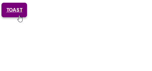
In mobile there is a very common component that is known as " Toast ", but I was thinking about how to adapt it only with HTML and CSS

Isthereanywaytodosomethinglikethis"component" above just using CSS and HTML, without framework or other libraries?

I came up with this template below, but I would like to make it functional like these% Toast types that we see mostly on Android ...

How to make it rise and stand still, and then click on the X to close it?

.btn {
    background-color: purple;
    border-radius: .5em;
    box-shadow: 0 .25em .5em 0 rgba(0, 0, 0, .25);
    padding: 1em;
    color: #fff;
    text-transform: uppercase;
    font-family: sans-serif;
    font-weight: bold;
    border: none;
    cursor: pointer;
    transition: background-color 250ms;
}
.btn:hover {
    background-color: rgb(100, 0, 100);
}
.toast {
    position: fixed;
    display: flex;
    bottom: 0;
    left: 0;
    width: 100%;
    justify-content: space-between;
    background-color: rgb(100, 0, 100);
    font-family: sans-serif;
}
.toast p,
.toast a {
    color: #fff;
    margin: 0;
    padding: 2em;
    text-decoration: none;
}
<br>
<label class="btn" for="open">TOAST</label>
<br>
<div class="toast">
    <p>
        Lorem, ipsum dolor.
    </p>
    <a href="#">
        X
    </a>
</div>
    
asked by anonymous 21.11.2018 / 11:51

2 answers

6

You can do something very close by using an element that can receive focus from the user in conjunction with the CSS% selector. With this selector, you can change the position of the toast message when your button has the focus.

.toast > .btn {
    background-color: purple;
    border-radius: .5em;
    box-shadow: 0 .25em .5em 0 rgba(0, 0, 0, .25);
    padding: 1em;
    color: #fff;
    text-transform: uppercase;
    font-family: sans-serif;
    font-weight: bold;
    border: none;
    cursor: pointer;
    transition: background-color 250ms;
}
.toast > .btn:hover {
    background-color: rgb(100, 0, 100);
}

.toast > .toast-message {
    position: fixed;
    display: flex;
    bottom: -83px;
    left: 0;
    width: 100%;
    justify-content: space-between;
    background-color: rgb(100, 0, 100);
    font-family: sans-serif;
    transition: bottom .5s ease-out;
}
.toast > .toast-message {
    color: #fff;
    margin: 0;
    padding: 2em;
    text-decoration: none;
}

.toast:focus-within > .toast-message {
  bottom: 0;
}
<div class="toast">
  <button class="btn" for="open">TOAST</button>
  <p class="toast-message">Lorem, ipsum dolor.</p>
</div>

Notice that instead of separating the action elements (button) and the message, both are within the same parent element ( :focus-within ). Thus, when the div.toast element has a child with the user's focus - in this case the - button, the .toast message will be displayed by changing the position relative to the bottom edge of the screen.

The requirement that is not satisfied with this solution is to close the message just by pressing the X in the message, but in compensation, any click outside the button will hide the message as it will lose focus.


The same effect you get with .toast > .toast-message , which replaces the use of .btn:focus + .toast-message { bottom: 0; } , as can be seen in link .

    
21.11.2018 / 12:21
2

For those who want a version that only closes when you click a button an option is using :target

SoyoucandoalinkwithahrefbycallingIDToast,andToasthasanotherlinkwithanempty%void,theintentofthisempty%istocauseToasttolosehref,soitclosesbacktoitsoriginalposition.

NOTE:KeepinmindthatToastcloseswhenhrefisdoneinanotherelement.Soevenifyouhaveabuttontoclose,youcancloseitbyclickingonsomeotherlink,becauseToastloses:targetin:targetitwillclose...

Seethecodefortheimageabove:

.btn {
    background-color: purple;
    border-radius: .5em;
    box-shadow: 0 .25em .5em 0 rgba(0, 0, 0, .25);
    padding: 1em;
    color: #fff;
    text-transform: uppercase;
    font-family: sans-serif;
    font-weight: bold;
    border: none;
    cursor: pointer;
    transition: background-color 250ms;
}
.btn:hover {
    background-color: rgb(100, 0, 100);
}
.toast {
    position: fixed;
    display: flex;
    bottom: -100px;
    left: 0;
    width: 100%;
    justify-content: space-between;
    background-color: rgb(100, 0, 100);
    font-family: sans-serif;
    transition: bottom 500ms;
}
.toast:target {
    bottom: 0;
}
.toast p,
.toast a {
    color: #fff;
    margin: 0;
    padding: 2em;
    text-decoration: none;
}

    
<br>
<a class="btn" href="#toast">TOAST</a>
<br>
<div class="toast" id="toast">
    <p>
        Lorem, ipsum dolor.
    </p>
    <a href="#">
        X
    </a>
</div>
    
26.11.2018 / 11:58