How to do with CSS loader bar with animated background?

8

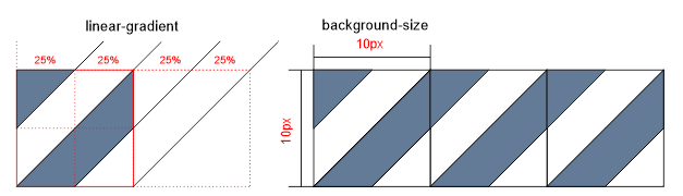
I've seen this element that actually works as a " loader " while the image is loading etc. And I tried to replicate it. Not the dynamics to function as a loader , but rather this effect of the passing line at the top.

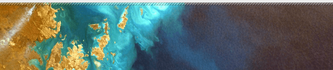
WhatIhavetocodesofaristhis,Ialignedthebaratthetopandeverything,butwhatIwouldliketoputisthis"candy bar" animated effect inside the bar from the top. How do you make these lines go like this?

html, body {
	width: 100%;
	height: 100%;
	margin: 0;
	padding: 0;
}
body {
	background-image: url(https://unsplash.it/600/300);
	background-size: cover;
}
.bar {
	position: fixed;
	top: 0;
	z-index: 1000;
	height: 10px;
	width: 100%;
	background-color: rgba(255,0,0,.25);
	border-bottom: 1px solid rgba(0,0,0,.25);
	box-shadow: inset 0 5px 5px 0 rgba(255,255,255,.25);
}
<div class="bar"></div>
    
asked by anonymous 30.11.2018 / 13:38

2 answers

6

I did not find a background that would look better, but this is the idea: Use a background animating position with keyframes:

html, body {
	width: 100%;
	height: 100%;
	margin: 0;
	padding: 0;
}
body {
	background-image: url(https://unsplash.it/600/300);
	background-size: cover;
}
.bar {
	position: fixed;
	top: 0;
	z-index: 1000;
	height: 10px;
	width: 100%;
	background-color: rgba(255,0,0,.25);
	border-bottom: 1px solid rgba(0,0,0,.25);
	box-shadow: inset 0 5px 5px 0 rgba(255,255,255,.25);
  background-image: url('https://images.esellerpro.com/2316/I/195/94/Black%20White%20Stripe.jpg');
  background-position: 0 -87px ;
  background-size:contain;
  animation: samba 10s infinite linear;
  opacity: .5;
  transform: skew(-37deg);
}
@keyframes samba{
0%{
background-position: 0 -87px ;
}
100%{
  background-position: 100% -87px ;
}
}
<div class="bar"></div>
    
30.11.2018 / 16:00
2

I came up with a solution using linear-gradient , the advantage of linear-gradient is that you do not need to use an image and it would be easier to edit colors and size for example. In the case of the image would be more complicated to edit the color, size, plus it will be another request on the server that may fail or delay loading etc ...

The idea of gradient construction is to have 10px for example repeating modules on the X axis. This 10px module is divided by the gradient in steps of 25%, so as to be as in the image below.

Afterthatwith@keyframesIchangethebackground-position-xin10pxtothesideandI'mreadytomove.

html, body {
	width: 100%;
	height: 100%;
	margin: 0;
	padding: 0;
}
body {
	background-image: url(https://unsplash.it/600/400);
	background-size: cover;
}
.bar {
	position: fixed;
	top: 0;
	z-index: 1000;
	height: 10px;
	width: 100%;
	background-color: rgba(0,0,0,.25);
	border-bottom: 1px solid rgba(0,0,0,.25);
	box-shadow: inset 0 5px 5px 0 rgba(255,255,255,.25);
    background-image: linear-gradient(-45deg, rgba(255,255,255,.25) 25%, rgba(0,0,0,.25) 25%, rgba(0,0,0,.25) 50%, rgba(255,255,255,.25) 50%, rgba(255,255,255,.25) 75%, rgba(0,0,0,.25) 75%);
    background-size: 10px 10px;
    background-repeat: repeat-x;
    animation: barra 250ms linear infinite;
}
@keyframes barra {
    to {
        background-position-x: 10px;
    }
}

    
<div class="bar"></div>
    
11.12.2018 / 13:59