Problem with bootstrap responsiveness

2

I'm having trouble aligning the responsiveness of my dashboard. Here is an image of how it sits on large screens.

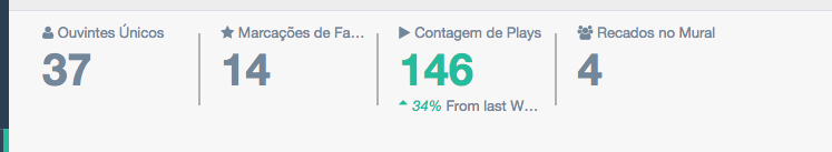
ButifIslowdownthescreenitshuffleslikethis:

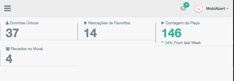
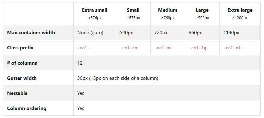
BelowistheexcerptofthecodeHTMLofthepagewhereIquotethispart.AmIdoingsomethingwrong?HowcanIfixthis?

<divclass="right_col" role="main">
        <!-- top tiles -->
        <div class="row tile_count">
          <div class="col-md-2 col-sm-4 col-xs-6 tile_stats_count">
            <span class="count_top">
              <i class="fa fa-user"></i> Ouvintes Únicos</span>
            <div class="count">37</div>
          </div>
          <div class="col-md-2 col-sm-4 col-xs-6 tile_stats_count">
            <span class="count_top">
              <i class="fa fa-star"></i> Marcações de Favoritos</span>
            <div class="count">14</div>
          </div>
          <div class="col-md-2 col-sm-4 col-xs-6 tile_stats_count">
            <span class="count_top">
              <i class="fa fa-play"></i> Contagem de Plays</span>
            <div class="count green">146</div>
            <span class="count_bottom">
              <i class="green">
                <i class="fa fa-sort-asc"></i>34% </i> From last Week</span>
          </div>
          <div class="col-md-2 col-sm-4 col-xs-6 tile_stats_count">
            <span class="count_top">
              <i class="fa fa-users"></i> Recados no Mural</span>
            <div class="count">4</div>
            <!-- <span class="count_bottom"><i class="red"><i class="fa fa-sort-desc"></i>12% </i> From last Week</span> -->
          </div>
        </div>
</div>
    
asked by anonymous 18.07.2018 / 15:10

2 answers

1

You need to understand the main idea of grids :

Let's read the acronym:

- sm : Small - devices with a screen size larger than 576 pixels

- md : Medium - devices with a screen size larger than 768 pixels

- lg : Large - devices with a screen size larger than 992 pixels

- xl : Extra large - devices with a screen size larger than 1200 pixels

Whenever you insert a new column div, you use one of the size classes for example col-md-2 which says that the div will occupy 2 columns when the device is Medium (super small tablets or monitors), remember that the grid system can have up to 12 columns per row.

In order to solve your problem, change the col-sm-4 to col-sm-6 so your div will occupy 6 columns on mobile devices or it will have 2 divs per line, if you want each div to be in a row just put col-sm-12 , and so on.

    
18.07.2018 / 15:28
0

The bootstrap has a grid of 12 columns, when it reduces the resolution is applied to the class .col-in-4 which means it will occupy the space of 4 columns.

As you are using 4x will be equivalent 4x4 or 16 columns so 4 more columns above the limit.

Try to put .col-sm-3 3x4 = 12

Check the bootstrap Grid documentation

    
18.07.2018 / 15:15