Fix the footer of an html page and follow the contents of the page

8

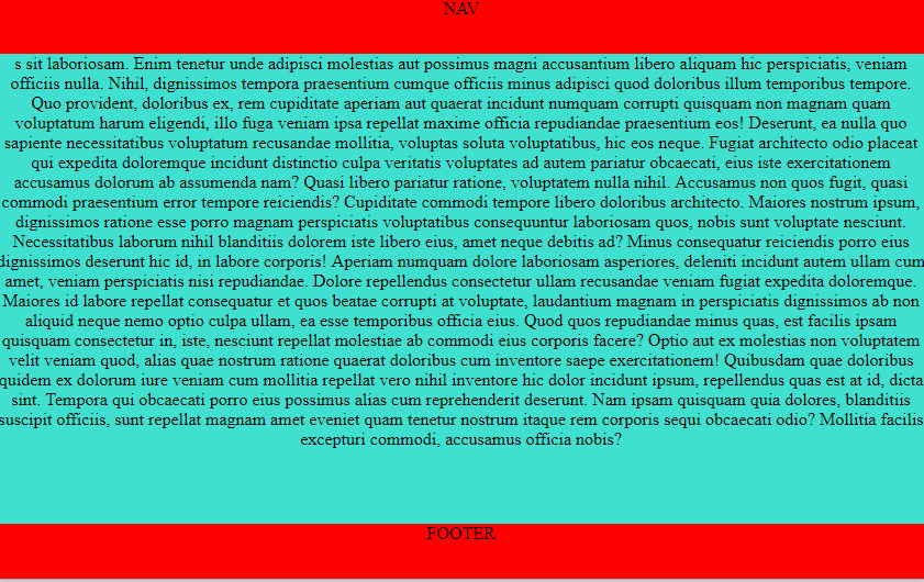
I need to set the footer tag to the end of the html page, but when the content exceeds the page the tag footer must accompany the content and not be fixed.

See the CSS code is the HTML code I'm using for this.

    header {
        min-height: 55px; /* original era 255px mudei para caber no snippet */
        background-color: blue;
    }
    article {
        padding-bottom: 60px; 
        width: 900px; 
        margin: 0 auto;
    }
    footer {
        position: absolute; 
        bottom: 0px; 
        width: 100%; 
        height: 60px; 
        background-color: green;
    }
<header></header>

<article>
  <p>Conteúdo</p><p>Conteúdo</p><p>Conteúdo</p><p>Conteúdo</p>
  <p>Conteúdo</p><p>Conteúdo</p><p>Conteúdo</p><p>Conteúdo</p>
  <p>Conteúdo</p><p>Conteúdo</p><p>Conteúdo</p><p>Conteúdo</p>
  <p>Conteúdo</p><p>Conteúdo</p><p>Conteúdo</p><p>Conteúdo</p>
  <p>Conteúdo</p><p>Conteúdo</p><p>Conteúdo</p><p>Conteúdo</p>
  <p>Conteúdo</p><p>Conteúdo</p><p>Conteúdo</p><p>Conteúdo</p>
  <p>Conteúdo</p><p>Conteúdo</p><p>Conteúdo</p><p>Conteúdo</p>
  <p>Conteúdo</p><p>Conteúdo</p><p>Conteúdo</p><p>Conteúdo</p>
  <p>Conteúdo</p><p>Conteúdo</p><p>Conteúdo</p><p>Conteúdo</p>
  <p>Conteúdo</p><p>Conteúdo</p><p>Conteúdo</p><p>Conteúdo</p>
  <p>Conteúdo</p><p>Conteúdo</p><p>Conteúdo</p><p>Conteúdo</p>
  <p>Conteúdo</p><p>Conteúdo</p><p>Conteúdo</p><p>Conteúdo</p>
  <p>Conteúdo</p><p>Conteúdo</p><p>Conteúdo</p><p>Conteúdo</p>
  <p>Conteúdo</p><p>Conteúdo</p><p>Conteúdo</p><p>Conteúdo</p>    
</article>

<footer></footer>
</body>
</html>

The problem is that the tag footer with property position with value fixed leaves the fixed footer.

When I change the property position to absolute the tag footer is floating and does not accompany the content.

    
asked by anonymous 08.06.2014 / 04:28

2 answers

8

For recent browsers you can add this to your CSS:

html {
    position: relative;
    min-height: 100%;
}
body {
    margin: 0 0 60px; /* altura do seu footer */
}

According to the creator of the solution, it works with: IE8 + , Firefox , Firefox and Opera .

The biggest advantage of this solution over others is that you do not need to create wrappers around your content. It uses body itself as wrapper .

Example: Com muito conteúdo - Sem muito conteúdo

(The same code was used for both examples, only content that changes.)     

08.06.2014 / 05:08
1

Give to do using flex in body .

First you need to set body to display: flex , then place the order as column , so that the grid "orientation" is vertical (more or less like the default behavior of divs ). Then in the main that will receive the content you put flex-grow: 1; and put position:sticky in the nav so that it stays fixed at the top. This way main will always occupy all available space, "pushing" footer always to the end of the page regardless of the amount of content.

Seethecodeusedtogettheresultoftheimageabove:

Alsoexitsas" Página toda " to see the result better!

html, body {
	width: 100%;
	height: 100%;
	margin: 0;
	padding: 0;
}
body {
	display: flex;
	flex-direction: column;
	background-color: #ddd;
}
nav, 
footer {
	width: 100%;
	min-height: 50px;
	background-color: #f00;
	text-align: center;
	color: #ddd;
}
nav {
	position: sticky;
	top: 0;
}
main {
	width: 100%;
	background-color: turquoise;
	flex-grow: 1;
}
<nav>NAV</nav>
<main>
Lorem ipsum dolor sit amet consectetur adipisicing elit. Tenetur voluptates reprehenderit magni molestias iure unde id minima voluptatem laudantium ipsum. Nam reprehenderit iusto consectetur ipsum natus doloremque laudantium illum quod delectus perferendis! Quam explicabo laudantium suscipit reprehenderit harum quo nostrum porro fugit natus. Eius sequi odit sunt, aut eveniet similique dicta mollitia reprehenderit incidunt, molestiae quod amet esse facere vero perspiciatis dignissimos voluptatum eligendi laborum dolorum asperiores inventore, ipsum est. Obcaecati dolores perspiciatis dignissimos. Consequuntur soluta quaerat, asperiores sed earum non impedit. Tempora dicta dolorum quas id asperiores laboriosam delectus velit perferendis veniam blanditiis ea exercitationem ullam, ab consequuntur incidunt ipsa est voluptate suscipit cumque non ipsum praesentium minima aliquam. Tempore ratione dolore aut saepe sint. Eos vel facilis minima nostruoloremque reprehenderit nisi sunt inventore maxime quisquam quaerat, totam perspiciatis. Quidem in sint debitis perspiciatis labore, eaque nam quis doloremque blanditiis ipsum architecto temporibus sunt tempore voluptates? Voluptatem, dolorum unde ut facilis quasi eligendi officia earum in. Nemo impedit pariatur itaque soluta non minus. Minima vel maiores aliquid officiis accusamus optio excepturi praesentium in doloremque, similique necessitatibus! Iure asperiores necess nemo ipsa laborum velit optio 
</main>
<footer>FOOTER</footer>

OBS: Flex works from IE10 up link until

    
13.12.2018 / 19:08