


<!DOCTYPE html>
<html>
<head>
<meta charset="utf-8">
<meta name="viewport" content="width=device-width, initial-scale=1">
<title>Example1</title>
<style type="text/css">
* {
margin: 0;
padding: 0;
box-sizing: border-box;
}
body {
}
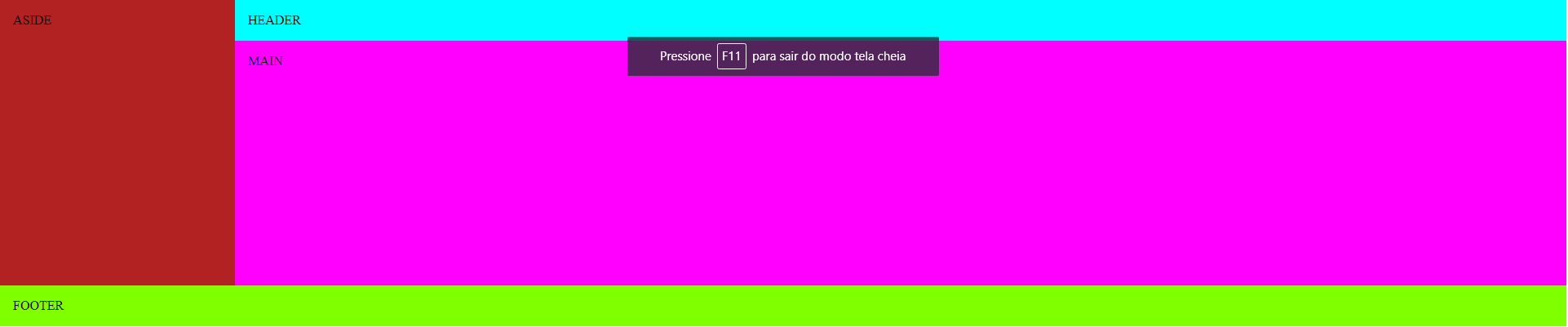
header {
background-color: aqua;
display: block;
float: right;
padding: 1em;
width: 85%;
}
main {
background-color: fuchsia;
display: block;
float: right;
padding: 1em;
width: 85%;
height: 300px;
}
aside {
background-color: firebrick;
padding: 1em;
width: 15%;
}
footer {
background-color: chartreuse;
clear: both;
padding: 1em;
}
</style>
</head>
<body>
<header>HEADER</header>
<main>MAIN</main>
<aside>ASIDE</aside>
<footer>FOOTER</footer>
</body>
</html>