Is it possible to add scroll-only overflow behavior in a table's tbody?

21

You can add overflow behavior with scroll only in tbody and still do not have to set fixed sizes in pixels without having to separate the header of the columns with the body, as seen in the plugins that provide grids ?

css for overflow:

table.grid tbody {
    overflow-y: scroll;
    overflow-x: auto;
}

table:

<table class='grid'>
    <thead> ... <thead>

    <tbody>
        ...
    </tbody>

    <tfoot> ... </tfoot>
</table>

The intention is that even a table having records that go beyond the boundary of the area in which it is allocated, that it does not overlap that limit, but that the records are navigable through the scroll bar, as in systems grids desktop, and who knows how to try to adapt it to be responsible.

EDITION

Following is an example of how to just add css from overflow to tbody does not work:

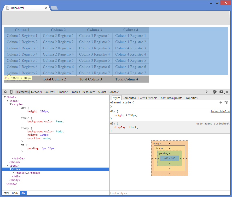
As you can see in the image, the table is inserted in a div > Fixed 200px height . But table continues to exceed this limit.

    
asked by anonymous 12.09.2014 / 16:06

2 answers

8

It is possible, but the solution is somewhat convoluted because of the behavior of elements related to the <TABLE> element.

By default, tbody has the display:row-group property. This allows browsers to maintain alignment between cells in the same column in different parts of the table ( thead , tbody and tfoot ).

To allow overflow , you will need to change the display property of elements thead , tbody and tfoot to block . However, this creates a problem: you lose alignment between the header, body, and footer cells.

As workaround , you will need to coordinate the size of cells via JavaScript or JQuery.

There is a response in the original Stack Overflow that exactly covers this behavior. Here is the translation of the important points:


Browsers display the thead and tbody elements as row-group (    table-header-group and table-row-group ) by default.


Since we changed this, tr elements do not fill the entire   space of your container.

CSS

thead, tbody { display: block; }

tbody {
    height: 100px;       
    overflow-y: auto;    /* Exibe a barra de rolamento vertical     */
    overflow-x: hidden;  /* Esconde a barra de rolamento horizontal */
}

JQuery

// Mude o seletor 'table' de acordo com sua necessidade.
var $table = $('table'),
    $bodyCells = $table.find('tbody tr:first').children(),
    colWidth;

// Obtém o array de largura de colunas dentro de tbody
colWidth = $bodyCells.map(function() {
    return $(this).width();
}).get();

// Ajusta o tamanho das colunas no cabeçalho
$table.find('thead tr').children().each(function(i, v) {
    $(v).width(colWidth[i]);
});    

A Fiddler with example of this process (including footer) can be seen here . A version that respects the size of the container can be seen here .

    
12.09.2014 / 16:48
0

It is possible to put the overflow on tbody only

HTML

<table>
    <thead>
        <tr>
            <td>Campo1</td>
            <td>Campo 2</td>
        </tr>
    </thead>
    <tbody>
        <tr><td>row1</td><td>row1</td></tr>
        <tr><td>row2</td><td>row2</td></tr>
        <tr><td>row3</td><td>row3</td></tr>
        <tr><td>row4</td><td>row4</td></tr>
        <tr><td>row4</td><td>row4</td></tr>
        <tr><td>row4</td><td>row4</td></tr>

    </tbody>
</table>

CSS

table {
    background-color: #aaa;
}
tbody {
    background-color: #ddd;
    height: 100px;
    overflow: auto;
}
td {
    padding: 3px 10px;
}

link

    
12.09.2014 / 16:16