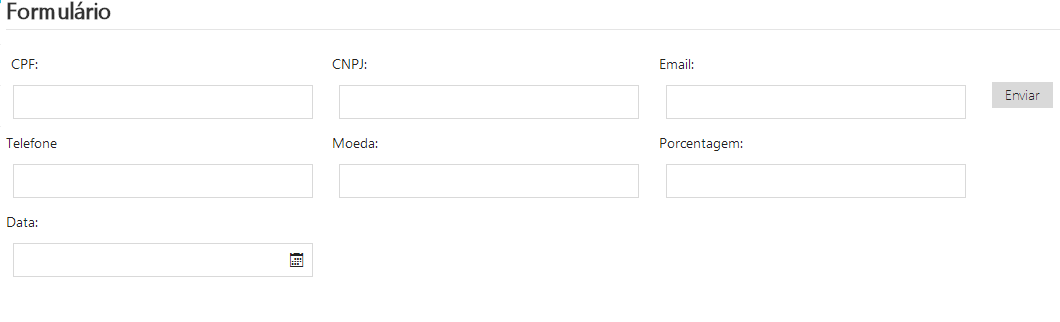
My situation : I have a form in which the fields are arranged vertically, and with the label aligned to the right and left, as shown in the image below:

Iwanttoleaveatleast2fieldsperlineforothertests,andthereisspaceonthepagetodothis.Ihavemadethefollowingchanges:
Placedisplay:inline-block,display:inline,float:leftoneatatime,inthedivscontainingthelabelandtheinput(divXXX).Inallcases,Ididnotsucceed,thelabelisthehardesttofit.IdonotmasterCSS,theywerejustsuggestionsIfoundinsearches.Anyothersolution?
Notes:I'musingMetroUICSS.Itisnotadvisabletouse<table>inmycase,duetosomerestrictionsofthecompany.
HTML
<divclass="conteudoConvenio">
    <div style="width: 100% !important;">
        <fieldset>
                <legend>Formulário</legend>
               <div id="divCPF">
                <label for="txtCPF">CPF:</label>
                <div class="input-control text size4">
                    <input class="text" type="text" name="txtCPF" id="txtCPF" autofocus data-rule-cpf="true" data-rule-required="true" data-inputmask="'mask' : '999.999.999-99'" />
                </div>
            </div>
            <div id="divCNPJ">
                <label for="txtCNPJ">
                    CNPJ:
                </label>
                <div class="input-control text size4">

                    <input class="text" type="text" name="txtCNPJ" id="txtCNPJ" autofocus data-rule-cnpj="true" data-rule-required="true" data-inputmask="'mask' : '99.999.999/9999-99'" />
                </div>
            </div>

           <div class="input-control">
                <input type="submit" class="btn btn-default" value="Enviar" id="btnEnviar" />
            </div>
        </fieldset>
    </div>
</div>
CSS
body {
font-size: .85em;
font-family: "Segoe UI", Verdana, Helvetica, Sans-Serif;
color: #232323;
background-color: #fff;
}

div[class^=input-control], #btnEnviar{
margin: 7px;
}

.divTotal{
width: 30%;
float: left;
}

label[for^=txt] {
text-align: right;
float: left;
width: 10%;
display: inline-block !important;
}

.help-block{
white-space:nowrap;
color: #e51400;
}

.conteudoConvenio {
/*width: 620px !important;
overflow-y:scroll;
overflow-x:hidden;
max-height: 80% !important;*/
width:80% !important;
position: relative;
left: 210px;
bottom: 90px;
}
EDIT : With the answer from Felipe Stoker, I was able to leave the divs in the same line, but the label came back as shown in the image below. I tried changing the width of the fields but did not get any progress.