


I'm making a website for the company where I work and made a multilevel menu. My problem is that when I open one of the levels, the last item does not appear and when I scroll what moves is the page that is behind. I wanted to know what I'm doing wrong, it will be the position: fixed that I put in the class?
/*== RESET ==*/
* {
	margin: 0;
	padding: 0;
	font-size: 100%;
	border: none;
	outline: none;
	font-weight: 300;
	box-sizing: border-box;
	font-family: 'Lato', sans-serif;
}

body{
	 background-color: #fff;
}

a {text-decoration: none;}

ul {
	list-style: none;
}

img {
	max-width: 100%;
}


/*== CABEÇAHO ==*/
.cabecalho {
	width: 100%;
	float: left;
	padding: 3% 5%;
}

.logo {
	width: 70px;
	height: 91px;
	float: left;
	background: url(../_img/Estores_JF-mobile.jpg) center center/70px no-repeat;
	font-size: 0;
}

.btn-menu {
	width: 70px;
	height: 70px;
	float: right;
	text-align: center;
	border-radius: 70px;
	cursor: pointer;
	background: linear-gradient(to right, #025aa4, #2599fb);
	color: #fff;
	box-shadow: 2px 3px 20px #888888;
}


/* == MENU == */
.menu {
	display: none;
	width: 100%;
	height: 100%;
	position: fixed;
	background-color: rgba(2, 90, 164, 0.9);
	top: 0;
	left: 0;
}

.btn-close {
	float: right;
	font-size: 30pt;
	color: #fff;
	cursor: pointer;
	margin-right: 5%;
	margin-top: 5%;
}

.menu ul {
	width: 100%;
	float: left;
	text-align: left;
}

.menu li{
	padding: 4%;
}

.menu li a {
	font-size: 25pt;
	color: #fff;
	padding: 2%;
}

.menu li a:hover {
	border: 2px solid #fff;
	border-radius: 5px;
}

.submenu_prod {
	display: none;
	text-align: left;
	margin-left: 20%;
}

.submenu_prod li a{
	color: #fff;
	font-size: 15pt;
}

.submenu_empr {
	display: none;
	text-align: left;
	margin-left: 20%;
}

.submenu_empr li a{
	color: #fff;
	font-size: 15pt;
}


/* == BANNER == */
.banner {
	width: 100%;
	float: left;
	text-align: center;
	padding: 3% 4%;
	background: url(../_img/wallpaper-azul_web.jpg);
}

.title {
	width: 100%;
}

.title h1 {
	font-size: 35pt;
	color: #fff;
	font-weight: 700;
}

.title h2 {
	margin-top: 10px;
	font-size: 18pt;
	color: #fff;
}

.buttons {
	width: 100%;
	margin-top: 5%;
}

.btn-sobre i {
	float: right;
}

.btn-sobre {
	width: 100%;
	font-size: 1.5em;
	text-align: left;
	cursor: pointer;
	padding: 5%;
	border-radius: 10px;
	background-color: #fff;
	color:#130400;
}


/* == SERVIÇOS == */
.servicos {
	margin-top: 50px;
 	width: 100%;
	float: left;
	padding: 3% 4%;
}

.servico {
	width: 100%;
	background-color: #fff;
	text-align: left;
	border-radius: 7px;
	margin-bottom: 3%;
	text-align: center;
	box-shadow: 2px 3px 20px #888888;
}

.servico img {
	margin-top: 3%;
	border-radius: 7px 7px 0 0;
}

.inner {
	padding: 5%;
}

.inner a {
	font-size: 25pt;
	color: #130400;
	font-weight: 700;
	line-height: 1em;
}

.inner h4 {
	font-size: 18pt;
	margin-top: 2%;
	color: #130400;
}

.inner p {
	margin-top: 10%;
	color: #130400;
}
<!DOCTYPE html>
<html lang="pt-pt">
<head>
<meta name="viewport" content="width=device-width, initial-scale=1.0">
<title>Estores JF</title>
<meta charset="utf-8">
<meta name="description" content="Empresa especializada em fabrico de estores e redes mosquiteiras.">
<meta name="keywords" content="Estore, Estores, Rede mosquiteira, Redes mosquiteiras, persianas">
<meta name="robots" content="index, follow">
<meta name="author" content="Diogo Sousa">
<link rel="stylesheet" type="text/css" href="_css/style.css">
<link rel="stylesheet" href="https://maxcdn.bootstrapcdn.com/font-awesome/4.6.1/css/font-awesome.min.css">
<link href="https://fonts.googleapis.com/css?family=Lato:300,400,700" rel="stylesheet">
<link rel="icon" href="_img/Estores_JF.png">
</head>
<body>
<!-- CABEÇALHO -->
<header class="cabecalho">
<a href="index.html"><h1 class="logo">Estores JF - Empresa especializada em fabrico de estores</h1></a>
<button class="btn-menu">
<i class="fa fa-bars fa-2x" aria-hidden="true"></i>
</button>
<nav class="menu">
<a class="btn-close"><i class="fa fa-times"></i></a>
<ul>
<li><a href="index.html">Home</a></li>
<li class="sub_empr"><a href="#">A Empresa +</a></li>
<ul class="submenu_empr">
<li><a href="#">Quem Somos?</a></li>
</ul>
<li class="sub_prod"><a href="#">Produtos +</a></li>
<ul class="submenu_prod">
<li><a href="">Soluções Exteriores</a></li>
<li><a href="">Soluções Interiores</a></li>
<li><a href="">Portões e Grades</a></li>
<li><a href="">Caixas Compactas</a></li>
<li><a href="">Caixas Pré-reboco</a></li>
<li><a href="">Motores e Comandos</a></li>
</ul>
<li><a href="contacto.html">Contactos</a></li>
</ul>
</nav>
</header>
<!--BANNER-->
<div class="banner">
<div class="title">
<hgroup>
<h1>Estores - JF</h1>
<h2>Possuimos o que precisa para o seu lar se tornar um
lugar mais agradável.</h2>
</hgroup>
</div>
<div class="buttons">
<button class="btn-sobre"> Sobre <i class="fa fa-question-circle"></i> </button>
</div>
</div>
<!--ARTIGOS-->
<main class="servicos">
<article class="servico">
<a href="#"><img src="_img/Servicos-Mobile.jpg" alt="Serviços"></a>
<div class="inner">
<a href="#">Os nossos serviços!</a>
<h4>Conheça-nos melhor...</h4>
<p>Aqui fica o texto que explica o que fazemos, o que podemos fazer pelas pessoas!</p>
</div>
</article>
<article class="servico">
<a href="#"><img src="_img/termico-mobile.png" alt="Serviços"></a>
<div class="inner">
<a href="#">Estores</a>
<h4>Temos o melhor para si!</h4>
<p>sdaklndalndaklsndklsandklskldnsada
lsandlkandlknlknda
ndlkandklankldndsalnasdlnsa
dnlkasndlkasndkaln</p>
</div>
</article>
<article class="servico">
<a href="#"><img src="_img/rede-mobile.jpg" alt="Serviços"></a>
<div class="inner">
<a href="#">Rede Mosquiteiras</a>
<h4>Contra os mosquitos.</h4>
<p>Aqui esplicar um pouco a função da rede mosquiteira.</p>
</div>
</article>
</main>
<footer></footer>
</body>
<script src="https://code.jquery.com/jquery-3.0.0.js"></script><scriptsrc="https://code.jquery.com/jquery-migrate-3.0.0.js"></script>
<script>
/*Para aparecer o menu*/
$(".btn-menu").click(function(){
$(".menu").show();
});
/* para fechar o menu*/
$(".btn-close").click(function(){
$(".menu").hide();
});
/*para abrir sub menu produtos*/
$(document).ready(function(){
$(".sub_prod").click(function(e){
$(".submenu_prod").toggle();
e.preventDefault();
})
})
/*para abrir sub menu empresa*/
$(document).ready(function(){
$(".sub_empr").click(function(e){
$(".submenu_empr").toggle();
e.preventDefault();
})
})
</script>
</html> 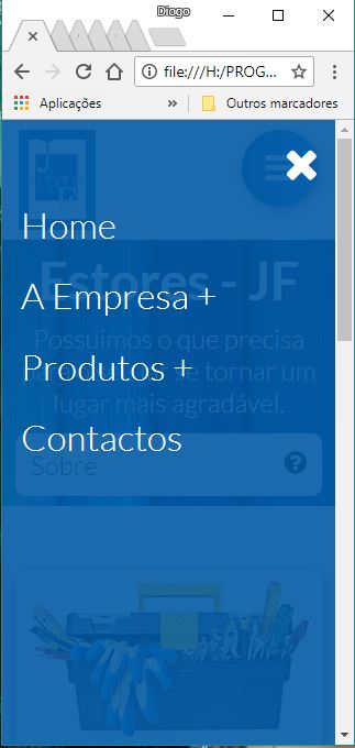
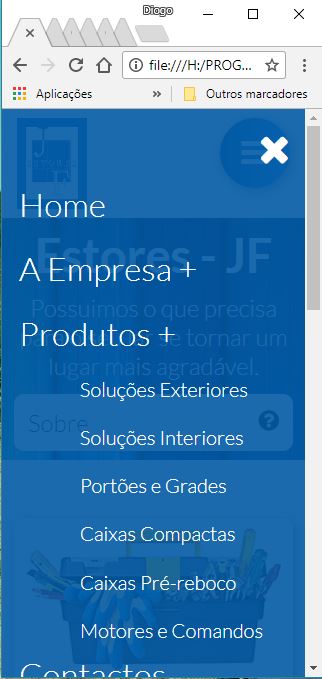
I would like to know how to do it, so that it does not happen on the phone and can slide the menu up to click on the contacts.