.lista-cartoneira h1 {
    font-size: 1.2rem;
    margin: 12px 0 12px 0;
    font-weight: 500;
}

.lista-cartoneira h2 {
    font-size: 1rem;
    margin: 12px 0 12px 0;
}

.lista-cartoneira img {
    width: 80px;
    height: 80px;
    max-width: 80px;
    margin: 12px;
}

.card-panel {
    padding: 0 !important;
}

.col.s9.lista-cartoneira {
    width: 75%;
    margin-left: 12px;
}

.botoes-cartoneira.row {
    height: 56px;
    margin: 24px 0 24px 0;
}

.botoes-cartoneira.col {
    height: 56px;
    text-align: center;
}

.atalhos-cartoneira.col i {
    margin-top: 43px;
}

.atalhos-cartoneira.col {
    height: 110px; text-align: center; color: white;
}

.item-total {
    width: 200%;
}

@media only screen and (min-width: 340px) {
    .col.s9.lista-cartoneira {
        width: 75%;
        margin-left: 0;
    }
}

@media only screen and (min-width: 600px) {
    .col.s9.lista-cartoneira {
        width: 220%;
        margin-left: 0;
    }
    .lista-cartoneira h1 {
        font-size: 1.8rem;
    }
    .lista-cartoneira h2 {
        font-size: 1.6rem;
    }
}
<link rel="stylesheet" href="https://cdnjs.cloudflare.com/ajax/libs/materialize/1.0.0/css/materialize.min.css">
<link href="https://fonts.googleapis.com/icon?family=Material+Icons" rel="stylesheet">
<script src="https://ajax.googleapis.com/ajax/libs/jquery/3.3.1/jquery.min.js"></script><divstyle="width: 100%; overflow-x: hidden;">
<div class="item-total">
<div class="col s12 m8 offset-m2 l6 offset-l3" style="width: 50%;">
<div class="card-panel grey lighten-5 z-depth-1">
<div class="row valign-wrapper">
<div class="col s3 lista-cartoneira" style="padding-left: 0px;">
<img src="https://encrypted-tbn0.gstatic.com/images?q=tbn:ANd9GcQrSKKu7oCCmPKDSTU6aSsZMfnUxrVImzv42-DDnAgVBmG54Szz"alt="" class="circle responsive-img">
</div>
<div class="col s9 lista-cartoneira">
<h1>ABC</h1>
<h2>DEF</h2>
</div>
</div>
</div>
</div>
</div>
<div class="col s12 m8 offset-m2 l6 offset-l3" style="width: 50%; float: right; margin-top: -136px;">
<div class="card-panel grey lighten-5 z-depth-1">
<div class="row valign-wrapper botoes">
<div class="atalhos-cartoneira col s3" style="background-color: #00b0ff;">
<i class="material-icons">phone</i>
</div>
<div class="atalhos-cartoneira col s3" style="background-color: #ffb74d;">
<i class="material-icons">email</i>
</div>
<div class="atalhos-cartoneira col s3" style="background-color: #757575;">
<i class="material-icons">place</i>
</div>
<div class="atalhos-cartoneira col s3" style="background-color: #00BFA5;">
<i class="material-icons">open_in_new</i>
</div>
</div>
</div>
</div>
</div>
<script type="text/javascript">
$('.botoes').hide();
// DESLIZA
var inicialX;
addEventListener('touchstart', function(e) {
var toqueobj = e.changedTouches[0];
inicialX = toqueobj.pageX;
}, false);
//
addEventListener('touchmove', function(e){
e.preventDefault();
}, false)
//
addEventListener('touchend', function(e){
var toqueobj = e.changedTouches[0];
var distancia = toqueobj.pageX - inicialX;
if(distancia < 0){
$('.botoes').show(100);
$('.botoes').css('position', 'relative');
}
if(distancia > 0){
$('.botoes').hide(100);
}
}, false)
</script>
</div>
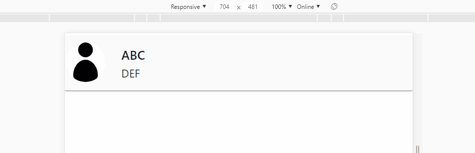
</div>I have this html:

Hereisthecodefortheimageabove:
<divstyle="width: 100%; overflow-x: hidden;">
                <div class="item-total">

                    <div class="col s12 m8 offset-m2 l6 offset-l3" style="width: 50%;">
                        <div class="card-panel grey lighten-5 z-depth-1">
                            <div class="row valign-wrapper">
                                <div class="col s3 lista-cartoneira" style="padding-left: 0px;">
                                    <img src="img/user-profile.jpg" alt="" class="circle responsive-img">
                                </div>
                                <div class="col s9 lista-cartoneira">
                                    <h1>ABC</h1>
                                    <h2>DEF</h2>
                                </div>
                            </div>
                        </div>
                    </div>
When the user slides left, the buttons appear:
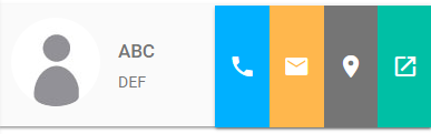
Hereisthecodefortheimageabove:
<divclass="col s12 m8 offset-m2 l6 offset-l3" style="width: 50%; float: right; margin-top: -136px;">
                        <div class="card-panel grey lighten-5 z-depth-1">
                            <div class="row valign-wrapper botoes">
                                <div class="atalhos-cartoneira col s3" style="background-color: #00b0ff;">
                                    <i class="material-icons">phone</i>
                                </div>
                                <div class="atalhos-cartoneira col s3" style="background-color: #ffb74d;">
                                    <i class="material-icons">email</i>
                                </div>
                                <div class="atalhos-cartoneira col s3" style="background-color: #757575;">
                                    <i class="material-icons">place</i>
                                </div>
                                <div class="atalhos-cartoneira col s3" style="background-color: #00BFA5;">
                                    <i class="material-icons">open_in_new</i>
                               </div>
                          </div>
                        </div>
                   </div>
                </div>
So far so good, but I wish that when it came up these buttons covered the entire first image and left only the buttons, for example:
OBS: Not duplicates, just for example. That filled the entire first div with the 4 buttons. Soon, when it slides again, it hides the buttons and the div appears again. How could I do that?
OBS: To test the buttons just by tapping your PC or mobile phone, mine is touch so it works.