Grid Skeleton Responsive with Wordpress

3

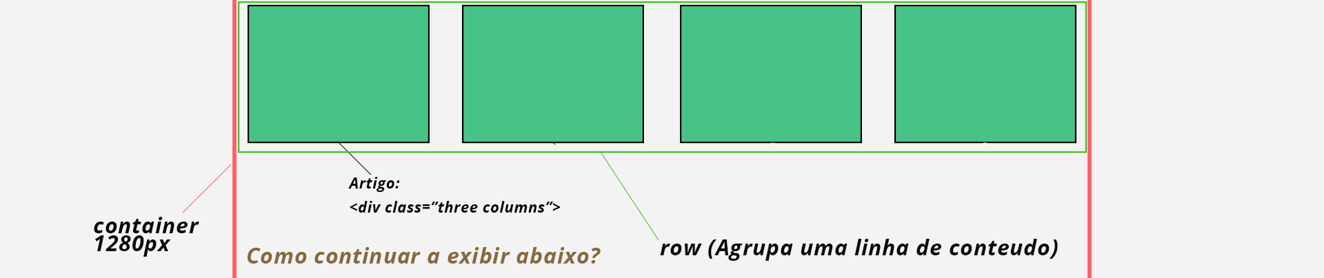
Next I'm building a website that needs to show posts with wordpress, however I'm using the Skeleton grid framework, it works as follows:

<div class="container">
    <div class="row">
       <div class="three columns"></div>
       <div class="three columns"></div>
       <div class="three columns"></div>
       <div class="three columns"></div>
    </div>
</div>

And so I go ....

But I'm having the following:

AndtheProblem:

Wordpresshasthefollowingschemetogivedisplayinposts:

<?phpif(have_posts()):while(have_posts()):the_post();?><?phpendwhile?><?phpelse:?><?phpendif;?>

HowdoIadaptthegridsystemforevery4poststogive<divclass="row"> at start and </div> at the end, to stay responsive?

Current situation:

<div class="row">
    <div class="three columns">
        <article class="articlebox">
            <header class="articleheader">
                <h2 class="article_title">Teste Bananinha</h2>
            </header>
        </article>
    </div>
    <div class="three columns">
        <article class="articlebox">
            <header class="articleheader">
                <h2 class="article_title">Teste Bananinha</h2>
            </header>
        </article>
    </div>
    <div class="three columns">
        <article class="articlebox">
            <header class="articleheader">
                <h2 class="article_title">Teste Bananinha</h2>
            </header>
        </article>
    </div>
    <div class="three columns">
        <article class="articlebox">
            <header class="articleheader">
                <h2 class="article_title">Teste Bananinha</h2>
            </header>
        </article>
    </div>
</div>
    
asked by anonymous 12.02.2016 / 04:58

1 answer

2

There are several ways to resolve this issue. Below are some of the forms I've used.

1. CSS:

Instead of using the framework in this situation you can use pure CSS. It would be something like this:

HTML (generated by WordPress):

<div class=" posts container">
    <div class="three"></div>
    <div class="three"></div>
    <div class="three"></div>
    <div class="three"></div>
    <div class="three"></div>
    <div class="three"></div>
    <div class="three"></div>
    <div class="three"></div>
</div>

CSS:

.posts {
    width: 1280px;
}

.posts .three {
    width: 25%;
}

However, it would take a few more lines of code to fix possible layout mismatches.

2. PHP:

You can also use a function to include the required code in the loop, this was the way I did at the beginning. I made an example function, just put it in funcions.php and call it on the page you want:

Function:

function add_row( $current, $end = false, $columns = 4 ) {
    $row = ( $current % $columns ) === 0 ? true : false;

    if( $row && ! $end ) {
        echo '<div class="row">';
    }
    if( $row && $end) {
        echo '</div>';
    }
}

Usage example:

if ( have_posts() ):
    $count = 1;
    while ( have_posts() ):
        add_row($count); // Imprimi a tag de abertura
        the_post();
        add_row($count, true); // Imprimi a tag de fechamento
        $count++;
    endwhile;
endif;

With this modification the loop will generate the HTML you expect.

3. Jeet:

Or you can use Jeet which is a grids system, it makes creating css grids much easier and faster. But for this you will also have to use a task runner like Grunt or Gulp and a CSS preprocessor like Less or Sass or Stylus. Interesting that by taking a look at the Skeleton documentation I saw that they support Less and Sass, you can see this here . Using these combined tools * you would have a code like this:

HTML:

It would be the same as the first example.

Sass:

@import 'jeet/index';

.container {
  .three {
    col(3/12)
  }
}

* The combination I like because of the learning curve is Gulp + Sass + Jeet.

    
18.02.2016 / 12:50