FlexBox + CSS GRID

3

I would like to know if there is any possibility of using CSSGrid with FlexBox.

display:grid;
display:flex;

I'm talking about using both in the same project, if not, which one would you recommend me to use? You can give an example of how to use the two together if given.

    
asked by anonymous 05.09.2018 / 05:12

1 answer

3

Yes my friend is perfectly feasible to use display:grid and display:flex in the same project. Mainly because of the particularities of each one. Generally speaking, Grid you can use more to build the page layout structure and flex to build the "components" within those grid layout blocks.

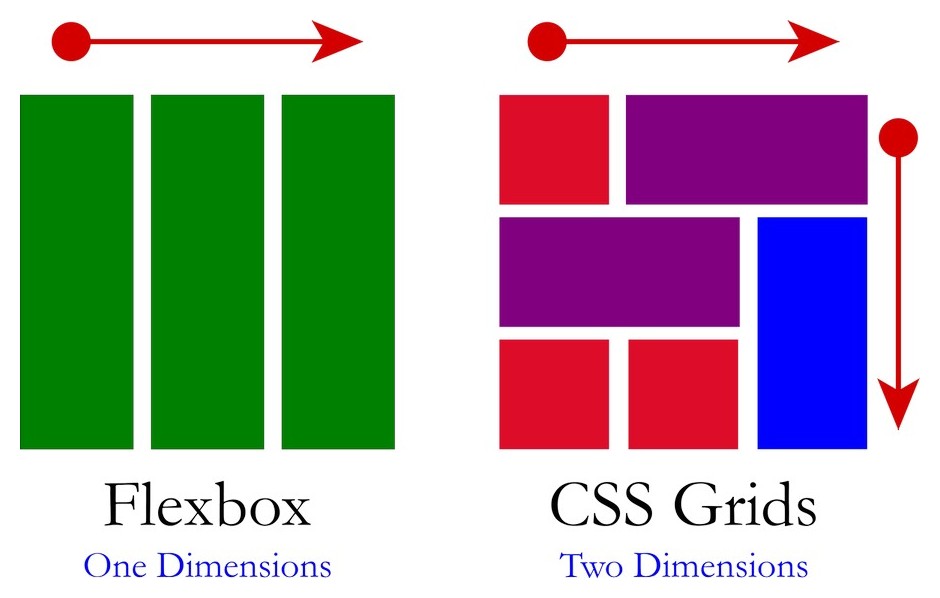
Grid takes advantage of the time to build page layouts, because it offers the possibility to work by expanding the spaces vertically and horizontally. However, flex-box only occupies the spaces in the axis X (although with "jeitinhos" you can work around this, but it is not the indicated option, mainly having grid available) / p>

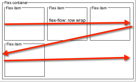
To better understand these two images. In Flex the components follow only one axis, or X or Y, and in Grid the two are available at the same time!

NowI'llgiveyousomepracticalexamples.IwillbuildthesamestructurewithFlexandthenwithGrid,noticehowwithFlexmorelinesofcodeareneededandthestructurebecomeslesssemantic.

ExamplewithFLEX

* {
  padding: 0;
  margin: 0;
  box-sizing: border-box;
}
html, body {
  width: 100%;
  height: 100%;
  margin: 0;
  padding: 0;
}
section, header, aside, main, article, footer {
  border: 1px solid;
  min-height: 80px;
}
section {
  display: flex;
  flex-wrap: wrap;
}
header, footer {
  width: 100%;
}
aside {
  width: 30%;
}
main {
  width: 70%;
  display: flex;
  flex-direction: column;
  border: 1px solid red;
}
article {
  width: 100%;
}
<section>
  <header>header</header>
  <aside>aside</aside>
  <main>
    <article>artivle</article>
    <article>article</article>
  </main>
  <footer>footer</footer>
</section>

Now with Grid we have much less code, a more semantic structure and easier to work the responsiveness of every container if you want.

Example with GRID

* {
  padding: 0;
  margin: 0;
  box-sizing: border-box;
}
html, body {
  width: 100%;
  height: 100%;
  margin: 0;
  padding: 0;
}
body {
	display: grid;
	grid-template-areas: 
    "header header "
    "aside main"
    "footer footer ";
	grid-template-rows: 1fr 4fr 1fr;
	grid-template-columns: 1fr 2fr;
}
header, aside, main, article, footer {
  border: 1px solid;
  min-height: 30px;
}
header {
  grid-area: header; 
}
aside {
	grid-area: aside; 
}
main {
	grid-area: main; 
  display: grid;
  border: 1px solid red;
}
footer {
  grid-area: footer; 
}
<header>header</header>
<aside>aside</aside>
<main>
  <article>artivle</article>
  <article>article</article>
</main>
<footer>footer</footer>

OBS1: Although I have ridden the templates they could work perfectly together, for example, <main> can be display:flex with no problem at all.

OBS2: I did not do the responsive treatment in these examples, they are just didactic models ok
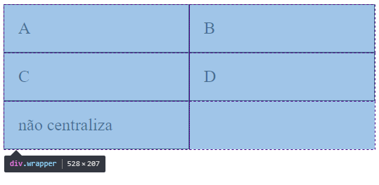
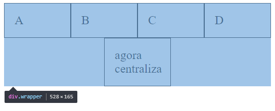
Although Grid practically accepts all attributes and styles of Flex , there are some peculiarities. And for me the most annoying of them is with regard to the centralization of elements in grid-template-columns for example. When you are throwing the elements to the bottom row you can not centralize the last element, this happens because of the grid structure.

See the image and code sample:

.wrapper {
    display: grid;
    grid-template-columns: repeat(auto-fill, minmax(200px, 1fr) );
    justify-content: center; /* não vai funcionar o alinhamento center*/
}
.box {
    border:1px solid;
    padding: 20px;
    font-size: 150%;
}
<div class="wrapper">
    <div class="box a">A</div>
    <div class="box b">B</div>
    <div class="box c">C</div>
    <div class="box d">D</div>
    <div class="box e">não centraliza</div>
</div>

The same example with Flex with the option to center the last item:

.wrapper {
    display: flex;
    flex-wrap: wrap;
    justify-content: center;
}
.box {
    width: 25%;
    box-sizing: border-box;
    border:1px solid;
    padding: 20px;
    font-size: 100%;

}
<div class="wrapper">
    <div class="box a">A</div>
    <div class="box b">B</div>
    <div class="box c">C</div>
    <div class="box d">D</div>
    <div class="box e">agora centraliza</div>
</div>

TIPS:

Always take browser support into account, and your target audience uses a browser that supports these types of display

link

link

And read the official documentation, this is from Mozilla, but it is quite complete and didactic:

link

link

    
05.09.2018 / 13:54
Can you create variables within a block and use them later? Condition of a query with a subquery