CSS Problem with borders and placement of list elements

3

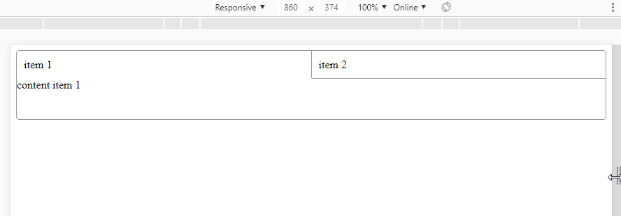
I'm doing a TAB component in HTML + CSS, and I have a question regarding css, the code I have is:

@import url("https://fonts.googleapis.com/css?family=Open+Sans:300,400,700");
.tabs {
  font-family: "Open Sans", sans-serif;
  width: 222px;
  border: 1px solid #E6E6E6;
  border-radius: 3px; }
  .tabs__tab-list {
    list-style: none;
    height: 40px;
    padding: 0;
    margin: -1px;
    font-size: 14px;
    font-weight: 700;
    background-color: #F2F2F2;
    border-top-left-radius: 3px;
    border-top-right-radius: 3px;
    border-top: 1px solid #E6E6E6;
    border-right: 1px solid #E6E6E6;
    border-left: 1px solid #E6E6E6; }
  .tabs__tab {
    display: inline;
    padding: 0;
    margin: 0;
    border: 0; }
    .tabs__tab:first-child {
      float: left;
      width: 46%;
      height: 40px;
      padding-left: 15px;
      display: table;
      border-top-left-radius: 3px;
      border-top-right-radius: 3px;
      border-bottom-right-radius: 3px;
      border-right: 1px solid #E6E6E6;
      background-color: #FFFFFF; }
    .tabs__tab:last-child {
      float: right;
      width: 54%;
      height: 40px;
      text-align: right;
      display: table;
      padding-right: 15px;
      border-bottom: 1px solid #E6E6E6;
      border-bottom-left-radius: 3px; }
    .tabs__tab--selected {
      color: pink; }
    .tabs__tab__text {
      display: table-cell;
      vertical-align: middle; }
  .tabs__content {
    clear: both;
    padding: 10px; }
<div class="tabs">
  <ul class="tabs__tab-list">
    <li class="tabs__tab">
      <span class="tabs__tab__text">Tab1</span>
    </li>
    <li class="tabs__tab">
      <span class="tabs__tab__text">
        Tab2
      </span>
    </li>
  </ul>
  <div class="tabs__content">
    <h1>Tab2</h1>
  </div>
</div>

How can I prepare this component to take n separators, and show the borders correctly? Any examples / tips that advise me? Thanks

    
asked by anonymous 14.11.2018 / 09:55

1 answer

3

I do not know if I understand you correctly, but using flex you can make a very responsive "component" ...

OnthecodethetipsI'llgiveyouistousetheborder-radiusinthecontourofthecontainerandthenavofthetabsyouputtheborder-bottom,andtabitemthatisactiveyouputabox-shadowof1pxdown,thuscappingthenavlineandmakingit"join" with the content below. In%% of tc you put a tab-item to make the splitters between a border-left and another, less pro tab than you do not need a right border.

See the code for the image above:

.tab-container {
    width: 100%;
    height: 100px;
    display: flex;
    flex-direction: column;
    box-sizing: border-box;
    border: 1px solid #999;
    border-radius: 5px;
}
.tab-container .tab-nav {
    width: 100%;
    height: 40px;
    line-height: 40px;
    box-sizing: border-box;
    display: flex;
    border-bottom: 1px solid #999;
}
.tab-container .tab-nav .tab-item:not(:last-child){
    border-right: 1px solid #999;
}
.tab-container .tab-nav .tab-item.ativo {
    box-shadow: 0px 1px 0px 0px #fff;
}
.tab-container .tab-nav .tab-item {
    flex: 1;
    padding: 0 10px;
}
<div class="tab-container">
    <div class="tab-nav">
        <div class="tab-item ativo">
            item 1
        </div>
        <div class="tab-item">
            item 2
        </div>
        <div class="tab-item">
            item 3
        </div>
        <div class="tab-item">
            item 4
        </div>
        <div class="tab-item">
            item 5
        </div>
    </div>
    <div class="tab-box">
        <div class="tab-content">
            content item 1
        </div>
    </div>
</div>
    
14.11.2018 / 11:58