With CSS is it possible to animate text-decoration?

12

Recently I saw this animation made with SVG,

ButIwaswondering,isitpossibletoanimatetext-decoration-style:wavyin:hoverinordertoachievethesameresult?

   body {
        font-family: sans-serif;
        font-size: 2rem;
    }
    p {
        font-weight: bold;
        display: inline-block;
        text-underline-position: under;
        text-decoration: underline orange;
    }
    p:hover {
        font-weight: bold;
        display: inline-block;
        text-underline-position: under;
        text-decoration-style: wavy;
    }
    
<p>Meu efeito</p> Lorem, ipsum.

OBS1: If you do not see the text-decoration-style: wavy property in your browser please see the support here:

OBS2: Mozilla documentation on text-decoration-style: wavy link

    
asked by anonymous 01.11.2018 / 12:14

3 answers

4

I made this code based on this Codepen but only works perfectly in Firefox:

TestinginOperaandChrome,thewavesarecutandsmallercomparedtowhatFirefoxdisplays:

Whenusingthispropertytext-underline-position:under;thecodewillnolongerworkinChrome/Opera.Itseemstomethatthesebrowsersdonotsupport100%ownership.InEdge/IE11nothinghappens,nosupport.IhavenottestedonmodernSafari.

Theideaistocreateapseudo::afterwithoverflow:hiddeninthetextandthispseudohavethesametransparenttextbypulling2xofadataattributewiththesametext,anduse@keyframestomovethepseudototheleftcontinuously,givingtheinfinitemotioneffect:

body {
   font-family: sans-serif;
   font-size: 2rem;
}
p {
   font-weight: bold;
   display: inline-block;
   text-decoration: underline orange;
   position: relative;
   overflow: hidden;
   padding-bottom: 7px; /* só funcionou no Firefox */
   white-space: nowrap;
}

p:hover {
   text-decoration: none;
}

p::after {
   visibility: hidden;
   z-index: -1;
   position: absolute;
   top: 0;
   left: 0;
   right: 0;
   bottom: 0;
   content: attr(data-texto) attr(data-texto);
   color: transparent;
   text-decoration: underline;
   -webkit-text-decoration-style: wavy;
   text-decoration-style: wavy;
   -webkit-text-decoration-color: orange;
   text-decoration-color: orange;
}

p:hover::after {
   visibility: visible;
   -webkit-animation: wavy-slide 3s linear infinite;
   animation: wavy-slide 3s linear infinite;
}

@-webkit-keyframes wavy-slide {
   to {
      left: -51%;
   }
}

@keyframes wavy-slide {
   to {
      left: -51%;
   }
}
<p data-texto="Meu efeito wavy underline">Meu efeito wavy underline</p>
  

Limitations found:

     
  • I only get the expected effect in Firefox, but the waves are larger than they appear in Chrome / Opera. It leads me to believe that there is no standardization of ownership.
  •   
  • Only for a whole line and without line break due to overflow .
  •   
    
01.11.2018 / 16:00
3

I got a movement effect (very bad), the idea is to create a pseudo element that will have the same content and it will have the underline. This element will stretch, giving this slight motion effect

It's not exactly what you want but it's already the basis for a better response.

body { margin:0; padding:0; }
p {
    position: absolute;
    left: 0;
    top: 10px;
    line-height: 2;
}
[under]::before {
    width: 100px;
    overflow: hidden;
    content: attr(under);
    color: transparent;
    position: absolute;
    text-underline-position: under;
    text-decoration: underline orange;
    text-decoration-style: wavy;
    opacity: 0;
}
[under]:hover::before {
    opacity: 1;
    animation: under 1s linear;
    animation-fill-mode: both;
}
@keyframes under {
    0% {
        transform: scaleX(1);
    }
    100% {
        transform: scaleX(2);
    }
}
<p>
    <span under="Meu efeito">Meu efeito</span> Lorem, ipsum.
</p>
    
01.11.2018 / 14:37
0

I'm going to post a solution that I got here that I found interesting and solved some bugs.

The main thing here was to make a small hake for the underline legal render. For this I needed to use a transparent linear-gradient as the span background. I do not wonder why, because I discovered this accidentally ... While I was testing the behavior of the animated element I put background-color in it and I noticed that bug stopped, however using color in rgba() o problem comes back, but with a background-imagem: linear-gradiend does not happen, at least in Chrome !

I also needed to use the text-underline-position: under; property to fix this issue in Chrome :

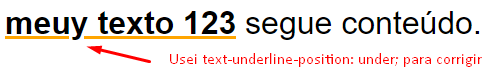
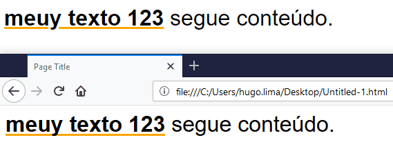
SeetheresultInChromeandFireFox

Ialsohadtomakeadjustmentsusingdisplay:inline-block,overflowandheighttocontrolhowthelinewillgetcutetc...

Followthecodeused:

div {
    font-family: sans-serif;
    font-size: 2rem;
}
div span,
div .efeito{
    display: inline-block;
    height: 60px;
    overflow: hidden;
}
div .efeito{
    font-weight: bold;
    text-decoration: underline;
    text-decoration-color: orange;
    text-underline-position: under;
    position: relative;
}
div .efeito:hover{
    text-decoration: none;
}
div .efeito::after{
    content: attr(data-text);
    width: 100%;
    color: transparent;
    position: absolute;
    top: 0;
    left: 15px;
    transition: 0s linear;
    text-decoration: none;
    text-decoration-style: none;
    text-decoration-color: orange;
    display: inline-block;
    height: 60px;
    text-underline-position: under;
    background-image: linear-gradient(rgba(0,0,0,0.0), rgba(0,0,0,0.0));
    z-index: -1;
}

div .efeito:hover::after {
    animation: underx 500ms infinite linear;
    text-decoration: underline;
    text-decoration-style: wavy;
    text-decoration-color: orange;
}

@keyframes underx {
    to {
        left: 0px;
    }
}
<div>
    <span class="efeito" data-text="meuy texto 123">meuy texto 123</span> <span>segue conteúdo.</span>
</div>

OBS: In different size fonts you will most likely need to adjust values that are in PX

    
10.12.2018 / 15:10
Call functions in C from R What is the method group?