


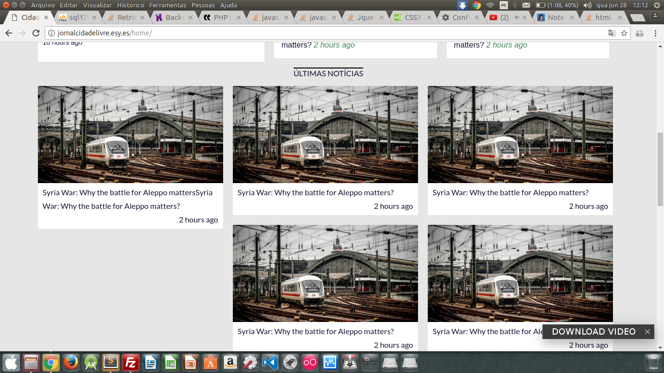
I have a list of items (ul), and each item occupies 33% of the screen, thus forming a horizontal list of 3 columns. When there is no more horizontal space, it forms a new line, something very simple, is perfect when all items have the same height, but when heights are different from each other, the layout "breaks". Here is the image and code:
.news-line {
  display: flex;
  flex-direction: column;
}

.news-line .news-line_title {
  text-align: center;
  font-family: 'Lato', sans-serif;
  text-transform: uppercase;
}

.news-line .news-line_title span {
  border-top: 2px solid #000;
}

.news-line .news-wrapper ul {
  list-style-type: none;
}

.news-line .news-wrapper ul li {
  margin: 0;
  width: 33.33%;
  float: left;
}

.news-line .news-wrapper ul li .box {
  background-color: #FFF;
  border-radius: 3px;
  overflow: hidden;
  margin: 10px;
}

.news-line .news-wrapper ul li .box .image {
  background: url('http://grafreez.com/wp-content/temp_demos/river/img/media-7.jpg') no-repeat;
  background-repeat: no-repeat;
  background-size: cover;
  height: 200px;
}

.news-line .news-wrapper ul li .box .content {
  padding: 5px 10px;
  line-height: 28px;
  font-family: 'Lato', sans-serif;
  display: inline-block;
}

.news-line .news-wrapper ul li .box .content .date {
  margin-left: 30px;
  float: right;
}

.news-line .more-news {
  display: flex;
  text-align: center;
  font-family: 'Lato', sans-serif;
  text-transform: uppercase;
}

.news-line .more-news a {
  width: 100%;
  background-color: #FFF;
  padding: 10px 0;
  margin-bottom: 15px;
}
<div class="news-line">
<div class="news-line_title"><span>Últimas Notícias</span></div>
<div class="news-wrapper">
<ul>
<li>
<div class="box">
<div class="image"></div>
<div class="content">
<span class="title">Syria War: Why the battle for Aleppo mattersSyria War: Why the battle for Aleppo matters?</span>
<span class="date">2 hours ago</span>
</div>
</div>
</li>
<li>
<div class="box">
<div class="image"></div>
<div class="content">
<span class="title">Syria War: Why the battle for Aleppo matters?</span>
<span class="date">2 hours ago</span>
</div>
</div>
</li>
<li>
<div class="box">
<div class="image"></div>
<div class="content">
<span class="title">Syria War: Why the battle for Aleppo matters?</span>
<span class="date">2 hours ago</span>
</div>
</div>
</li>
<li>
<div class="box">
<div class="image"></div>
<div class="content">
<span class="title">Syria War: Why the battle for Aleppo matters?</span>
<span class="date">2 hours ago</span>
</div>
</div>
</li>
<li>
<div class="box">
<div class="image"></div>
<div class="content">
<span class="title">Syria War: Why the battle for Aleppo matters?</span>
<span class="date">2 hours ago</span>
</div>
</div>
</li>
<li>
<div class="box">
<div class="image"></div>
<div class="content">
<span class="title">Syria War: Why the battle for Aleppo matters?</span>
<br/>
<span class="date">2 hours ago</span>
</div>
</div>
</li>
</ul>
</div>
<div class="more-news"><a href="#">Ver todos</a></div>
</div>