


Hello. I'm doing a login screen and would like to center the forms and put the login and forgot password buttons at the end of that white rectangle, which neither the title of the rectangle. I'm using materialize css and am new to html and css.
Thecodeisthefollowing
body{

	background-color:#44BBFF;
}

#logincard{
	background-color:white;
	height:600px;
	width:1000px;
	max-width:100%;
    max-height:100%;
    overflow:auto;
	 position:absolute; /*it can be fixed too*/
        left:0; right:0;
        top:0; bottom:0;
        margin:auto;
-webkit-box-shadow: 1px 1px 8px 1px rgba(0,0,0,0.31);
-moz-box-shadow: 1px 1px 8px 1px rgba(0,0,0,0.31);
box-shadow: 1px 1px 8px 1px rgba(0,0,0,0.31);


}

#parent{
}

html, body{
  height: 100%;
}

#botaologin{
	width:50%;
	height:50px;
	color:white;
	padding: 15px 40px;
	text-align:center;
	float:left;

}

 #header {
    position: relative;
    min-height: 150px;
  }
  #header-content {
    position: absolute;
    bottom: 0;
    left: 0;
  }


#inner {
  display: table;
  width: 40%; /* Altere para o valor da largura desejada. */
}
<!DOCTYPE html>
<html>
<head>
<!--Import Google Icon Font-->
<link href="https://fonts.googleapis.com/icon?family=Material+Icons" rel="stylesheet">
<!--Import materialize.css-->
<link type="text/css" rel="stylesheet" href="css/materialize.min.css" media="screen,projection"/>
<link type="text/css" rel="stylesheet" href="style.css" media="screen,projection"/>
<!--Let browser know website is optimized for mobile-->
<meta name="viewport" content="width=device-width, initial-scale=1.0"/>
</head>
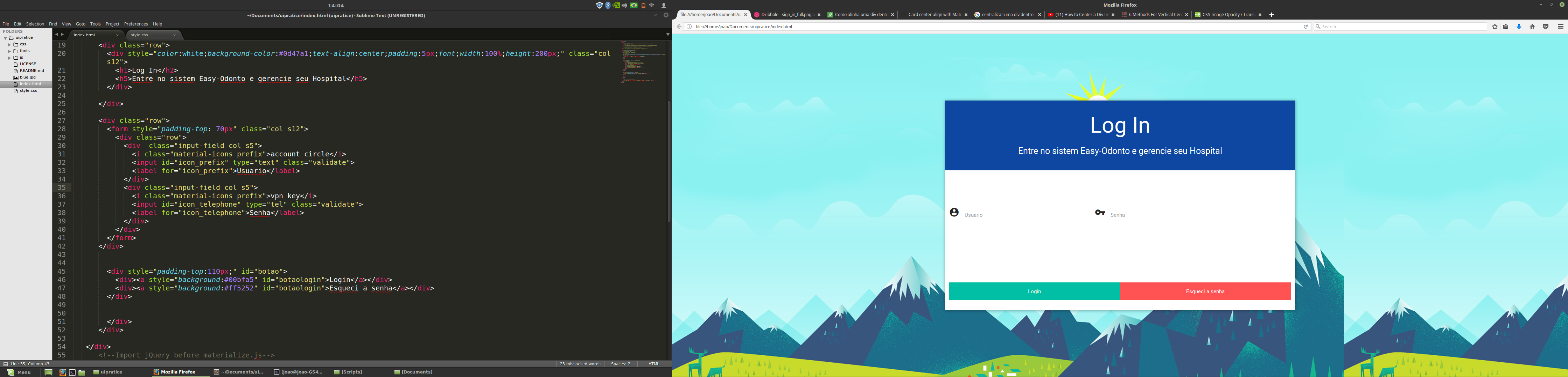
<body style="background:url(blue.jpg);">
<div class="container"><!--Comeco tela login -->
<div class="row col s12">
<div class="col s12" id="logincard">
<div class="row">
<div style="color:white;background-color:#0d47a1;text-align:center;padding:5px;font;width:100%;height:200px;" class="col s12">
<h1>Log In</h2>
<h5>Entre no sistem Easy-Odonto e gerencie seu Hospital</h5>
</div>
</div>
<div class="row">
<form style="padding-top: 70px" class="col s12">
<div class="row">
<div class="input-field col s5">
<i class="material-icons prefix">account_circle</i>
<input id="icon_prefix" type="text" class="validate">
<label for="icon_prefix">Usuario</label>
</div>
<div class="input-field col s5">
<i class="material-icons prefix">vpn_key</i>
<input id="icon_telephone" type="tel" class="validate">
<label for="icon_telephone">Senha</label>
</div>
</div>
</form>
</div>
<div style="padding-top:110px;" id="botao">
<div><a style="background:#00bfa5" id="botaologin">Login</a></div>
<div><a style="background:#ff5252" id="botaologin">Esqueci a senha</a></div>
</div>
</div>
</div>
</div>
<!--Import jQuery before materialize.js-->
<script type="text/javascript" src="https://code.jquery.com/jquery-3.2.1.min.js"></script><scripttype="text/javascript" src="js/materialize.min.js"></script>
</body>
</html>