The problem here is that you are using an image that already has this zebra effect. To use background images in this way, which in the background are small stripes that repeat horizontally, so the image can not have anything white.
To use sprites then your original image has to have the two whole images, I do not see how to have two stripes / lines with space between them in the same image and to repeat only the part you are looking for. So there they would have to be as @bfavareto suggests, one on top of the other.
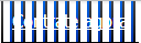
A full-size image / sprite would look like this (single image / file):

andinCSS:
background-image:url('http://i.stack.imgur.com/Zi14e.jpg');background-position:-5px0px;
andtotheotherpartoftheimage
background-image:url('http://i.stack.imgur.com/Zi14e.jpg');background-position:-115px0px;
Example
You can also use only CSS, you can for example use this tool to choose colors and clicking can see CSS.
With CSS only your image will need:
gradient: to have different color at the top and bottom
border-radius: to make round corners
.botao {
    margin-top: 40px;
    border-top: 1px solid #000000;
    background: #000000;
    background: -webkit-gradient(linear, left top, left bottom, from(#777), to(#000000));
    background: -webkit-linear-gradient(top, #777, #000000);
    background: -moz-linear-gradient(top, #777, #000000);
    background: -ms-linear-gradient(top, #777, #000000);
    background: -o-linear-gradient(top, #777, #000000);
    padding: 13px 26px;
    -webkit-border-radius: 15px;
    -moz-border-radius: 15px;
    border-radius: 15px;
    -webkit-box-shadow: rgba(0, 0, 0, 1) 0 1px 0;
    -moz-box-shadow: rgba(0, 0, 0, 1) 0 1px 0;
    box-shadow: rgba(0, 0, 0, 1) 0 1px 0;
    text-shadow: rgba(0, 0, 0, .4) 0 1px 0;
    color: white;
    font-size: 19px;
    font-family:'Lucida Grande', Helvetica, Arial, Sans-Serif;
    text-decoration: none;
    vertical-align: middle;
}
.botao:hover {
    border-top-color: #28597a;
    background: #0422ba;
    background: -webkit-gradient(linear, left top, left bottom, from(#27274f), to(#0422ba));
    background: -webkit-linear-gradient(top, #27274f, #0422ba);
    background: -moz-linear-gradient(top, #27274f, #0422ba);
    background: -ms-linear-gradient(top, #27274f, #0422ba);
    background: -o-linear-gradient(top, #27274f, #0422ba);
    color: #ccc;
}