


Make the background of a <img> or <div> transparent like the iPhone's design - blurry, blurred, but only with CSS.
DIV / IMG with blurred / blurry background
4
asked by anonymous 21.07.2015 / 03:17
3 answers
10
Peter, then use with the settings below, and set the "haze" by means of the filter: blur property, the result will look like this:

<!-- HTML -->
<div class="content">
</div>
/* CSS */
.content:before {
  content: "";
  position: fixed;
  left: 0;
  right: 0;
  z-index: -1;

  display: block;
  background-image: url('http://www.zeldadungeon.net/wp-content/uploads/2011/07/legend-of-zelda-ocarina-of-time-3d-screenshots.jpg');
  width: 1200px;
  height: 800px;

  -webkit-filter: blur(15px);
  -moz-filter: blur(15px);
  -o-filter: blur(15px);
  -ms-filter: blur(15px);
  filter: blur(15px);
}

.content {
  position: fixed;
  left: 0;
  right: 0;
  z-index: 0;
  margin-left: 20px;
  margin-right: 20px;
}
21.07.2015 / 05:38
7
There is no CSS specification yet for the case you describe. However, it can be simulated with a combination.
The ios-7.jpg image is our background. The idea is to position the div which will display the same image inside the main container, and then move the background according to the offset.
Example:
.bg
{
    background-image:url(http://www.cnetfrance.fr/i/edit/2013/06/39791275/620x465/ios-7.jpg);
    width:620px;
    height:465px;
    position:relative;
}

.fg
{
    width:128px;
    height:128px;
    position:absolute;
    top:154px;
    left:69px;
    border: 4px solid black;
    border-radius:6px;
    overflow:hidden;
}

.fg .conteudo
{
    position:absolute;
    top:0;
    left:0;
}

.fg .bg
{
    position:absolute;
    background-image:url(http://www.cnetfrance.fr/i/edit/2013/06/39791275/620x465/ios-7.jpg);
    top:-154px;
    left:-69px;
    -webkit-filter: blur(10px);
    -moz-filter: blur(10px);
    -o-filter: blur(10px);
    -ms-filter: blur(10px);
    filter: blur(10px);
    display:none;
}

.fg:hover .bg
{
    display:block;
}
<div class='bg'>
<div class='fg'>
<div class='bg'></div>
<div class='conteudo'>
Conteúdo
</div>
</div>
</div>Click > Run code snippet and hover over the black border area to see the effect in action. Note that neither the text 'Content' nor the border suffers the effect of blurring .
08.10.2015 / 19:28
3
For modern browsers, use the opacity CSS attribute to see images or other things with transparency:
div {
  opacity: 0.8; //1.0 = totalmente opaco, 0.0 = totalmente transparente
}
To see a blurry image, use a couple of similar images, which I found here in the CSS Tricks . It uses a good one and a blur. Using CSS, you can by one on top of the other, like this:
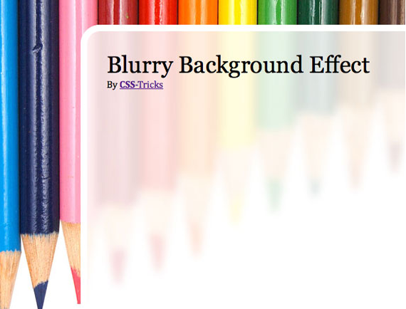
AndtheCSS:
body{background:url(images/bg-solid.jpg)no-repeat;}#page-wrap{background:url(images/bg-blurry.jpg)no-repeatfixed;width:500px;margin:40pxauto;}Thekeybeingfixed.
Update
Eventhoughthetwoimagesarepossible,CSS3hasamediumwiththefilterattribute.
div{-webkit-filter:blur(0px);-moz-filter:blur(0px);-o-filter:blur(0px);-ms-filter:blur(13px);filter:blur(0px);}Today(2015-07-20), CanIUse.com states that only IE and Opera Mini do not support this CSS3 attribute.
21.07.2015 / 03:45