It depends on the browser.
Some browsers can find all the images, including those that were not used on the page.
This has a positive side, after all the desktop user can resize the window, for example, so the images are already cached.
Test:
@media all and (min-width: 1024px) {
    .teste {
        background-image:url('http://lorempixel.com/output/abstract-q-c-200-200-1.jpg');
        width:200px;
        height:200px;
    }
}

@media all and (max-width: 1024px) {
    .teste {
        background-image:url('http://lorempixel.com/output/abstract-q-c-200-200-2.jpg');
        width:200px;
        height:200px;
    }
}
Result:
Used Chrome 52 in Windows 10:
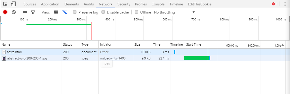
Justgotthesetby@mediaalland(min-width:1024px){.
UsedMicrosoftEdgeinWindows10: 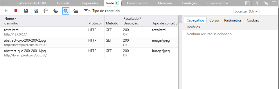
Gotallimagesofboth@media.
UsedFirefoxinWindows10: 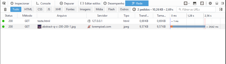
Justgotthesetby@mediaalland(min-width:1024px){.
UsedChrome(Mobile)52onAndroid6.0.1 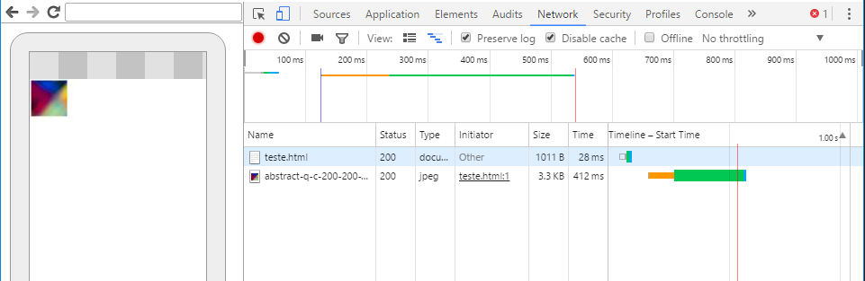
Justgotthesetby@mediaalland(max-width:1024px){.
Allsituationsthesitehasbeenaccessedinamaximizedwindowwiththe@mediadefined,exceptinMobile,whichisexactlywheretheotherimageshouldbedisplayed!
Conclusion:
Eachbrowserworksinadifferentway,althoughingeneraltheytendtorespectwhatissetby@media,atleastinthelatestbrowsers!
Thesetestsweredonebyme,forthatreasonIhavenottestedinmorebrowsersorinmoresituations.However,somepeoplehavealreadymademorecompletetestsandmoresituations,youcanfindmoretests(mainlyfromoldbrowsers)in link .


