Centralize components

0

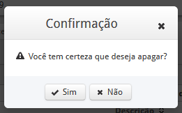
The print below is the confirmation of a record of my datatable, the popup opens when you click the delete record button:

Thecodeforthisdialogisasfollows:

<p:commandButtonicon="ui-icon-trash" action="#{geracaomb.excluir(linha)}" ajax="true" process="@this" update="pesquisa">
    <p:confirm header="#{msg['cabecalho.apagar.registro']}" message="#{msg['apagar.registro']}" icon="ui-icon-alert" />
    </p:commandButton>
    <p:confirmDialog global="true" showEffect="exploud" hideEffect="fade">
    <p:commandButton value="Sim" type="button" styleClass="ui-confirmdialog-yes" icon="ui-icon-check"/>
    <p:commandButton value="Não" type="button" styleClass="ui-confirmdialog-no" icon="ui-icon-close"/>
    </p:confirmDialog>

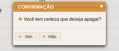
I want to put the title (CONFIRMATION) and the 2 centralized buttons (Yes and No), how do I do this?

    
asked by anonymous 09.11.2016 / 16:23

1 answer

1

Method 1 (without changing CSS):

I do not know if it is possible to centralize the title without touching the CSS, but the buttons can do:

<p:confirmDialog global="true" showEffect="explode" hideEffect="fade">
    <div style="display:flex;justify-content:center;align-items:center;">
        <p:commandButton value="Sim" type="button" styleClass="ui-confirmdialog-yes" icon="ui-icon-check"/>
        <p:commandButton value="Não" type="button" styleClass="ui-confirmdialog-no" icon="ui-icon-close"/>
    </div>
</p:confirmDialog>

Method 2 (customizing the CSS of the Primefaces):

There are several ways to customize CSS, below is an example of CSS customization on the page itself, using the <style> tag. In this case, there would be no change in your ConfirmDialog, all changes would be in CSS:

<style>
.ui-dialog-title {
    width: 88%;
    display: flex;
    justify-content: center;
    margin-right: 0 !important;
}
.ui-dialog-buttonpane {
    display:flex;
    justify-content:center;
    align-items:center;
}
</style>

You may need to adjust the values of width and margin-right for your project, but only testing. Here is the list of other ConfirmDialog Style Classes:

  • .ui-dialog Container element of dialog
  • .ui-dialog-titlebar Title bar
  • .ui-dialog-title Header text
  • .ui-dialog-titlebar-close Close icon
  • .ui-dialog-content Dialog body
  • .ui-dialog-buttonpane Footer button panel
23.11.2016 / 21:53