Image cracking (HTML, CSS, responsiveness)

0

Good morning,

My problem is this:

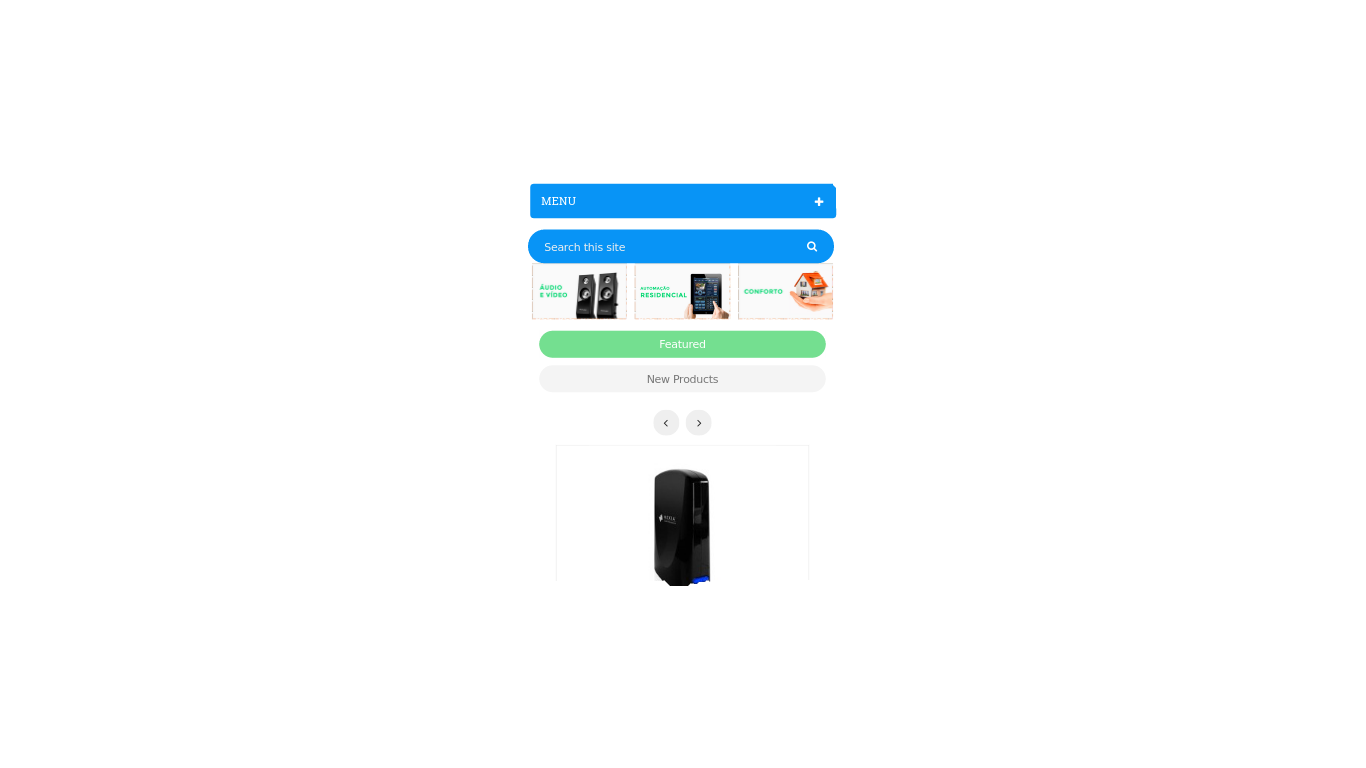
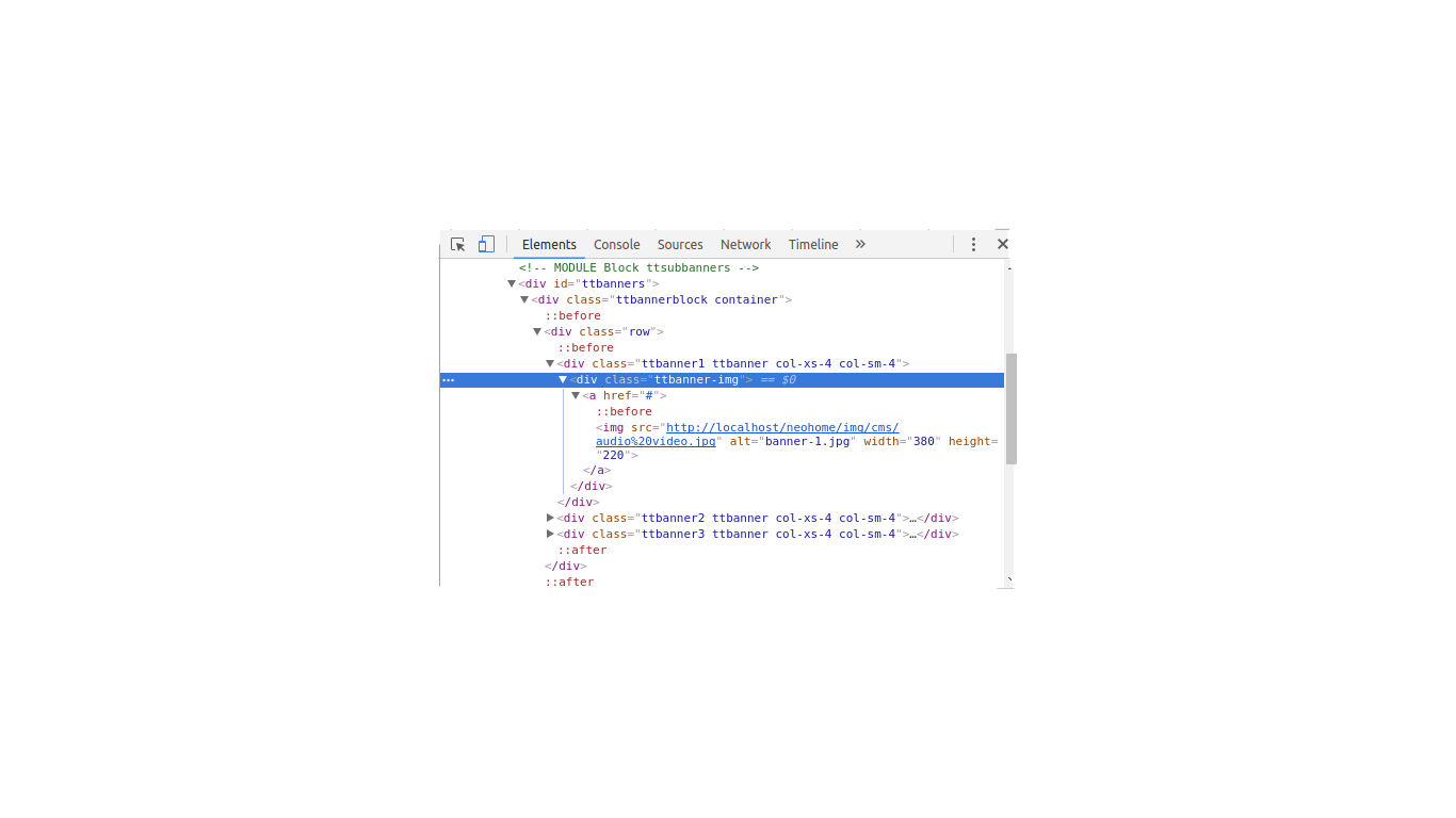
I'musingPrestaShop.Ineedthoseimagesintheprinttobeunderneatheachother,whentheresolutiondecreasesorwhenitisaccessedfromamobiledevice,sothattheybecomeunreadable.Itwouldjustleavethemonebelowtheother,Idonotknowiftheaveragewouldworkout.Thanksforthehelp.

    
asked by anonymous 13.03.2017 / 13:56

1 answer

1

Change the div with class "col-xs-4 col-sm-4" to "col-xs-12 col-sm-4" . The bootstrap grid works from smaller to larger resolutions. If you only put col-xs-4 this same grid size will be set to all resolutions as sm md lg . Placing% w /% the images stayed one below the other in smaller resolutions and placing% w / o% the same grid that was shown will be maintained for larger resolutions.

    
13.03.2017 / 14:43