Zoom effect with CSS

5

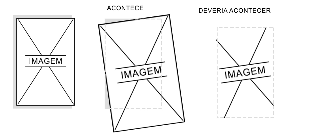
I have a div with an image in which I applied a zoom effect and a slight rotation! but this image should zoom and rotate within the boundaries of the DIV without overflowing, but hide parts that exceed the size of the div.

image explaining:

Code:

* {
    	margin: 0;
    	padding: 0;
    	border: 0;
	}
	body {
    	font-family: "Open Sans", sans-serif;
	}
    ul, ol, li {
        list-style: none;
    }
	
	.imagem {
		background: #ddd;
		width: 14%;
		height: auto;
		display: inline-grid;
		position: absolute;
    	left: 50%;
    	top: 50%;
    	transform: translate(-50%, -50%);
	}
	.imagem img {
		width: 100%;
        max-width:260px;
		border-radius: 10px;
		padding: 5%;
	}
	.imagem img {
	   width:100%;
		-webkit-transition: all .8s cubic-bezier(.190, 1.000, .220, 1.000);
			-moz-transition: all .8s cubic-bezier(.190, 1.000, .220, 1.000);
			 -ms-transition: all .8s cubic-bezier(.190, 1.000, .220, 1.000);
			  -o-transition: all .8s cubic-bezier(.190, 1.000, .220, 1.000);
				 transition: all .8s cubic-bezier(.190, 1.000, .220, 1.000);
	}
	.imagem:hover > img {
		-webkit-transition: all 0.5s ease;
		-moz-transition: all 0.5s ease;
		transition: all 0.5s ease;
		-moz-transform: scale(1.5) rotate(-5deg) ;
		-webkit-transform: scale(1.5) rotate(-5deg) ;
		-o-transform: scale(1.5) rotate(-5deg) ;
		-ms-transform: scale(1.5) rotate(-5deg) ;
		transform: scale(1.5) rotate(-5deg);
	}
<div class="imagem">
	<img alt="folder" src="https://i.imgur.com/7s6gp01.jpg"/>
</div>
    
asked by anonymous 17.05.2018 / 01:07

2 answers

4

You can resolve this by using padding and a pseudo-element ::after . You have to remove the background color from the div image and use the pseudo-element as the color of backgroud . Then make a setting of padding to overflow:hidden not cut the image before time.

See how the result was. (I left the comment in the code)

* {
    margin: 0;
    padding: 0;
    border: 0;
}
body {
    font-family: "Open Sans", sans-serif;
}
ul, ol, li {
    list-style: none;
}

.imagem {
    width: 14%;
    height: auto;
    display: inline-grid;
    position: absolute;
    left: 50%;
    top: 50%;
    transform: translate(-50%, -50%);
    padding: 6px 0px 6px 6px; /* ajuste de padding para não cortar a imagem */
    overflow: hidden; /* esconde a imagem no :hover */
}

 /* elemento com a cor de fundo */
.imagem::after {
    content: "";
    position: absolute;
    left: -6px;
    width: 100%;
    height: 100%;
    background-color: #ddd;
    z-index: -1;
}
.imagem img {
    width: 100%;
    max-width:265px;

    -webkit-transition: all .8s cubic-bezier(.190, 1.000, .220, 1.000);
        -moz-transition: all .8s cubic-bezier(.190, 1.000, .220, 1.000);
            -ms-transition: all .8s cubic-bezier(.190, 1.000, .220, 1.000);
            -o-transition: all .8s cubic-bezier(.190, 1.000, .220, 1.000);
                transition: all .8s cubic-bezier(.190, 1.000, .220, 1.000);
}
.imagem:hover > img {
    -webkit-transition: all 0.5s ease;
    -moz-transition: all 0.5s ease;
    transition: all 0.5s ease;
    -moz-transform: scale(1.5) rotate(-5deg) ;
    -webkit-transform: scale(1.5) rotate(-5deg) ;
    -o-transform: scale(1.5) rotate(-5deg) ;
    -ms-transform: scale(1.5) rotate(-5deg) ;
    transform: scale(1.5) rotate(-5deg);
}
<div class="imagem">
    <img alt="folder" src="https://i.imgur.com/7s6gp01.jpg"/>
</div>
    
17.05.2018 / 01:54
0

I solved it like this:

	* {
    	margin: 0;
    	padding: 0;
    	border: 0;
	}
	body {
    	font-family: "Open Sans", sans-serif;
	}
    ul, ol, li {
        list-style: none;
    }
	
	.imagem {
		background: #ddd;
		width: 14%;
		height: auto;
		display: inline-grid;
		position: absolute;
    	left: 50%;
    	top: 50%;
    	transform: translate(-50%, -50%);
		overflow: hidden;
		border-radius: 10px;
	}
	.imagem img {
		width: 100%;
        max-width:255px;
	
		-webkit-transition: all .8s cubic-bezier(.190, 1.000, .220, 1.000);
			-moz-transition: all .8s cubic-bezier(.190, 1.000, .220, 1.000);
			 -ms-transition: all .8s cubic-bezier(.190, 1.000, .220, 1.000);
			  -o-transition: all .8s cubic-bezier(.190, 1.000, .220, 1.000);
				 transition: all .8s cubic-bezier(.190, 1.000, .220, 1.000);
	}
	.imagem:hover > img {
		-webkit-transition: all 0.5s ease;
		-moz-transition: all 0.5s ease;
		transition: all 0.5s ease;
		-moz-transform: scale(1.5) rotate(-5deg) ;
		-webkit-transform: scale(1.5) rotate(-5deg) ;
		-o-transform: scale(1.5) rotate(-5deg) ;
		-ms-transform: scale(1.5) rotate(-5deg) ;
		transform: scale(1.5) rotate(-5deg);
	}
<div class="imagem">
		<img alt="folder" src="https://i.imgur.com/7s6gp01.jpg"/>
	</div>
    
17.05.2018 / 06:29