Mounting CSS from Image

6

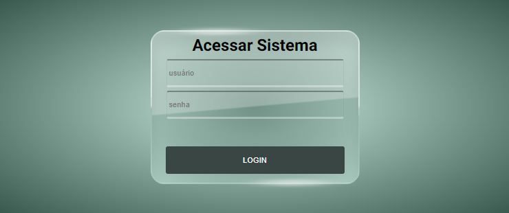
I have the image below that shows a form HTML .

IwantedtomakethiseffectintheformbutIcouldnot.

Cananyonehelpme?

Followmyattempt.

body {
  font-family: 'Roboto', sans-serif;
  background-color: rgb(40, 22, 111);
}

.logon {
  position: relative;
  top: 50% - 150px;
  width: 300px;
  height: 220px;
  margin: 0 auto;
  border: 4px rgb(93, 138, 168) solid;
  border-radius: 20px;
  background-color: rgb(255, 255, 255);
}

.logon * {
  display: block;
  margin: 5px auto;
}

.logon input,
.logon button {
  font-size: .7em;
  padding: 3px;
  border-top: 2px rgb(10, 10, 10) solid;
  border-right: 1px rgb(10, 10, 10) solid;
  border-left: 1px rgb(10, 10, 10) solid;
  border-bottom: 3px rgb(255, 255, 255) solid;
}

.logon h2 {
  width: 250px;
  height: 30px;
  text-align: center;
  color: rgb(0, 0, 0);
}

.logon input {
  width: 250px;
  height: 30px;
  background: rgba(10, 10, 10, .3);
  color: rgb(0, 0, 0);
}

.logon .lembra {
  width: 250px;
  height: 30px;
  color: rgb(0, 0, 0);
}

.logon button {
  width: 260px;
  height: 40px;
  background-color: rgb(0, 0, 0);
  color: rgb(255, 255, 255);
}
<div class="logon">
  <h2>Acessar Sistema</h2>
  <input type="text" name="usuario" id="usuario" placeholder="usuário" />
  <input type="password" name="senha" id="senha" placeholder="senha" />
  <div class="lembra"></div>
  <button id="logar">LOGIN</button>
</div>
    
asked by anonymous 02.01.2019 / 11:39

1 answer

8

Here's an option here.

Studythebackgroundstyleofbody,whichisnothingmorethanaradial-gradient,whichgoesfromthelightesthalftothedarkerend,givingthiseffectthatyoucommentedon.Readtheradial-gradientdocumentationhere link

E Attention also to the styles of class .logon which is where there is more. In addition to the pseudo-elements ::after and ::before that was what I used to make the glitter on the edge. On the .logon border, I used a gradient, for this I needed to use border-image and border-image-slice

html,
body {
  width: 100%;
  height: 100%;
  margin: 0;
  padding: 0;
}
body {
  font-family: 'Roboto', sans-serif;
  background-image: radial-gradient(#ACCCC1 20%, #39594E);
  background-size: cover;
  background-repeat: no-repeat;
  display: flex;
  justify-content: center;
  align-items: center;
}
.logon {
  position: relative;
  width: 300px;
  height: 220px;
  margin: 0 auto;	
  box-shadow: inset 0 18px 32px 0px rgba(0,0,0, 0.1) ;
  border: 2px solid;
  border-image: linear-gradient(rgba(255,255,255, 0.5) 40%, rgba(255,255,255, 0.05) 60%);
  border-image-slice: 1;
  border-radius: 20px;
  background-image: linear-gradient(-10deg, rgba(255,255,255, 0.05) 49%, 
  rgba(255,255,255, 0.25) 50%), radial-gradient( rgba(57, 89, 78, 0.5), #ACCCC1);
}
.logon::after,
.logon::before {
  content: "";
  position: absolute;
  width: 10px;
  height: 10px;
  background-color: rgba(255,255,255, 0.5);
  filter: blur(2px);
  transform: scaleX(10);
  border-radius: 50%;
  top: -5px;
  left: 30%;

}
.logon::before {
  top: unset;
  left: unset;
  right: 30%;
  bottom: -5px;
}
.logon * {			
  display:block;
  margin: 5px auto;	
}		
.logon input,
.logon button{
  font-size: .7em;		
  padding: 3px;
  border-top: 2px rgba(10,10,10, 0.35) solid;
  border-right: 1px rgba(10,10,10, 0.05) solid;
  border-left: 1px rgba(10,10,10, 0.05) solid;
  border-bottom: 3px rgba(255,255,255, 0.35) solid;
  border-radius: 3px;
}
.logon h2{
  width: 250px;
  height: 30px;
  text-align: center;
  color: rgb(0,0,0);
}		
.logon input {
  width: 250px;
  height: 30px;
  background: transparent;
  color: rgb(0,0,0);
}
.logon .lembra {
  width: 250px;
  height: 30px;
  color: rgb(0,0,0);
}
.logon button{
  width: 260px;
  height: 40px;
  /* background-color: rgb(0,0,0); */
  border: none;
  color: #fff;
  background-color: #3A4644;
} 
<div class="logon">
  <h2>Acessar Sistema</h2>
  <input type="text" name="usuario" id="usuario" placeholder="usuário" />
  <input type="password" name="senha" id="senha" placeholder="senha" />
  <div class="lembra"></div>
  <button id="logar">LOGIN</button>
</div>
    
02.01.2019 / 12:26