Working with datepicker in ng-bootstrap

0

I'm working with this component example: link

I need to add three features.

The first I believe to have to do with the class, as in this example , if the day is out of the minimum date or maximum allowed, the day would be "off", with a different coloration. My attempts to reproduce the above example were all flawed.

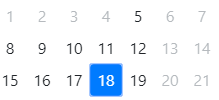
It should look like this:

Thesecondfeaturewouldbetocallthedatapickeronlywhenabuttonwasclicked.

Andthethirdfeaturehastodowithbusinessrule,whenthe"dateFrom", I would like to change the setting so that it allows you to select the "dateTo" for a maximum of one month from the date selected in dateFrom.

I tried to do the following:

onDateSelection(date: NgbDateStruct, config: NgbDatepickerConfig) {
  if (!this.fromDate && !this.toDate) {
    this.fromDate = date;
    config.maxDate = {year: date.year, month: date.month + 1, day: date.day};
  } else if (this.fromDate && !this.toDate && after(date, this.fromDate)) {
    this.toDate = date;
  } else {
    this.toDate = null;
    this.fromDate = date;
    config.maxDate = {year: date.year, month: date.month + 1, day: date.day};
  }
}

But I get the following error:


ERROR Error: Can not set property 'maxDate' of undefined

This can also be seen at link

    
asked by anonymous 08.06.2018 / 01:01

1 answer

1

To set a maximum date, create a new property in your NgbdDatepickerRange class:

maxDate: NgbDateStruct;

To avoid code repetition, create a function to add a month to the start date:

addMonth() {
  let maxDate = new Date(this.fromDate.year, this.fromDate.month, this.fromDate.day);
  // Define o valor da propriedade 'this.maxDate'
  this.maxDate = {
    year: maxDate.getFullYear(),
    month: (maxDate.getMonth()+1),
    day: maxDate.getDate()
  };
}

add the [maxDate]="maxDate" property in the template:

<ngb-datepicker #dp (select)="onDateSelection($event)" [dayTemplate]="t" [maxDate]="maxDate">

In the condition inside the function onDateSelection call the function addMonth() :

if (!this.fromDate && !this.toDate) {
  this.fromDate = date;
  this.addMonth();
} else if (this.fromDate && !this.toDate && after(date, this.fromDate)) {
  this.toDate = date;
} else {
  this.fromDate = date;
  this.toDate = null;
  this.addMonth();
}

See working at stackblitz.com

To set the css for disabled days, add the let-disabled="disabled" property on the ng-template element and [class.disabled]="disabled" element on the span element

<ng-template #t let-date="date" let-focused="focused" let-disabled="disabled">
  <span class="custom-day"
    [class.disabled]="disabled"
    [class.focused]="focused"
    [class.range]="isFrom(date) || isTo(date) || isInside(date) || isHovered(date)"
    [class.faded]="isHovered(date) || isInside(date)"
    (mouseenter)="hoveredDate = date"
    (mouseleave)="hoveredDate = null">
      {{ date.day }}
  </span>
</ng-template>

Then add in component style:

.custom-day.disabled {
  background-color: #fff;
  color: #c1c1c1;
}
.custom-day.disabled:hover {
  background-color: #fff;
  color: #c1c1c1;
}

To display when you click a button, see a simple example in the documentation .

    
10.06.2018 / 02:21