Wordpress Loop coming out unlike!

0

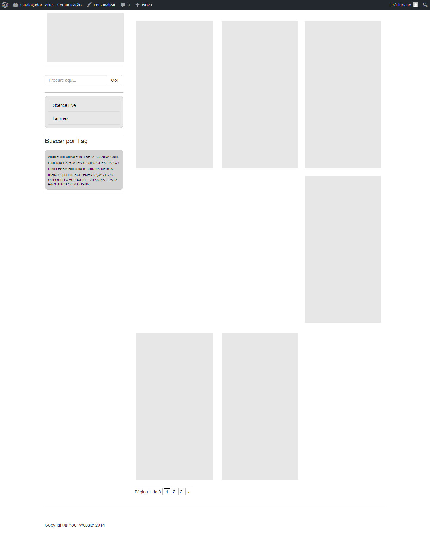
Good morning, I'm doing the loop using wordpress + bootstrap and at the time of showing the content the loop adds some posts as shown in the following image:

Followtheloopcode:

<divclass="container">
    <div class="row">        
       <?php get_sidebar(); ?>           
        <div class="col-md-9">                 
            <?php if ( have_posts() ) : while ( have_posts() ) : the_post(); ?>
                <div class="coluna-post">
                    <div class="thumbnail">
                       <?php
                            $thumb = get_post_thumbnail_id();
                            $img_url = wp_get_attachment_url( $thumb,'full'); //get img URL
                            $image = aq_resize( $img_url, 207, 292); //resize & crop img
                        ?>
                            <img src="<?php echo $image ?>" />
                        <div class="caption">
                            <h4><a href="<?php the_permalink(); ?>"><?php the_title(); ?></a>
                            </h4>
                            <p><?php the_excerpt(); ?></p>
                        </div>

                    </div>
                </div>
                <?php endwhile; else: ?>
                <p><?php _e('Sorry, no posts matched your criteria.'); ?></p>
                <?php endif; ?>
                <?php wp_pagenavi(); wp_reset_postdata(); ?>

         </div>
    </div>

</div>

As I'm using the bootstrap, just the column-post div I created the css .. follow the code

.coluna-post{ float:left; width:260px; padding:10px; margin:10px;}

I think this is a failure in my loop, but I can not identify the problem. This has already happened on some sites that create loops with images.

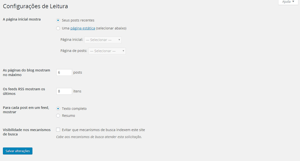
In my Wordpress settings in Reading is the following:

Any light at the end of the tunnel?

    
asked by anonymous 19.04.2016 / 14:28

1 answer

2

is not fading any post, what is happening is that you are using a bad grid , some li ai is at least 1px higher than the rest, thus causing li below to hit it , one way to resolve this is by using display: flex ;

How to use:

        ul#lista {
            display: flex;
            width: 100%;
            float: left;
            box-sizing: border-box;
            padding: 0;
            flex-wrap: wrap;
        }

        ul#lista:before, ul#lista:afer {
            content:" ";
            display: table;
            width: 0;
        }

This :before and :after is not to have any errors in Google Chrome, try to adapt to your css, since you did not inform it, I do not know how to help you.

Another way to sort is to use max-height: pixel fixo with height: pixel igual ao max-height , so it will not have any errors, I prefer display: flex , it is simpler and more beautiful when viewing the site.

But there is still another way to solve it, you can use a famous margin-bottom: 1.5em there, maybe that will solve, try to use it in the last case.

Good luck on your theme.

    
23.04.2016 / 18:15