Aligns navbar bootstrap text vertically

5

I am using two navbar in my project and I have a problem to align the text of the first menu vertically, I tried to create a structure to change but I did not succeed, what I have is this:

First Navbar :

    <div class="navbar-collapse collapse" id="MenuUm">
      <div class="search-side"> <a href="#" class="show-search"><i class="icon-search-1"></i></a>
        <div class="search-form">
          <form autocomplete="off" role="search" method="POST" class="searchform" action="resultado.php">
            <input type="text" value="" name="s" id="s" placeholder="Buscar...">
          </form>
        </div>
      </div>
      <!-- Início da Lista de Navegação-->
      <ul class="nav navbar-nav navbar-right">
        <li> <a href="catalogos.php">catálogos e manuais</a> </li>
        <li> <a href="cores.php">cores e linha</a> </li>
        <li> <a href="garantia.php">garantia e uso</a> </li>
      </ul>
    </div>

Second Navbar :

    <div class="navbar-collapse collapse" id="MenuDois"> 
      <!-- Início da Lista de Navegação-->
      <ul class="nav navbar-nav navbar-right">
        <li> <a href="index.php">INÍCIO</a> </li>
        <li> <a href="empresa.php">EMPRESA</a> </li>
        <li> <a href="produtos.php">PRODUTOS</a> </li>
        <li> <a href="representantes.php">REPRESENTANTES</a> </li>
        <li> <a href="encontrar.php">ONDE ENCONTRAR</a> </li>
        <li><a href="contato.php">CONTATO</a></li>
      </ul>
    </div>

The css of Navbar looks like this:

.navbar-nav {
  margin: 7.5px -15px;
}

.navbar-nav > li > a {
  padding-top: 10px;
  padding-bottom: 10px;
  line-height: 20px;
}

What I tried to do was create two different structures for each Navbar , so, but as I said, it did not work.

.navbar-nav-1 > li > a {
  padding-top: 10px;
  padding-bottom: 10px;
  line-height: 20px;
}

.navbar-nav-2 > li > a {
  padding-top: 10px;
  padding-bottom: 10px;
  line-height: 20px;
}

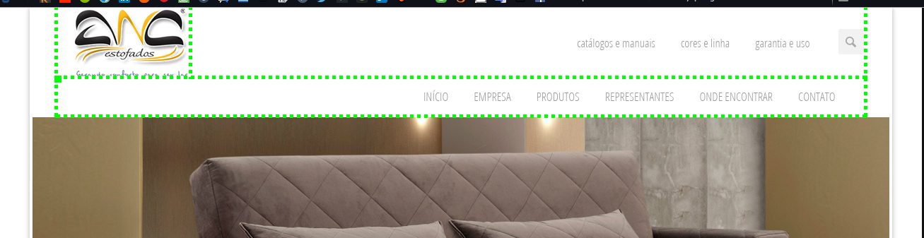
To get easier to understand I'll attach a picture of what I'm trying to do, see: Example of what I need

The site under development is this: Site

    
asked by anonymous 30.12.2015 / 19:22

3 answers

3

Using Grid from the bootstrap to make this menu without additional css.

Walkthrough:

1st - I added a container to center

2 ° - I added 1% with the general% divided into 4 | 8, the 4 will have the logo of the 8 menus.

3 ° - I added the logo normally within row .

4th - I added each menu in a row within col-md-4  each menu received col-md-8 , to be aligned to the right.

Example:

  <div class="container">
     <div class="row">
        <div class="col-md-4">
           <img src="http://ancestofados.com.br/anc/images/anc.fw.png"alt="logo">
        </div>
        <div class="col-md-8">

           <!--  MENU AQUI 1-->
           <div class="row">
              <div class="col-md-11 pull-right">
                 <ul class="nav nav-pills">
                    <li role="presentation"><a href="#">Catálogos e manuais</a></li>
                    <li role="presentation"><a href="#">Cores e linha </a></li>
                    <li role="presentation"><a href="#">Garantia e uso </a></li>
                    <li role="presentation">
                       <form class="navbar-form" role="search">
                          <div class="input-group">
                             <input type="text" class="form-control" placeholder="Pesquisar..." name="srch-term" id="srch-term">
                             <div class="input-group-btn">
                                <button class="btn btn-default" type="submit"><i class="glyphicon glyphicon-search"></i></button>
                             </div>
                          </div>
                       </form>
                    </li>
                 </ul>
              </div>
           </div>

           <!--  MENU AQUI 2 -->
           <div class="row">
              <div class="col-md-12 pull-right">
                 <ul class="nav nav-pills">
                    <li role="presentation"><a href="#">INÍCIO </a></li>
                    <li role="presentation"><a href="#">EMPRESA </a></li>
                    <li role="presentation"><a href="#">PRODUTOS </a></li>
                    <li role="presentation"><a href="#">REPRESENTANTES </a></li>
                    <li role="presentation"><a href="#">ONDE ENCONTRAR </a></li>
                    <li role="presentation"><a href="#">CONTATO</a></li>
                 </ul>
              </div>
           </div>

        </div>
     </div>
  </div>

How it was:

View in jsfiddle

    
04.01.2016 / 20:08
2

From the site you passed, I think it would be interesting to review the structure of your header because the bootstrap framework was not meant to keep 2 navbar in one another. From what I saw in the link you passed, what you could do is add this:

using flex property (future of CSS rs)

.navbar-top > .menu1 >ul.navbar-right { 
    height: 101px;
    display: inline-flex;
    justify-content: center;
    align-items: center;
}

using the old form (as table)

.navbar-top > .menu1 >ul.navbar-right { 
    height: 101px;
    display: table;
}

.navbar-top > .menu1 >ul.navbar-right li a {
    height: 101px;
    display: table-cell;
    vertical-align: middle;
}

Furthermore, in terms of design you put that hidden looking there will disrupt you as to the average sizes queries. the best thing to do would be to insert it inside the navbar as a li and open, so besides not occupying memory for the animations, its design is already treated when the bootstrap adapts and stay with the smaller menu. >     

11.01.2016 / 12:16
2

No style.css, in class search-side add property margin-top with 15px

.search-side {
    margin-top: -15px !important;
}

At first navbar set a class name to navbar-primeira and add the property

.navbar-primeira { 
   margin-top: 35px !important; 
}

And for the second navbar add the properties

ul li a { 
    max-height: 55px !important; 
    margin-top: -15px !important;
}

Finally, in div with class hidden-header , remove the style="height: 161px;" attribute that was set directly in html .

I left the outline turned on, but that's it.

    
04.01.2016 / 20:21