col-md-6 occupying all space

0

In my contact form I need to leave some information about the contact on one side, and on the other side a form with email and message. But the part of my form of information is occupying everything, and when I try to add the email input it falls down.

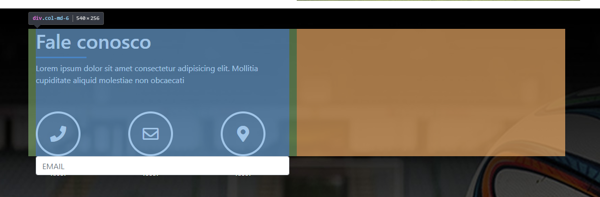
Intheorangepartwastostaytheinputemail.

.col-md-12 {
  background-color: red;
}

.col-md-6 {
  background-color: blue;
}
<link href="https://stackpath.bootstrapcdn.com/bootstrap/4.1.3/css/bootstrap.min.css" rel="stylesheet" />

<div class="contato-content display-table">
  <div class="container">
    <div class="col-md-12">
      <div class="col-md-6 ">
        <h1>Fale conosco</h1>
        <div class="linha-separador mt-2"></div>
        <p class="mt-2">Lorem ipsum dolor sit amet consectetur adipisicing elit. Mollitia cupiditate aliquid molestiae non obcaecati</p>
        <div class="contato-itens">
          <div class="circulo-itens mr-5"><i class="fas fa-phone"></i>
            <p class="mt-5">xxxx</p>
          </div>
          <div class="circulo-itens  mr-5"><i class="far fa-envelope"></i>
            <p class="mt-5">xxxx</p>
          </div>
          <div class="circulo-itens  mr-5"><i class="fas fa-map-marker-alt"></i>
            <p class="mt-5">xxxx</p>
          </div>
        </div>
      </div>

      <div class="col-md-6">
        <form>
          <input class="form-control form-control" type="text" placeholder="EMAIL">
        </form>
      </div>

    </div>
  </div>
</div>
    
asked by anonymous 21.12.2018 / 19:22

2 answers

3

Instead of putting the two col-md-6 columns inside a col-md-12 column, why not put it inside a row ? The line occupies the 12 columns and does not have the spacing that a column has, which breaks its layout.

.col-md-12 {
  background-color: red;
}

.col-md-6 {
  background-color: blue;
}
<link href="https://stackpath.bootstrapcdn.com/bootstrap/4.1.3/css/bootstrap.min.css" rel="stylesheet" />

<div class="contato-content display-table">
  <div class="container">
    <div class="row">
      <div class="col-md-6 ">
        <h1>Fale conosco</h1>
        <div class="linha-separador mt-2"></div>
        <p class="mt-2">Lorem ipsum dolor sit amet consectetur adipisicing elit. Mollitia cupiditate aliquid molestiae non obcaecati</p>
        <div class="contato-itens">
          <div class="circulo-itens mr-5"><i class="fas fa-phone"></i>
            <p class="mt-5">xxxx</p>
          </div>
          <div class="circulo-itens  mr-5"><i class="far fa-envelope"></i>
            <p class="mt-5">xxxx</p>
          </div>
          <div class="circulo-itens  mr-5"><i class="fas fa-map-marker-alt"></i>
            <p class="mt-5">xxxx</p>
          </div>
        </div>
      </div>

      <div class="col-md-6">
        <form>
          <input class="form-control form-control" type="text" placeholder="EMAIL">
        </form>
      </div>

    </div>
  </div>
</div>
    
21.12.2018 / 19:39
0

The Bootstrap in 3.x version worked, but in the current 4.x version apparently .col-* requires a .row parent, I believe this should be because of the flex-box schema.

Obs. In the code below I've changed .col-md-* by .col-* so that it obeys the size on smaller screens. If I am not mistaken just by setting the size md smaller screens used the equivalent of .col-12

.col-12 {
  background-color: red;
}

.col-6 {
  border:blue solid 1px;
}
<link href="https://stackpath.bootstrapcdn.com/bootstrap/4.1.3/css/bootstrap.min.css" rel="stylesheet" />

<div class="contato-content display-table">
    <div class="container">
        <div class='row'> <!-- adicionado -->
            <div class="col-12">
                <div class='row'> <!-- adicionado -->
                    <div class="col-6">
                        <h1>Fale conosco</h1>
                        <div class="linha-separador mt-2"></div>
                        <p class="mt-2">Lorem ipsum dolor sit amet consectetur adipisicing elit. Mollitia cupiditate aliquid molestiae non obcaecati</p>
                        <div class="contato-itens">
                            <div class="circulo-itens mr-5">
                                <i class="fas fa-phone"></i>
                                <p class="mt-5">xxxx</p>
                            </div>
                            <div class="circulo-itens  mr-5">
                                <i class="far fa-envelope"></i>
                                <p class="mt-5">xxxx</p>
                            </div>
                            <div class="circulo-itens  mr-5">
                                <i class="fas fa-map-marker-alt"></i>
                                <p class="mt-5">xxxx</p>
                            </div>
                        </div>
                    </div>
                    <div class="col-6">
                        <form>
                            <input class="form-control form-control" type="text" placeholder="EMAIL">
                        </form>
                    </div>
                </div> <!-- fim row interna -->
            </div> <!-- fim col-12 -->
        </div> <!-- fim da row externa -->
    </div> <!-- fim do container -->
</div> <!-- fim contato-content -->
    
22.12.2018 / 15:30