There are several ways to do it. Here is a simple example with Flexbox .
This model works like this, using the average query @media when the screen is greater than 660px with flex-basis I determine that the right column will have 70% of the right 30% , When the screen is less than 660px each column is with 100% of flex-basis , thus each column occupies an entire row.
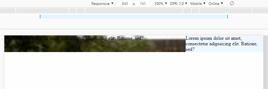
Codewiththeresultoftheimageabove:
OBS:Displayallpagetoseehowresponsiveyouare.Ifyouwanttoadjustthewidthofthecolumns,simplyadjustthe70%and30%proportionally,alwaysaddingupto100%,eg:75%,25%
* {
    box-sizing: border-box;
}
.container {
    display: flex;
    flex-wrap: wrap;
}
.esq {
    flex-basis: 70%;
    background-image: radial-gradient(transparent, rgba(0,0,0,0.9)), url(https://unsplash.it/360/200);
    background-size: cover;
}
.dir {
    flex-basis: 30%;
    background-color: aliceblue;
}
@media screen and (max-width: 660px) {
    .container > div {
        flex-basis: 100%;
    }
}
<div class="container">
    <div class="esq">
        Lorem ipsum dolor sit amet, consectetur adipisicing elit. Ratione, sed?
    </div>
    <div class="dir">
        Lorem ipsum dolor sit amet, consectetur adipisicing elit. Ratione, sed?
    </div>
</div>
In this specific case you can use the technique known as Flex-grow 9999 Hack with it you can make the columns break without needing a media query! Here you you can read more about this: link
.container {
display: flex;
flex-wrap: wrap;
}
.cell {
display: flex;
align-items: center;
height: 100px;
}
.first {
flex-grow: 1;
background-color: lightgreen;
flex-basis: 70%;
min-width: 320px;
}
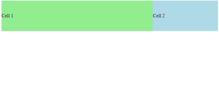
.second {
flex-grow: 9999;
flex-basis: 30%;
background-color: lightblue;
}
<div class="container">
  <div class="cell first">
    Cell 1
  </div>
  <div class="cell second">
    Cell 2
  </div>
</div>