I'm making a website and it does not look right in some mobile phone models.
In an old cell phone ( galaxy and duos ) the image I use does not appear, and look that the html page is very light.
Can you help me? How can I make my website work on a wider range of phones?
html code
<li class="form-line" data-type="control_radio" id="id_808">
<label class="form-label form-label-left form-label-auto" id="label_808" for="input_808"> </label>
<meta content='width=device-width, initial-scale=1.0' name='viewport'>
<div id="cid_808" class="form-input jf-required">
<div class="form-multiple-column" data-columncount="3" data-component="radio">
<ul class="payment-methods">
<li class="payment-method salada">
<span class="form-radio-item">
<span class="dragger-item"> </span>
<div id="f_salada_menu"></div>
<input type="radio" class="form-radio" id="input_808_0" name="q808_input808" value="Salada" />
<label id="label_input_808_0" for="input_808_0"> Salada </label>
</span>
</li>
<li class="payment-method lanche">
<span class="form-radio-item">
<span class="dragger-item"> </span>
<div id="f_lanche_menu"></div>
<input type="radio" class="form-radio" id="input_808_1" name="q808_input808" value="Lanche" />
<label id="label_input_808_1" for="input_808_1"> Lanche </label>
</span>
</li>
<li class="payment-method suco">
<span class="form-radio-item">
<span class="dragger-item"> </span>
<div id="f_suco_menu"></div>
<input type="radio" class="form-radio" id="input_808_2" name="q808_input808" value="Suco" />
<label id="label_input_808_2" for="input_808_2"> Suco </label>
</span>
</li>
</ul>
</div>
</div>
</li>
<style type="text/css">
body {
padding: 25px;
}
.payment-methods {
list-style: none;
margin: 0;
padding: 0;
}
.payment-methods:after {
content: "";
clear: both;
width:100px;
}
.payment-method {
border: 1px solid #ccc;
box-sizing: border-box;
float: left;
height: 70px;
position: relative;
width: 250px;
height:250px;
}
.payment-method label {
background: #fff no-repeat center center;
bottom: 1px;
cursor: pointer;
display: block;
font-size: 0;
left: 1px;
position: absolute;
right: 1px;
text-indent: 100%;
top: 1px;
white-space: nowrap;
}
.payment-method + .payment-method {
margin-left: 25px;
}
.lanche label {
background-image: url(http://i.imgur.com/TN8fMNT.jpg);
background-size:100%;
}
.salada label {
background-image: url(http://i.imgur.com/7f8QY1k.jpg);
background-size:100%;
}
.suco label {
background-image: url(http://i.imgur.com/TmPnN3u.png);
background-size:100%;
}
#salada_radio, #lanche_radio, #suco_radio{
display:none;
}
#f_salada_menu, #f_lanche_menu, #f_suco_menu{
display:none;
}
.payment-methods input:checked + label {
outline: 4px solid #21b4d0;
-webkit-filter: blur(0px); /* Safari 6.0 - 9.0 */
filter: blur(0px);
opacity: 1;
}
</style>
<style type="text/css">
/*AREA RESPONSIVA MOBILE*/
@media only screen and (max-width: 480px) {
.payment-method {
border: 1px solid #ccc;
box-sizing: border-box;
float: left;
height: 70px;
position: relative;
width: 33%;
height:250px;
}
.payment-method + .payment-method {
margin-left: 0px;
}
.lanche label {
background-image: url(http://i.imgur.com/TN8fMNT.jpg);
background-size:300%;
opacity: 0.4;
-webkit-filter: blur(5px); /* Safari 6.0 - 9.0 */
filter: blur(5px);
}
.salada label {
background-image: url(http://i.imgur.com/7f8QY1k.jpg);
background-size:300%;
opacity: 0.4;
-webkit-filter: blur(5px); /* Safari 6.0 - 9.0 */
filter: blur(2px);
}
.suco label {
background-image: url(http://i.imgur.com/TmPnN3u.png);
background-size:300%;
opacity: 0.4;
-webkit-filter: blur(5px); /* Safari 6.0 - 9.0 */
filter: blur(2px);
}
#f_salada_menu {
display:block;
width: 100%;
height: 100%;
background: #73B14E;
z-index:100;
}
#f_lanche_menu {
display:block;
width: 100%;
height: 100%;
background: #AB834F;
z-index:100;
}
#f_suco_menu {
display:block;
width: 100%;
height: 100%;
background: #CC6322;
z-index:100;
}
}
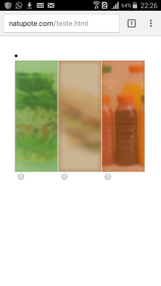
</style>The image below shows a cell phone that opened the site correctly
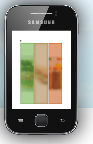
Theimagebelowshowsanoldcellphone(samsunggalaxyduosy)thatdidnotproperlyopenthesite
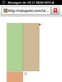
Butinanonlinesimulatorthissamecellphone(galaxyduosy)behaveddifferentlyfromwhatwastestedinpractice