The concept of "responsive" when we talk about tabular data, and somehow when we talk about any elements, has limitations that relate to usability.
In the particular case of your table, some techniques can be used to adapt it to smaller devices, but from a certain point, scrollbars play a crucial role in maintaining the readability and usability of the table. / p>
Note: Since you are using Bootstrap, the example below uses some CSS helper classes present in the Framework .
Applied solutions:
In very wide screen, we use icon instead of text;
Text size will be reduced or increased depending on screen size;
Using auxiliary classes present in Bootstrap, the text or icon is displayed depending on the width of the screen;
When the icon is in use, the text is present as the title of the icon to allow the user to correctly identify the icon ;
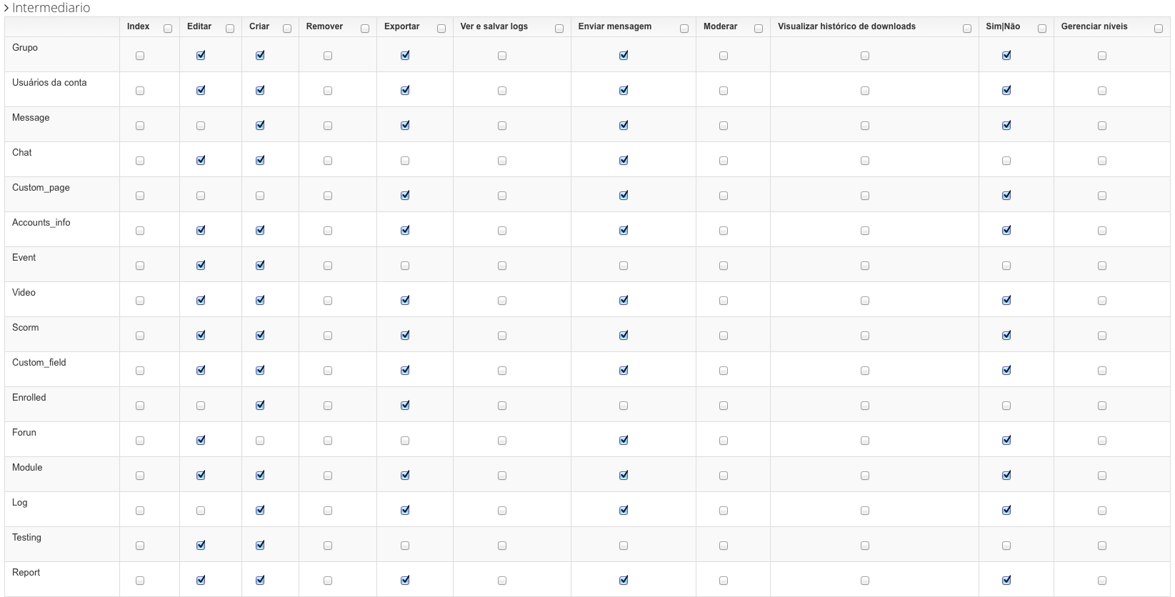
Table with minimum width to guarantee readability and usability. Scrollbars are used below this width to complement navigation.
HTML
With the class visible-xs , we have been able to guarantee that a certain element only appears on very small screens, such as mobile phone or smaller.
With class hidden-xs , we were able to ensure that the text is hidden when the icon is visible.
<span class="glyphicon glyphicon-pencil visible-xs" title="Editar"></span>
<span class="hidden-xs">Editar</span>
<input type="checkbox"/>
CSS
Making use of media queries < sup> (English) , we have been able to manipulate the CSS properties of each element so that they fit the screen size.
In this case we are manipulating the text size up to a certain point. After this, as explained above, it no longer appears and an icon appears that represents it:
/* Landscape phones and smaller */
@media (max-width: 480px) {
    table.cf thead th{
        font-size:0.6em;
    }
}

/* Landscape phones and portrait tablets */
@media (max-width: 767px) {
    table.cf thead th{
        font-size:0.6em;
    }
}

/* Portrait tablets and small desktops */
@media (min-width: 768px) and (max-width: 991px) {
    table.cf thead th{
        font-size:0.6em;
    }
}

/* Portrait tablets and medium desktops */
@media (min-width: 992px) and (max-width: 1199px) {
    table.cf thead th{
        font-size:0.8em;
    }
}

/* Large desktops and laptops */
@media (min-width: 1200px) {

}
Result
With this practical example the table can be read on a device with 360px width up to the widest of the screens:
Example running on JSFiddle
Note: The edit title appears because the mouse is above the icon "Edit".

Below 360 pixels, the suggestion is to use scrollbars where the table has a fixed width of 360px and the scrollbars provide auxiliary navigation.