How to put two divs side by side in Bootstrap

6

I'm still new to web development and I'm having a question on my form putting the two lines of the form side by side into the responsive Bootstrap, knowing that each input will bring information separately.

Example:

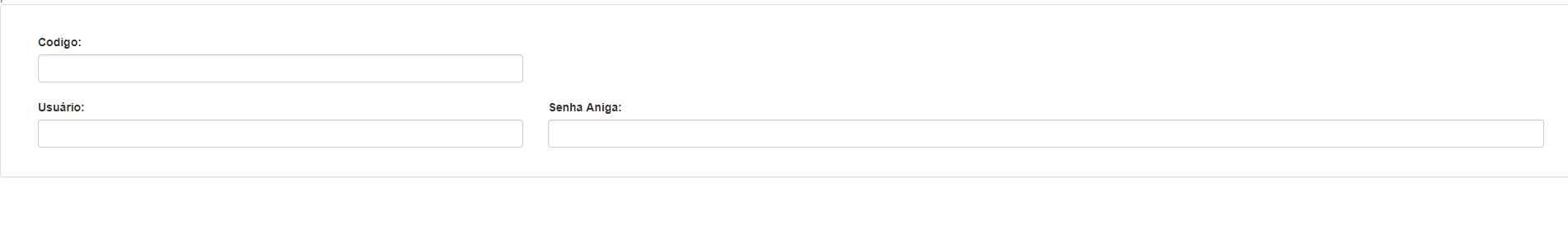
Nome: ________________    Sobrenome: ______________

.group{ 
	position:relative; 
	margin-bottom:20px; 
  }
  .group input 				{
	font-size:18px;
	padding:7px 7px 5px 2px;
	display:block;
	width:80%;
	border:none;
	border-bottom:1px solid #B3AFAF;
  }
  .group input:focus 		{ outline:none; }
  
  /* LABEL ======================================= */
  .group label 				 {
	color:#fff; 
	font-size:18px;
	font-weight:normal;
	position:absolute;
	pointer-events:none;
	left:5px;
	top:10px;
	transition:0.2s ease all; 
	-moz-transition:0.2s ease all; 
	-webkit-transition:0.2s ease all;
  }
  
  /* active state */
  .group input:focus ~ label, input:valid ~ label 		{
	top:-15px;
	font-size:14px;
	color:#5264AE;
  }
  
  /* BOTTOM BARS ================================= */
  .group .bar 	{ position:relative; display:block; width:300px; }
  .group .bar:before, .bar:after 	{
	content:'';
	height:2px; 
	width:0;
	bottom:1px; 
	position:absolute;
	background:#5264AE; 
	transition:0.2s ease all; 
	-moz-transition:0.2s ease all; 
	-webkit-transition:0.2s ease all;
  }
  .group .bar:before {
	left:50%;
  }
  .group .bar:after {
	right:50%; 
  }
  
  /* active state */
  .group input:focus ~ .bar:before, input:focus ~ .bar:after {
	width:50%;
  }
  
  /* HIGHLIGHTER ================================== */
  .group .highlight {
	position:absolute;
	height:60%; 
	width:100px; 
	top:25%; 
	left:0;
	pointer-events:none;
	opacity:0.5;
  }
  
  /* active state */
  .group input:focus ~ .highlight {
	-webkit-animation:inputHighlighter 0.3s ease;
	-moz-animation:inputHighlighter 0.3s ease;
	animation:inputHighlighter 0.3s ease;
  }
  
  /* ANIMATIONS ================ */
  @-webkit-keyframes inputHighlighter {
	  from { background:#5264AE; }
	to 	{ width:0; background:transparent; }
  }
  @-moz-keyframes inputHighlighter {
	  from { background:#5264AE; }
	to 	{ width:0; background:transparent; }
  }
  @keyframes inputHighlighter {
	  from { background:#5264AE; }
	to 	{ width:0; background:transparent; }
  }
<div class="group">
												<input type="number" name="Phone" required="required"style="background-color:transparent"onkeydown="limit(this, 11);" onkeyup="limit(this,11);">
                                                <span class="highlight"></span>
                                                <span class="bar"></span><label>Usuario</label>
											</div>
											
											<div class="group">
												<input type="password" name="password" required="required"><input type="hidden" name="senh" value="Trainer"style="background-color:transparent"onkeydown="limit(this, 4);" onkeyup="limit(this,4);">
                                                <span class="highlight"></span>
                                                <span class="bar"></span><label>Senha</label>
    
asked by anonymous 06.11.2017 / 16:31

3 answers

3

If you're using Bootstrap 4, just set the .form-row class in the div instead of .row , thus getting more compact layouts. See more at: link

Example:

<form>
  <div class="form-row">
    <div class="col">
      <input type="text" class="form-control" placeholder="First name">
    </div>
    <div class="col">
      <input type="text" class="form-control" placeholder="Last name">
    </div>
  </div>
</form>

Another way is to use a Grid system, using columns. By creating a .row class div and then child divs with the .col-sm - ## class, being col - choose sm / md / lg / xl , to set the time the columns will move down from the other (responsive resource), and then choose the column ratio, 1 to 12 of 12. Home For example .col-md-6 , for two columns (divs) of the same size in the ratio of 6 and 6 of 12, and another example, 3 columns (divs) with the class. col-lg-4 , for 3 columns of the same size. Remember that, the Grid system uses 12 as the base size for defining the proportions of the columns.

Example:

<div class="row">
  <div class="col-sm-6">seu objeto aqui</div>
  <div class="col-sm-6">seu objeto aqui</div>
</div>

It is very important to read the Bootstrap Framework documentation. See more at: link

    
20.12.2017 / 13:34
0

I think you're wanting to put your labels next to each other, so here it goes, if it is not, comment that I edit the answer

<!DOCTYPE html>
<html lang="en">
<head>

<meta charset="utf-8">
<meta name="viewport" content="width=device-width, initial-scale=1">
<meta http-equiv="content-type" content="text/html; charset=UTF-8">

<title></title> 

<link rel="stylesheet" href="https://maxcdn.bootstrapcdn.com/bootstrap/3.3.7/css/bootstrap.min.css">
<!-- Início do sript JQuery JS -->
<script src="https://ajax.googleapis.com/ajax/libs/jquery/3.2.1/jquery.min.js"></script><!--FimdoscriptJQueryJS--><scriptsrc="https://maxcdn.bootstrapcdn.com/bootstrap/3.3.7/js/bootstrap.min.js">
</script>    

</head>

<div class="row">
    <div class="col-lg-12"><!-- Conteiner Geral -->     

        <div class="panel panel-default"><!-- Inicio Panel Geral -->
            <div class="panel-body"><!-- Corpo Panel  -->

                <!-- Inicio do formulario -->
                <form method="POST" action="">
                    <br>
                    <div class="col-lg-12">
                        <div class="col-lg-4"><!-- Inicio Input Código -->
                            <label for="ex1">Codigo: </label>
                            <input  type="text" class="form-control" id="" name="" size="60"><br>
                        </div><!-- FimInput Código -->
                    </div>

                    <div class="col-lg-12">
                        <div class="col-lg-4"><!-- Inicio Input Usuário -->
                            <label for="ex1">Usuário: </label>
                            <input  type="text"  class="form-control" id="" name="" size="40"><br>
                        </div><!-- Fim Input Usuário -->

                        <div class="col-lg-8"><!-- Inicio Input Senha Antiga -->
                            <label for="ex1">Senha Aniga: </label>
                            <input  type="text"  class="form-control" id="" name="" size="40"><br>
                        </div><!-- Fim Input Senha Antiga -->
                    </div>
            </div>  
        </div>
    </div>
</div>

Resulting from this, see the image below.

    
06.11.2017 / 18:51
0

.group{ 
	position:relative; 
	margin-bottom:20px; 
  }
  .group input 				{
	font-size:18px;
	padding:7px 7px 5px 2px;
	display:block;
	width:80%;
	border:none;
	border-bottom:1px solid #B3AFAF;
  }
  .group input:focus 		{ outline:none; }
  
  /* LABEL ======================================= */
  .group label 				 {
	color:#fff; 
	font-size:18px;
	font-weight:normal;
	position:absolute;
	pointer-events:none;
	left:5px;
	top:10px;
	transition:0.2s ease all; 
	-moz-transition:0.2s ease all; 
	-webkit-transition:0.2s ease all;
  }
  
  /* active state */
  .group input:focus ~ label, input:valid ~ label 		{
	top:-15px;
	font-size:14px;
	color:#5264AE;
  }
  
  /* BOTTOM BARS ================================= */
  .group .bar 	{ position:relative; display:block; width:300px; }
  .group .bar:before, .bar:after 	{
	content:'';
	height:2px; 
	width:0;
	bottom:1px; 
	position:absolute;
	background:#5264AE; 
	transition:0.2s ease all; 
	-moz-transition:0.2s ease all; 
	-webkit-transition:0.2s ease all;
  }
  .group .bar:before {
	left:50%;
  }
  .group .bar:after {
	right:50%; 
  }
  
  /* active state */
  .group input:focus ~ .bar:before, input:focus ~ .bar:after {
	width:50%;
  }
  
  /* HIGHLIGHTER ================================== */
  .group .highlight {
	position:absolute;
	height:60%; 
	width:100px; 
	top:25%; 
	left:0;
	pointer-events:none;
	opacity:0.5;
  }
  
  /* active state */
  .group input:focus ~ .highlight {
	-webkit-animation:inputHighlighter 0.3s ease;
	-moz-animation:inputHighlighter 0.3s ease;
	animation:inputHighlighter 0.3s ease;
  }
  
  /* ANIMATIONS ================ */
  @-webkit-keyframes inputHighlighter {
	  from { background:#5264AE; }
	to 	{ width:0; background:transparent; }
  }
  @-moz-keyframes inputHighlighter {
	  from { background:#5264AE; }
	to 	{ width:0; background:transparent; }
  }
  @keyframes inputHighlighter {
	  from { background:#5264AE; }
	to 	{ width:0; background:transparent; }
  }
<div class="group">
												<input type="number" name="Phone" required="required"style="background-color:transparent"onkeydown="limit(this, 11);" onkeyup="limit(this,11);">
                                                <span class="highlight"></span>
                                                <span class="bar"></span><label>Usuario</label>
											</div>
											
											<div class="group">
												<input type="password" name="password" required="required"><input type="hidden" name="senh" value="Trainer"style="background-color:transparent"onkeydown="limit(this, 4);" onkeyup="limit(this,4);">
                                                <span class="highlight"></span>
                                                <span class="bar"></span><label>Senha</label>
    
06.11.2017 / 19:16