How can I make the geometric shapes below using preferably CSS? If it is not possible to do using only CSS, I also accept responses with other methods.


How can I make the geometric shapes below using preferably CSS? If it is not possible to do using only CSS, I also accept responses with other methods.
Simpler and more similar to your image:
.trapezio {
border-bottom: 70px solid #c1c1c1;
border-left: 30px solid transparent;
border-right: 15px solid transparent;
height: 0;
width: 120px;
}

.trapezioinvertido {
border-top: 70px solid #c1c1c1;
border-left: 30px solid transparent;
border-right: 15px solid transparent;
height: 0;
width: 120px;
}

.paralelograma {
width: 150px;
height: 70px;
-webkit-transform: skew(-20deg);
   -moz-transform: skew(-20deg);
     -o-transform: skew(-20deg);
background: #c1c1c1;
}
<html>
<head>
<title></title>
</head>
<body>
<div class="trapezio"></div>
</br>
<div class="paralelograma"></div>
</br>
<div class="paralelograma"></div>
</br>
<div class="trapezioinvertido"></div>
</body>
</html> Use transform: rotate in child elements, and perspective , in parent element.
.a{
  perspective:1000px;
  text-align:center;
}

.b{
    transform:rotateX(-60deg);
    width:100px;
    background:gold;
    height:100px;
 }

.c{
    transform:rotateX(30deg);
    width:100px;
    background:tomato;
    height:100px;
}
.d{
    transform:rotateY(30deg);
    width:100px;
    background:lightgreen;
    height:100px;
}
<div class="a">
<div class="b">B</div>
<div class="c">C</div>
<div class="d">D</div>
</div> The perspective property affects only child elements where this property was set, but does not affect itself.
perspective ? This property allows you to change the perspective in which 3D elements are viewed. The perspective property determines the distance between the Z plane and the user, in order to give the 3D element some perspective.
The intensity of the effect is determined by the value of perspective . The lower the value, the closer you get to the Z plane. The higher the value, the more subtle the effect.
When setting the perspective property on an element, it is the child elements that receive the perspective in which it is viewed, not the element itself.
Note: The perspective property only affects elements transformed into 3D!
References (where I did a half-word translation):
There are a few ways to do this. I'll add some of the shapes you asked for here.
#trapezoid {
  border-bottom: 100px solid red;
  border-left: 50px solid transparent;
  border-right: 50px solid transparent;
  height: 0;
  width: 100px;
}

#parallelogram {
  width: 150px;
  height: 100px;
  -webkit-transform: skew(20deg);
  -moz-transform: skew(20deg);
  -o-transform: skew(20deg);
  background: red;
}
<div id="trapezoid">Trapezoide</div>
<br/><br/><br/><br/><br/><br/><br/><br/><br/><br/>
<div id="parallelogram">Paralelogram</div>The rest is enough to change the properties however you want.
This Site has several examples of geometric shapes.
Use polygon :
svg polygon { fill: #666 }<svg width='200' height='100'>
<polygon points='0,100 50,0 150,0 200,100'/>
</svg>
<svg width='200' height='100'>
<polygon points='0,100 50,0 200,0 150,100'/>
</svg>
<svg width='200' height='100'>
<polygon points='50,100 0,0 200,0 150,100'/>
</svg>By using ONLY css, this is the maximum you'll achieve: link
The skew property will 'distort' the div the way you want it to.
.skew{
    transform:skew(40deg);
}
.skew p {
    transform:skew(-40deg);
}
Note that it is important to apply the negative-mode value to the child of this div so that it can continue 'normal'.
The problem with your layout is that in addition to the distortion it also has different height and width in each corner.
The only way to get this result (as far as I know) would be through svg .
Using the SVG method, which allows you to create complex shapes.
This code example will generate a "div" with random widths and heights:
<div class="container">
    <div class="col-lg-6">
        <svg class="svg" viewBox="0 0 910 500" >
            <defs>
                <pattern id="img1" patternUnits="userSpaceOnUse" width="900" height="490">
                    <image xlink:href="http://www.thesaleslion.com/wp-content/uploads/2013/12/web-design.jpg" x="0" y="0" width="890" height="480" />
                </pattern>
            </defs>
            <polygon points="96.729,27.124 10,470.109 867.032,420.878 890,10" fill="url(#img1)"/>
        </svg>
    </div>
</div>
However, I chose not to use this template because it becomes 'annoying' to work on maintenance. Each "div" or block, which you are going to generate, should be drawn before moving on to the html. I did it through the illustrator, saved it in svg and just took the code that generated the form (it was easier for me because it already involved other services that needed the same way - there could be easier / simpler methods).
The code that represents the format of the "div" would be this:
<polygon points="96.729,27.124 10,470.109 867.032,420.878 890,10" fill="url(#img1)"/>
Where you also have a background image, referenced within the pattern tag.
The size of the "div" is managed here:
<svg class="svg" viewBox="0 0 910 500" >
Where the viewbox determines the size of the viewbox.
The code I gave you, already works responsive . But as said before, maintaining this model is quite complex, compared to maintaining a simple div.
See a working example here: link
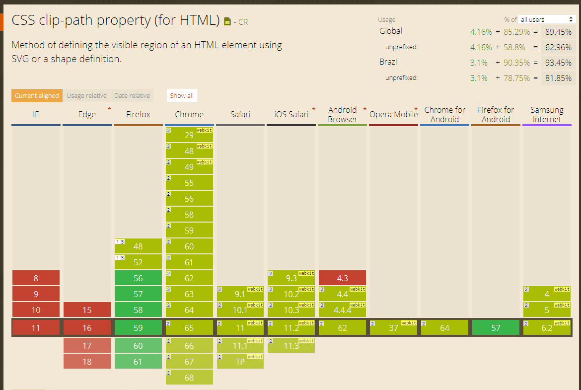
You can also do with Clip-Path !
Since it was not mentioned in any of the other answers I will give a solution using clip-path:polygon
.trap, .skw, .skw-inc, .trap-inv  {
    width: 160px;
    height: 80px;
    background-color: #666;
    margin: 1rem;
}
.trap {
    -webkit-clip-path: polygon(20% 0%, 91% 0, 100% 100%, 0% 100%);
    clip-path: polygon(20% 0%, 91% 0, 100% 100%, 0% 100%);
}
.skw {
    -webkit-clip-path: polygon(25% 0%, 100% 0%, 75% 100%, 0% 100%);
    clip-path: polygon(25% 0%, 100% 0%, 75% 100%, 0% 100%);
}
.skw-inc {
    -webkit-clip-path: polygon(25% 0%, 100% 0%, 89% 100%, 0% 100%);
    clip-path: polygon(25% 0%, 100% 0%, 89% 100%, 0% 100%);
}
.trap-inv {
    -webkit-clip-path: polygon(0 0, 100% 0, 89% 100%, 23% 100%);
    clip-path: polygon(0 0, 100% 0, 89% 100%, 23% 100%);
}
<div class="trap"></div>
<div class="skw"></div>
<div class="skw-inc"></div>
<div class="trap-inv"></div>clip-phat link
OBS!: Unfortunately it still does not work in IE or EDGE, however more than 90% of browsers worldwide already support clip-phat link