


I'm doing a free HTML and CSS theme work for college, but some modifications I made to make the site responsive prevent me from putting an element in the center of the container . I have a section of the site with a UL, and each item has a "download" button that appears in the center when you mouse over the item, but when the site is resized it is no longer centralized.
I have the following code in HTML:
        <!-- Terceira seção -->
        <section>
            <h1>Lançamentos Recentes</h1>
            <ul>
                <li class="sec-li-dl">
                    <img src="img/anime/fake1.png"/>
                    <h2>Lançamento 1</h2>
                    <a href="#" target="_blank" class="dl-button">Download</a>
                </li>
                <li class="sec-li-dl">
                    <img src="img/anime/fake2.png"/>
                    <h2>Lançamento 2</h2>
                    <a href="#" target="_blank" class="dl-button">Download</a>
                </li>
                <li class="sec-li-dl">
                    <img src="img/anime/fake3.png"/>
                    <h2>Lançamento 3</h2>
                    <a href="#" target="_blank" class="dl-button">Download</a>
                </li>
                <li class="sec-li-dl">
                    <img src="img/anime/fake4.png"/>
                    <h2>Lançamento 4</h2>
                    <a href="#" target="_blank" class="dl-button">Download</a>
                </li>
            </ul>
        </section>
And in CSS:
/* Seções */
section{
    width: 90%;
    height: auto;
    margin: 0 auto;
    margin-bottom: 25px;
    background-color: white;
    overflow: hidden;
}
/* UL das seções */
section ul{
    margin: 0;
    height: auto;
    width: 100%;
    padding: 0;
    list-style: none;
}
/* Itens das seções */
.sec-li, .sec-li-dl{
    float: left;
    width: 25%;
    height: auto;
    max-height: 306px;
    margin: 0;
    overflow: hidden;
    cursor:pointer;
    position: relative;
}
/* Efeito ao passar o mouse em um item da seção de lançamentos recentes */
.sec-li-dl:hover .dl-button{
    display: initial;
}
/* Botão de download */
/* CENTRALIZAR RESPONSIVAMENTE */
.dl-button{
    width: 100px;
    height: 35px;
    margin: 0 auto;
    /* background-color: #107c0f; */
    background-color: black;
    text-decoration: none;
    color: white;
    font-family: calibri;
    font-size: 18px;
    font-weight: 100;
    text-align: center;
    padding-top: 12px;
    position:absolute;
    bottom: 130;
    left: 100;
    display: none;
}
/* Imagens das seções */
.sec-li a img, .sec-li-dl img{
    width: 100%;
    height: auto;
}
/* Legendas dos itens */
.sec-li h2, .sec-li-dl h2{
    width: 100%;
    height: 50px;
    margin: 0;
    background-color: rgba(0, 0, 0, 0.6);
    color: white;
    font-family: calibri;
    font-size: 18px;
    font-weight: 100;
    text-align: center;
    padding-top: 12px;
    position:absolute;
    bottom:0;
}
And the end result: 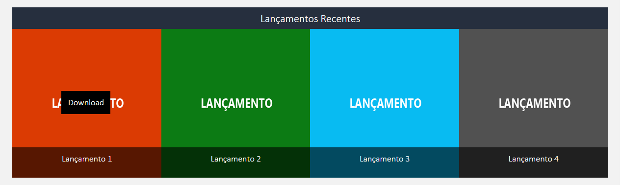
I need the download button always to be in the center, regardless of screen size. The items always have a height and proportional width of 1: 1.