


I have a navbar that works with the collapse, when at a lower resolution the menu group and appear only when clicked. Anyway, can I change the breakpoint of navbar only so that this effect occurs in a different resolution? I tried switching on the bootstrap.css where I had reference, but I got no results.
Change the breakpoint of the navbar
1
asked by anonymous 15.04.2015 / 14:07
3 answers
1
Change the max-width as desired.
@media (max-width: 990px) {
    .navbar-header {
        float: none;
    }
    .navbar-toggle {
        display: block;
    }
    .navbar-collapse {
        border-top: 1px solid transparent;
        box-shadow: inset 0 1px 0 rgba(255,255,255,0.1);
    }
    .navbar-collapse.collapse {
        display: none!important;
    }
    .navbar-nav {
        float: none!important;
        margin: 7.5px -15px;
    }
    .navbar-nav>li {
        float: none;
    }
    .navbar-nav>li>a {
        padding-top: 10px;
        padding-bottom: 10px;
    }
}
Source: Bootstrap 3 - navbar collapsible until 990px
Example: Bootply
15.04.2015 / 14:56
0
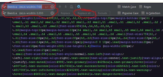
Much simpler than I thought,
Open the bootstrap.css file, and using the IDE preferably just apply a "replace all" to the following strings:
@media (min-width:768
Switch to
@media (min-width:990
Then the responsiveness of the application will be applied when the screen reaches 990px
Using the phpStorm IDE:
22.10.2017 / 17:22
0
I know this does not directly address the problem presented, but it really does not seem to be a good idea to have specific breakpoints for just one component when it's usual for the entire layout to follow. Specifically, Bootstrap 3 has variables that handle this, and you can generate a custom build . Otherwise, the best approach is for Rafael Barbosa, applying an extra CSS styles as a patch on the Bootstrap rules.
22.10.2017 / 18:54