Style an input type = 'number' to change the arrows

6

How to customize input type='number' as the following image?

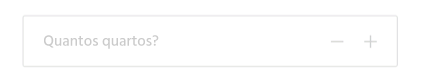
Clickingon+/-addsorsubtractsthenumberinsidethebox.

Currentlymycodeis:

.bedrooms=f.input:bedrooms,:label=>false,as:"number", placeholder: 'Quantos quartos?', min: 0

which results in the following image:

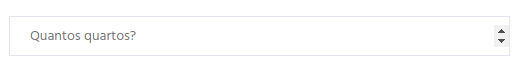
a default%, I want to know how to stylize to change the up / down arrows to an icon or image of +/-

    
asked by anonymous 12.10.2018 / 22:48

2 answers

4

The default increment and decrement buttons have been disabled, and instead have been customized:

function mais(){
  var atual = document.getElementById("total").value;
  var novo = atual - (-1); //Evitando Concatenacoes
  document.getElementById("total").value = novo;
}

function menos(){
  var atual = document.getElementById("total").value;
  if(atual > 0) { //evita números negativos
    var novo = atual - 1;
    document.getElementById("total").value = novo;
  }
}
*{
margin:0;
}
div{
margin-top:10%;
}

input[type="number"] {
  -webkit-appearance: textfield;
     -moz-appearance: textfield;
          appearance: textfield;
}
input[type=number]::-webkit-inner-spin-button, 
input[type=number]::-webkit-outer-spin-button { 
  -webkit-appearance: none;
}
input[type="number"]{
outline:none;
border-right: 0px;
border-top: 1px solid black;
border-left: 1px solid black;
border-bottom: 1px solid black;
height: 20px;
padding:1%;
border-right: 0 px solid black;
}
label, input, button {
    font-size: inherit;
    padding: 0.2em;
    -moz-box-sizing: content-box;
    -webkit-box-sizing: content-box;
    box-sizing: content-box;
}
button{
height:20px;
padding:1%;
border-top: 1px solid black;
border-bottom: 1px solid black;
background-color: white;
border-left: 0px solid black;
padding-left:2%;
padding-right:2%;
outline:none;
cursor: pointer;

}
button.a{
  border-right: 0px solid black;
}
button.b{
    border-right: 1px solid black;
}
<center>
<div>

  <input placeholder="Quantos quartos?" min=0 id="total" type="number"><button onclick="menos()" class="a">-</button><button onclick="mais()" class="b">+</button>

</div>
</center>

Worth noting

In order to deactivate the default arrows of input type='number' , make the following code:

input[type=number]::-webkit-inner-spin-button, 
input[type=number]::-webkit-outer-spin-button { 
  -webkit-appearance: none; 
  margin: 0; 
}
<input type="number">
    
17.10.2018 / 21:33
2

Native%% controls are not cross-browser capable of being stylized. The easiest and safest way to get what you want:

input[type="number"] {
  -webkit-appearance: textfield;
     -moz-appearance: textfield;
          appearance: textfield;
}
input[type=number]::-webkit-inner-spin-button, 
input[type=number]::-webkit-outer-spin-button { 
  -webkit-appearance: none;
}

This allows you to use your custom buttons, which can be linked to perform the functions that the input[type=number] (arrows) would do ( spinners and .stepUp() ), as long as you keep .stepDown() / p>

For example:

input[type="number"] {
  -webkit-appearance: textfield;
  -moz-appearance: textfield;
  appearance: textfield;
}

input[type=number]::-webkit-inner-spin-button,
input[type=number]::-webkit-outer-spin-button {
  -webkit-appearance: none;
}

.number-input {
  border: 2px solid #ddd;
  display: inline-flex;
}

.number-input,
.number-input * {
  box-sizing: border-box;
}

.number-input button {
  outline:none;
  -webkit-appearance: none;
  background-color: transparent;
  border: none;
  align-items: center;
  justify-content: center;
  width: 3rem;
  height: 3rem;
  cursor: pointer;
  margin: 0;
  position: relative;
}

.number-input button:before,
.number-input button:after {
  display: inline-block;
  position: absolute;
  content: '';
  width: 1rem;
  height: 2px;
  background-color: #212121;
  transform: translate(-50%, -50%);
}
.number-input button.plus:after {
  transform: translate(-50%, -50%) rotate(90deg);
}

.number-input input[type=number] {
  font-family: sans-serif;
  max-width: 5rem;
  padding: .5rem;
  border: solid #ddd;
  border-width: 0 2px;
  font-size: 2rem;
  height: 3rem;
  font-weight: bold;
  text-align: center;
}
<div class="number-input">
  <button onclick="this.parentNode.querySelector('input[type=number]').stepDown()" ></button>
  <input class="quantity" min="0" name="quantity" value="1" type="number">
  <button onclick="this.parentNode.querySelector('input[type=number]').stepUp()" class="plus"></button>
</div>
    
17.10.2018 / 21:41